
Bored by your art? Try a bit of flair
(And I'm not talking about TGI Fridays)


Have you ever spent time looking at a Matisse painting? Like really looking at one?
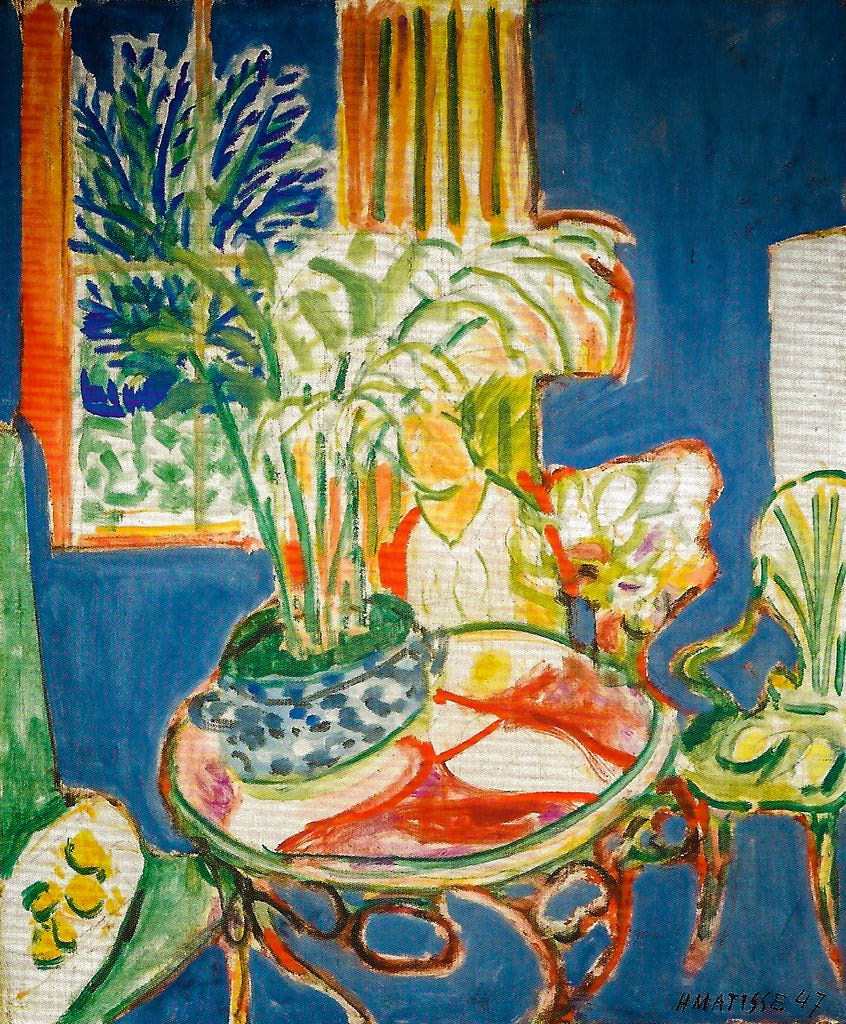
Matisse, Small Interior in Blue, 1947 at StaaatsgaleIf
If you spend a little time with a Matisse interior you begin to get past the bright palette capturing that South of France light and the sumptuous lines building out the plants. You notice that bit of lavender in the gestural painting of a bouquet. The dusty burgundy shapes on the table. A strange desaturated green creating the folds on the curtains. He inserts Easter eggs of color, here and there, throughout his paintings for the viewer to encounter. He adds flair.
What purpose does this flair serve beyond just adding beauty? It rescues the viewer of the painting from the mundane world. Those extra bits of color and line push the viewer through the 4th wall, from our boring, everyday life into a more visionary, otherworldly and fabulous place.
I bring up the value of inserting a little panache into a painting because there is a pretty good chance that you occasionally make boring art. You might work on a painting for some period of time and like many aspects of it, the palette charms you, the composition is dynamic, the brushstrokes lovely. But despite all of that, the work is a little underwhelming. As my kids might say, it is mid.
And we do not stand at an easel to underwhelm.

Self-Portrait with Dark Felt Hat at the Easel, Vincent van Gogh
My own boring paintings are usually the result of timidity, I’m too scared to free them from real life. And often the best way for me to bring that painting to a more interesting place is to leave the realistic world behind and experiment with some flourishes.
By looking through the evolution of Matisse’s work we can see how the insertion of more and more flair moved his work from lovely to groundbreaking. One great way to see this is by tracking the evolution of a series of interior paintings that Matisse painted in Nice.
This earlier version from 1918-1919 is beautiful to look at, of course. But it is not that engaging. There are hints of what is to come in a pop of red on the flower in the vase, a long green shutter and the expanse of blue out of the window.

Interior at Nice 1918-1919
Les régates de Nice, 1921
In this 1921 painting we see a little more bravery. Look at that darker green-gray, abstract shape on the doors to the balcony. The dark red oval on the table by the vase. The lovely dull lavender swooshes in the wallpaper pattern.
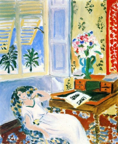
Interior in Nice, a Siesta, 1922
A year later and Matisse is taking even more chances. The patterns on the carpet, wallpaper and chair are complicated, bright, bold. A strong, dark line establishes the edge of the writing desk.
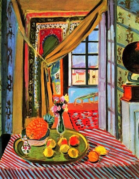
Interior at Nice, circa 1924
By 1924 he is really going for it. He has left our plane and dragged us into a place where we are enveloped in his color and pattern. We are overwhelmed by his fantastical world, the only calm the four rectangles of blue in the sky.
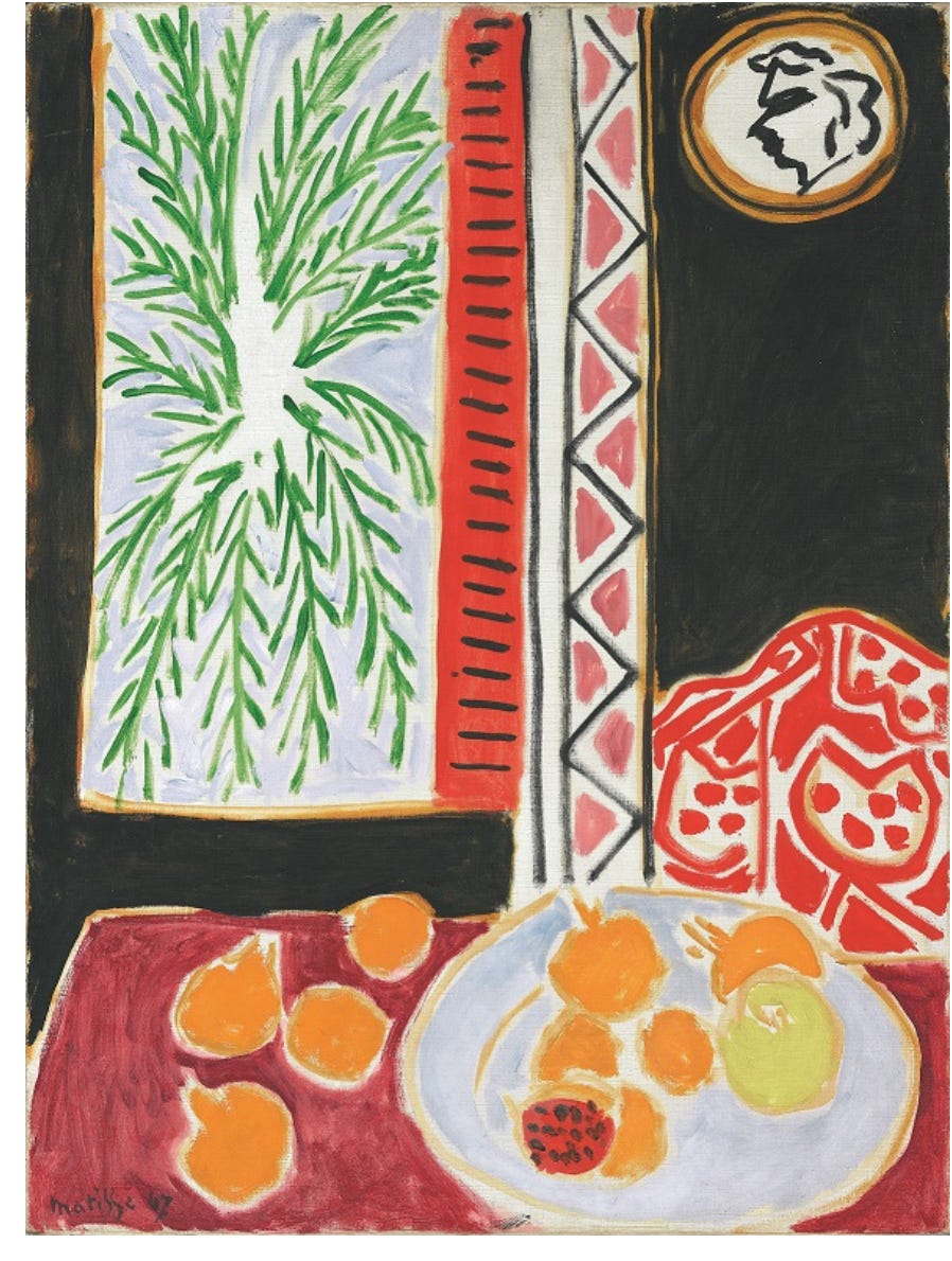
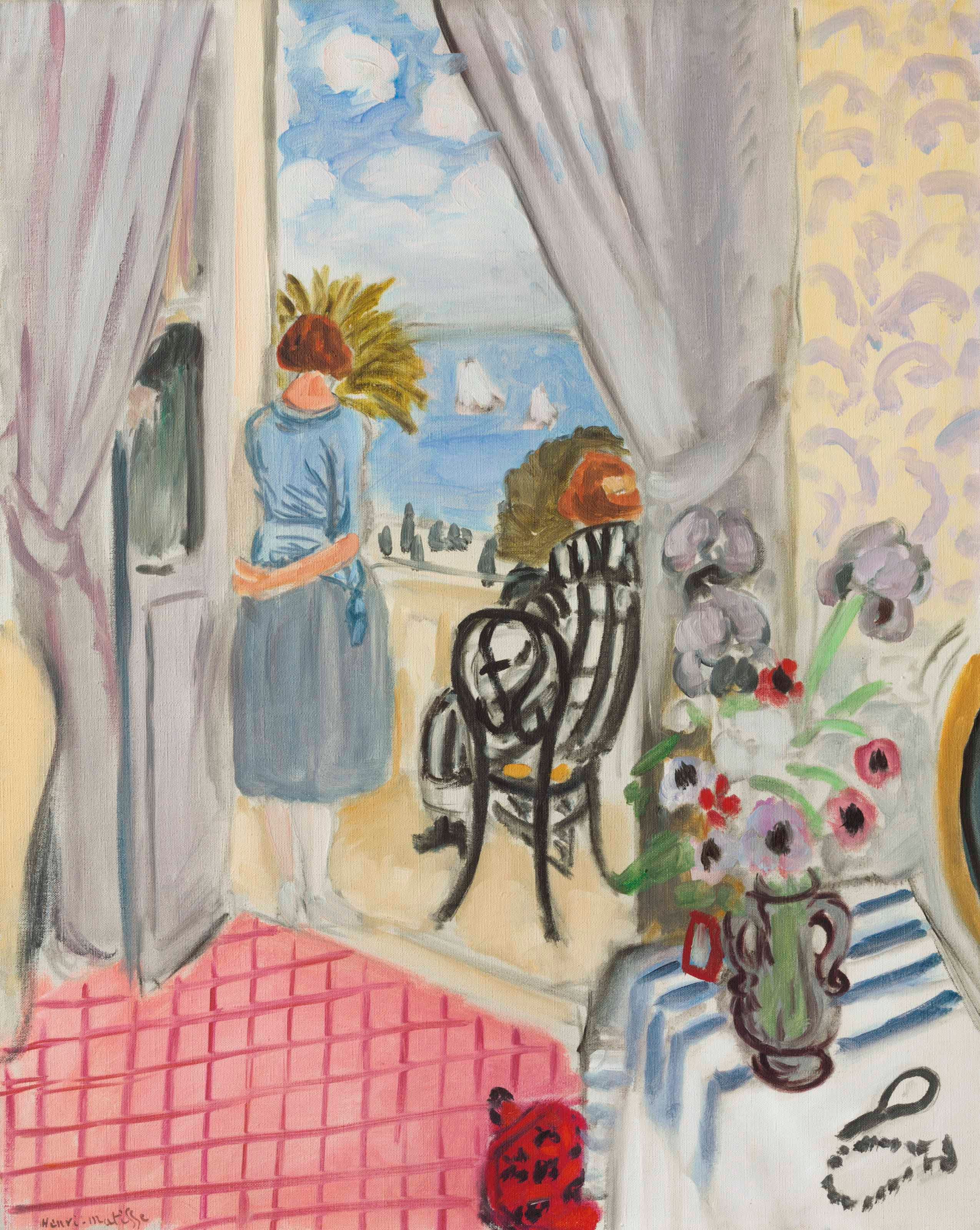
Henri Matisse, Still Life with Pomegranates, 1947
What do we see twenty years later? He has removed much of the fussiness, a lot of the shadows, and left us with an audacious reduction of form and space. What remains is a tableau of the light and color of a moment. The essence of a space and a moment.
Cutting directly into color reminds me of a sculptor’s carving into stone. - Henri Matisse
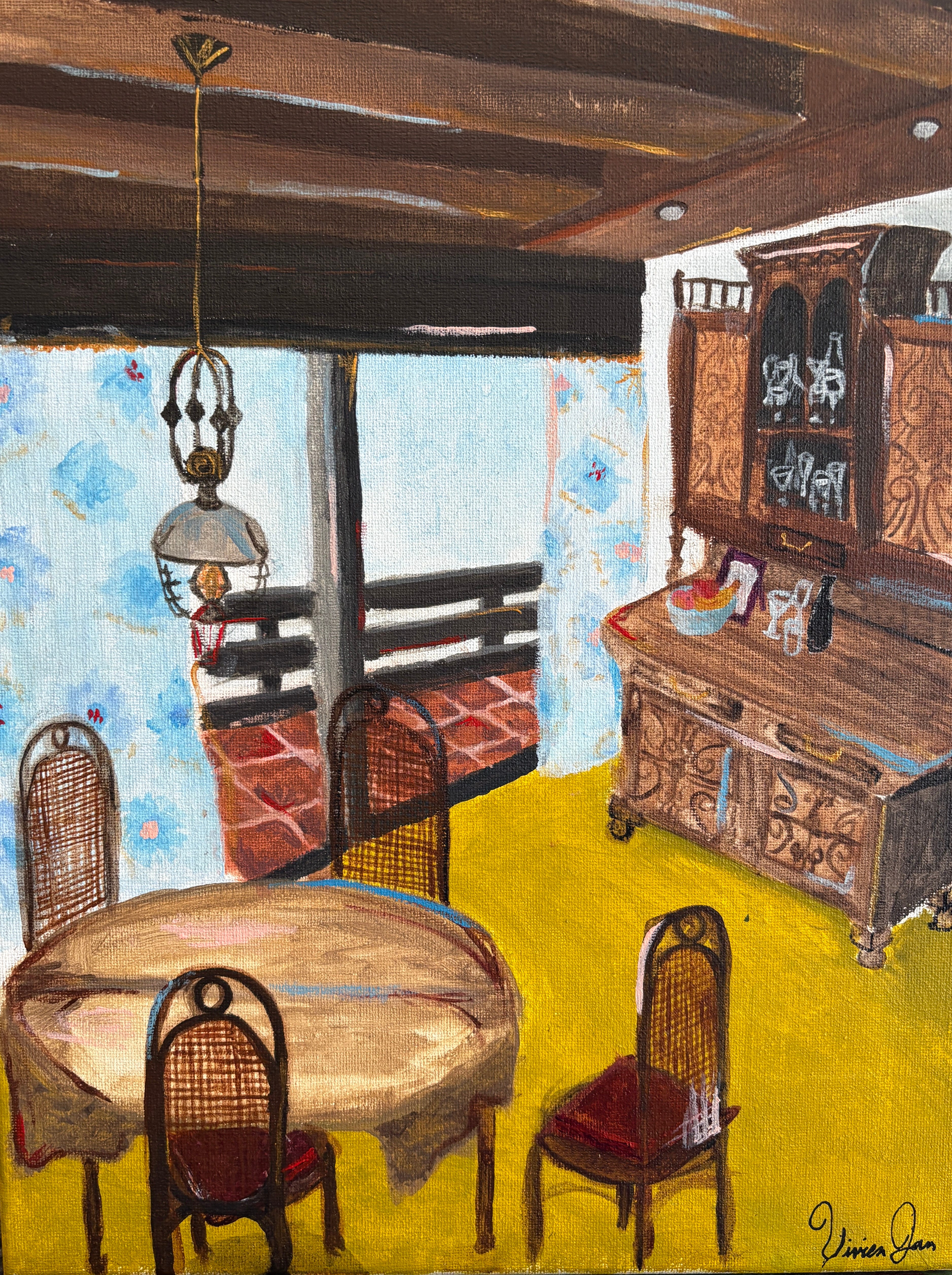
I started thinking about this whole flair business while painting with a couple of talented high schoolers last week. We were painting spaces that matter to us and one of the artists spent most of the week working on a painting of her grandmother’s dining room in Slovenia. On day four I was getting nervous that this young painter would not be happy with her final painting because, while the painting was well done and lovely, it was not as dynamic as I knew she wanted it to be.
So I decided to do a mini demo for her on the power of flair.
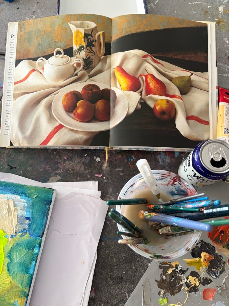
Using the above image from a book on Cezanne as reference, I first painted a simple, expressive take on that image and turned it into a still life.
This is a totally fine painting, but it is still pretty mundane and of this world.
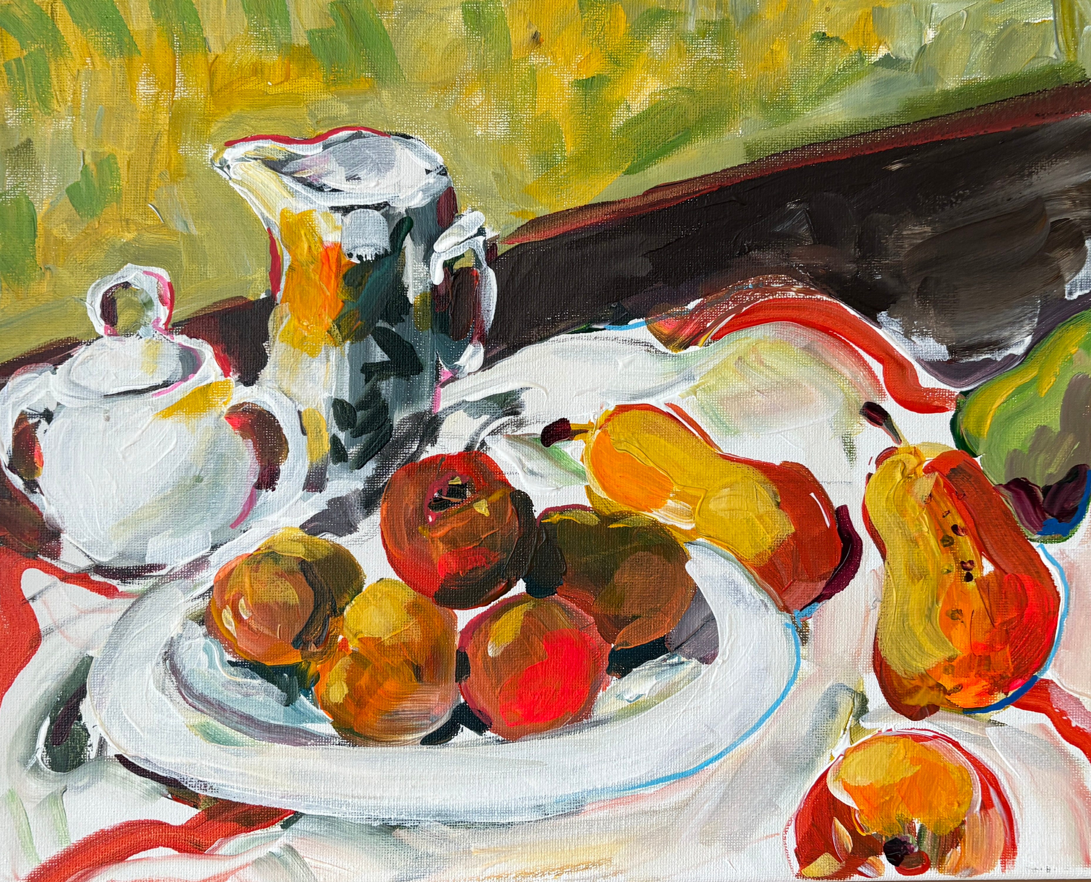
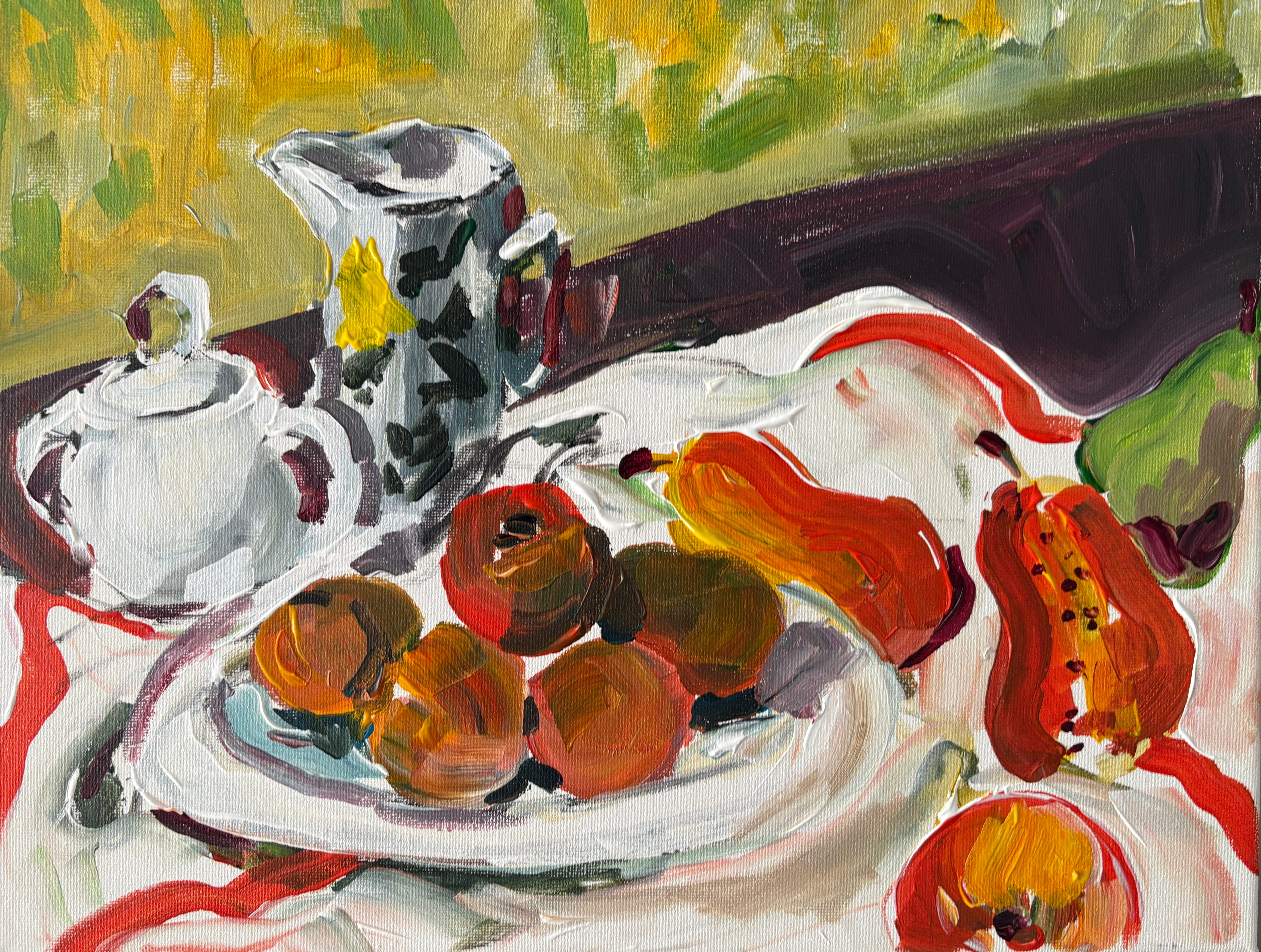
As she watched, I went back in and added unnecessary, totally extra, bits of color here and there. Red lines around the teapot and sugar bowl, I took a wide brush and slathered bright yellow-orange on the pear. I added a blob of hot pink to the apple. It took two minutes and it made all the difference in the world. The objects seemed to suddenly come to life.
The young painter returned to her painting and started added sky blue lines to the brown china hutch, a red line to the beams in the ceiling, a bright red line on the seat of the chair. The piece was brought to life. It is magical and lively.
If you have a painting or two that you like but don’t love, why don’t you give some flair a try? Who knows, it. might be exactly what you need to bring your painting to another place.
Happy painting and please remember that fall classes at The Painting School are open for registration - including an online class taught by me for anybody reading this from somewhere else in the world! - learn more here!
Thank you for reading,
Sara
My YouTube for lots of art history-based art lessons
Should have read: but not to paint (see how excited I am?).
What a great selection! Love this