


Bored with your palette? Consider lifting color combos of the past.
(also, Rembrandt knew what's up.)

I love a good color wheel. (I have an entire chapter dedicated to the use of color wheels in my book “Painting Can Save Your Life: How and Why We Paint”) You can’t go wrong with the analogous color themes and split complimentary combos they offer, so I often use them in class.
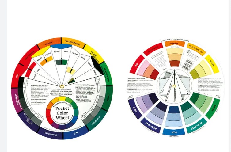
But I realized that sticking so close to the color wheel might be restraining my students. I wanted to introduce a new way to select a color theme or palette and lifting the color palettes of art movements or famous painters was a great solution..
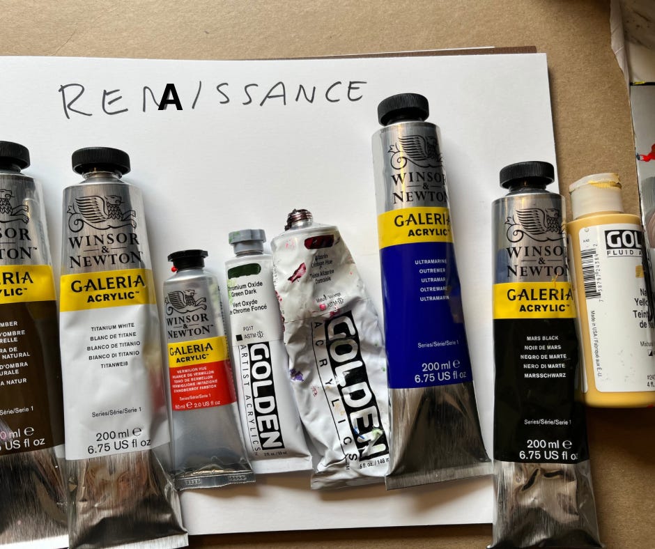
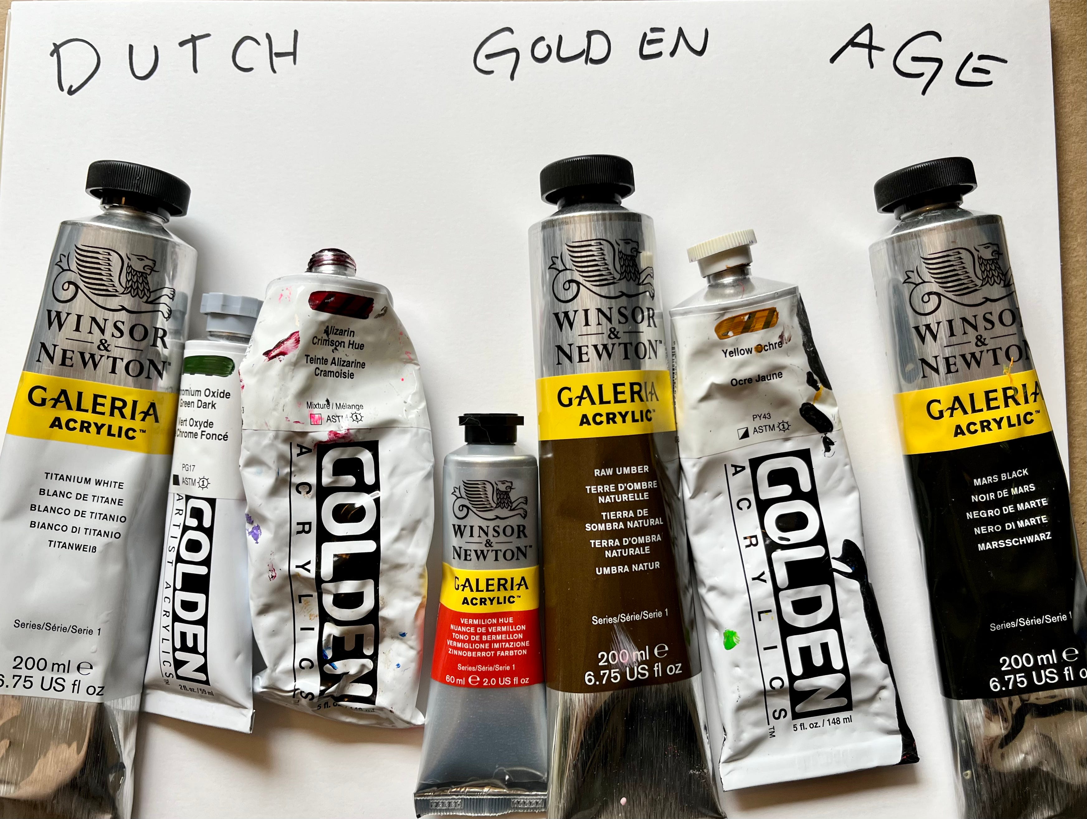
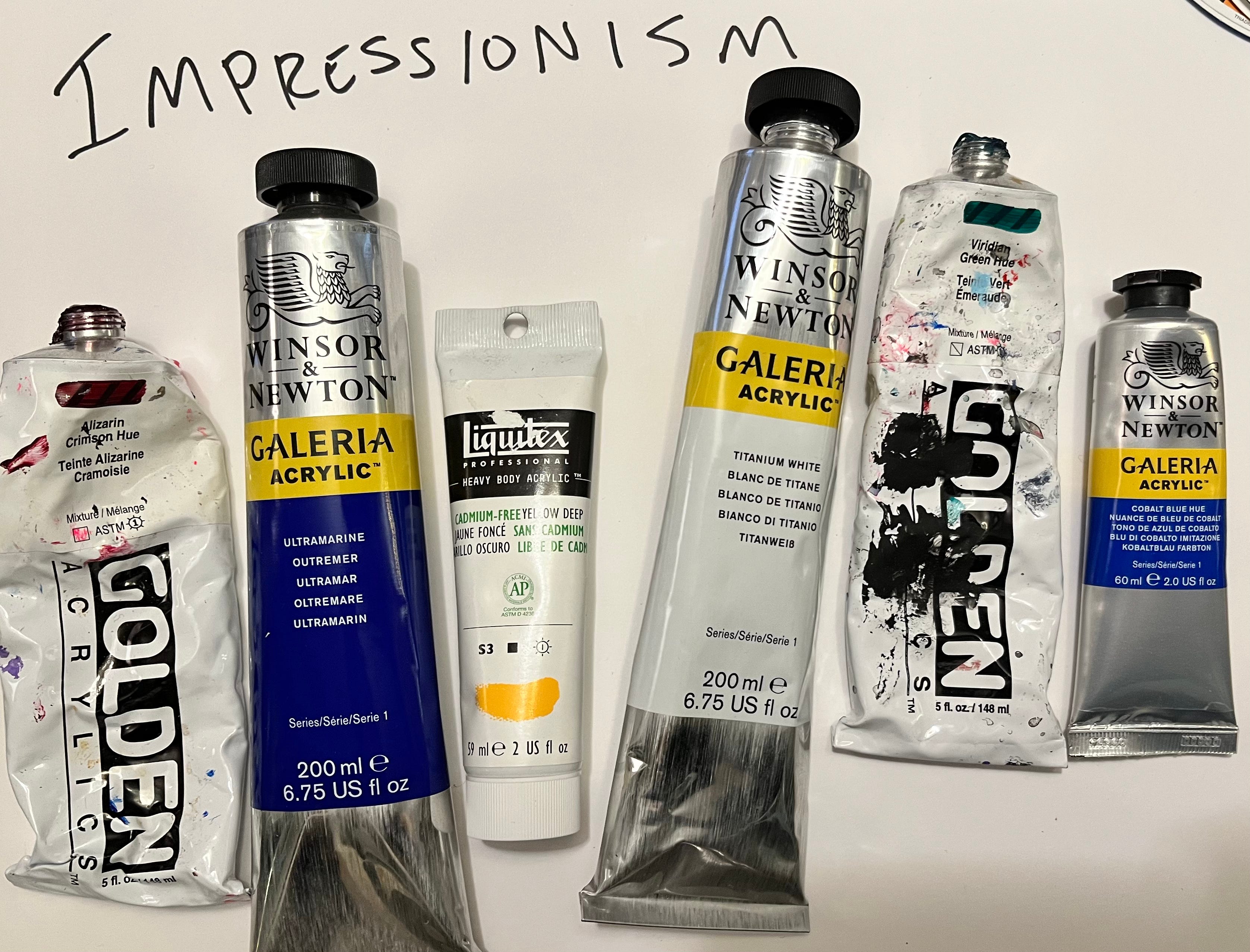
So this week I painted tiny little flags for the Netherlands, Italy and France, flipped them over, and when each artist got to class they picked a flag without knowing what art movement they would get. The flag would determine if they would use a Renaissance, Impressionism, and Dutch Golden Age palette. I filled the palette for each painter based on the movement they were given using the following colors. (Yes, I did misspell Renaissance and had to go back in and add the A…)
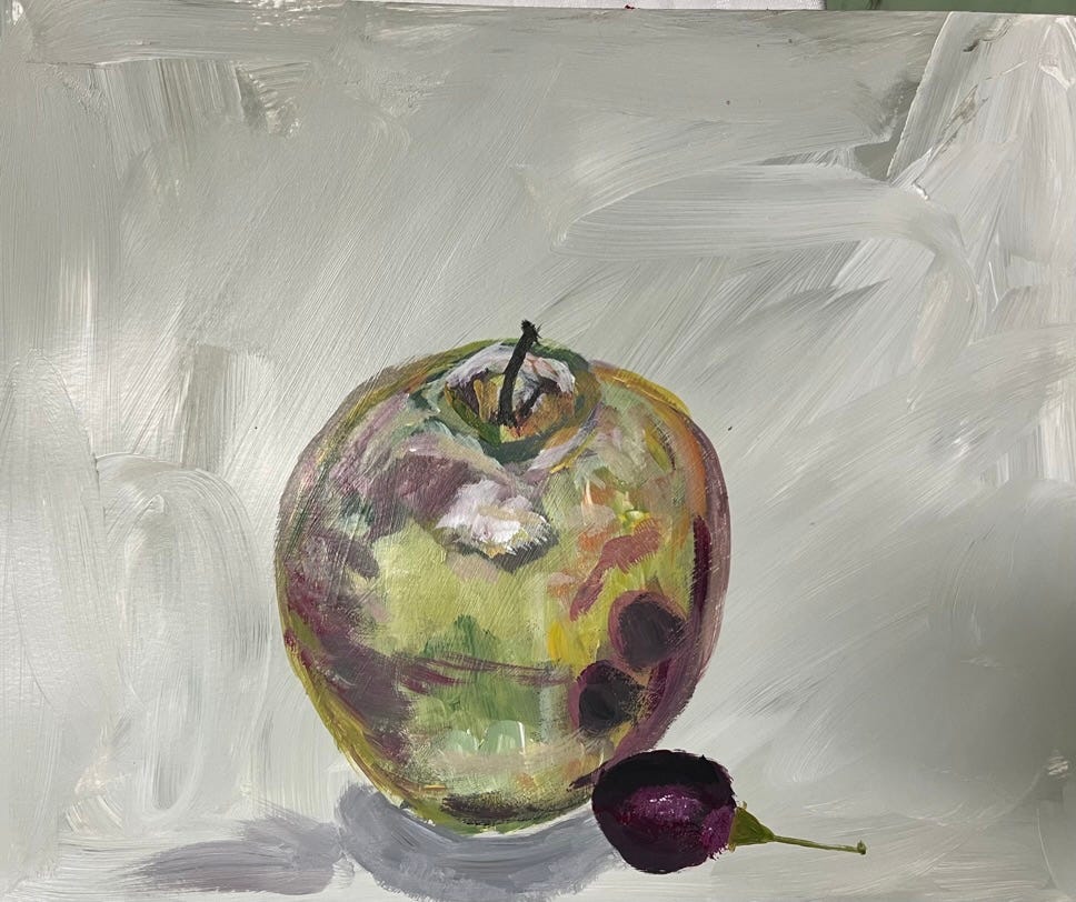
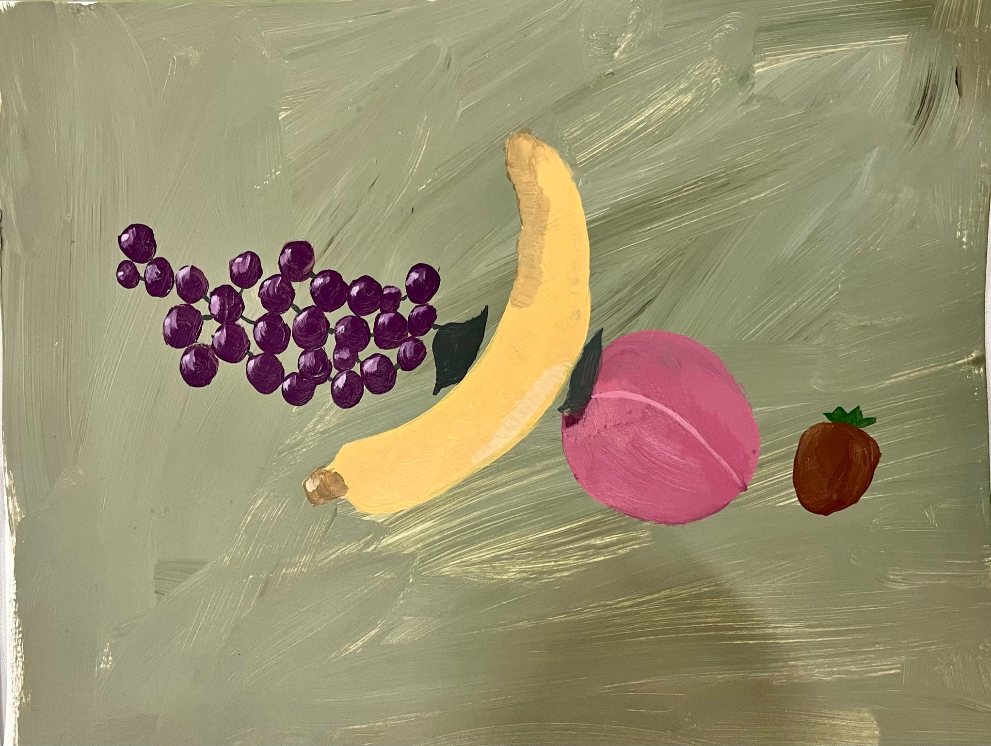
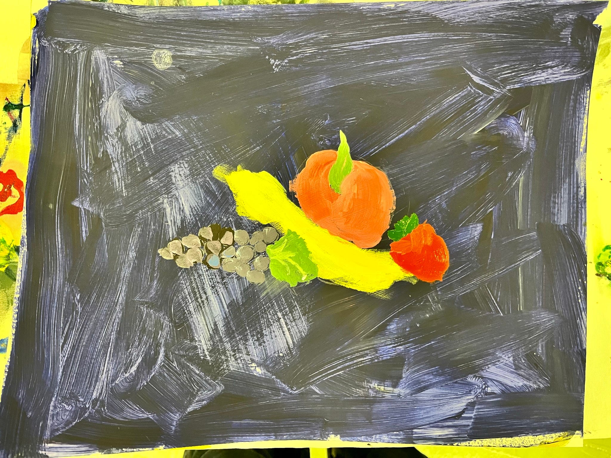
Then I brought out the fake fruit collection I recently bought and love (except for the cherries, which are shaped weird and the kiwi, which is totally weird and faux hairy) and had them paint the fruit using these restricted olden days palettes. The results were AMAZING.
Here are some of the dynamic olden days Dutch palette paintings (Think Rembrandt, Vermeer, etc)
.
Definitely try this at home if you are bored of your colors. Changing up the palette you usually turn to is a great exercise. This will push you out of your comfort zone, surprise you with what colors could go where, and force you to truly engage with the painting challenges at hand rather than sleepwalking through your usual color choices.
Hint: Mix a ton of colors on your palette before you start to paint. Give yourself a goal of creating 20 colors and then start painting and have your goal be to use ever hue you have mixed.
Happy Painting!
Sara