


Bored with your palette? Travel back in time
Get inspired by the Impressionism, Dutch Golden Age and Renaissance artists

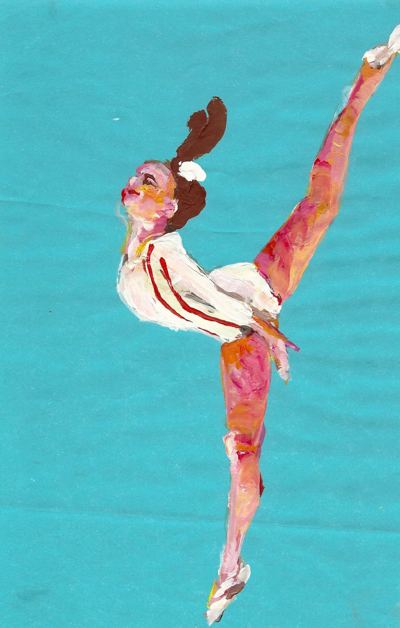
Years ago I had an exhibit in Amsterdam of a series of tiny paintings of gymnasts and a very strange animation about Nadia Comaneci and Bart Conner falling in love. (An animation so bad weird that I won’t share it.)
On that trip I had my first encounter with paintings from the Dutch Golden Age painted by Rembrandt, Clara Peeters, Vermeer and other moody painters from the 17th century. Artists of that era liked to paint things like unflattering self portraits and still lifes of butter and beer that signaled to the world the wealth of their nation - “We are rich enough to own cheese!” the Dutch Golden Age painters flexed in their art. “And don’t forget about the pretzels!”
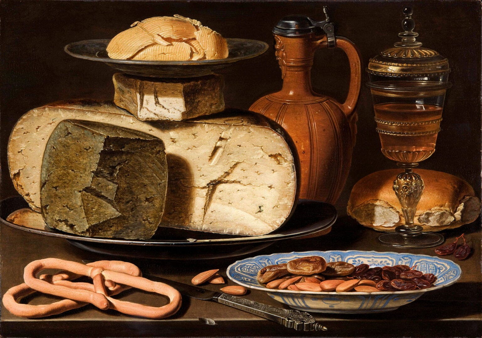
Clara Peeters, Still Life with Cheeses, Almonds and Pretzels
And way before tradwives and lifestyle influencers were doing it, the Dutch Golden Age painters were depicting highly-styled, possibly fake, merriment.
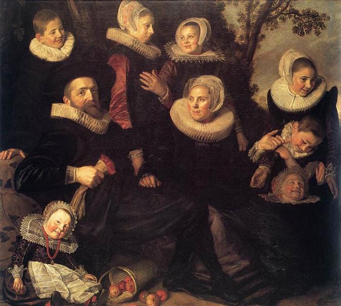
Family Group in a Landscape Frans Hals
But it wasn’t hard to notice as I walked around the Rijksmuseum that no matter the subject matter, there was something in the water in terms of the color choices.
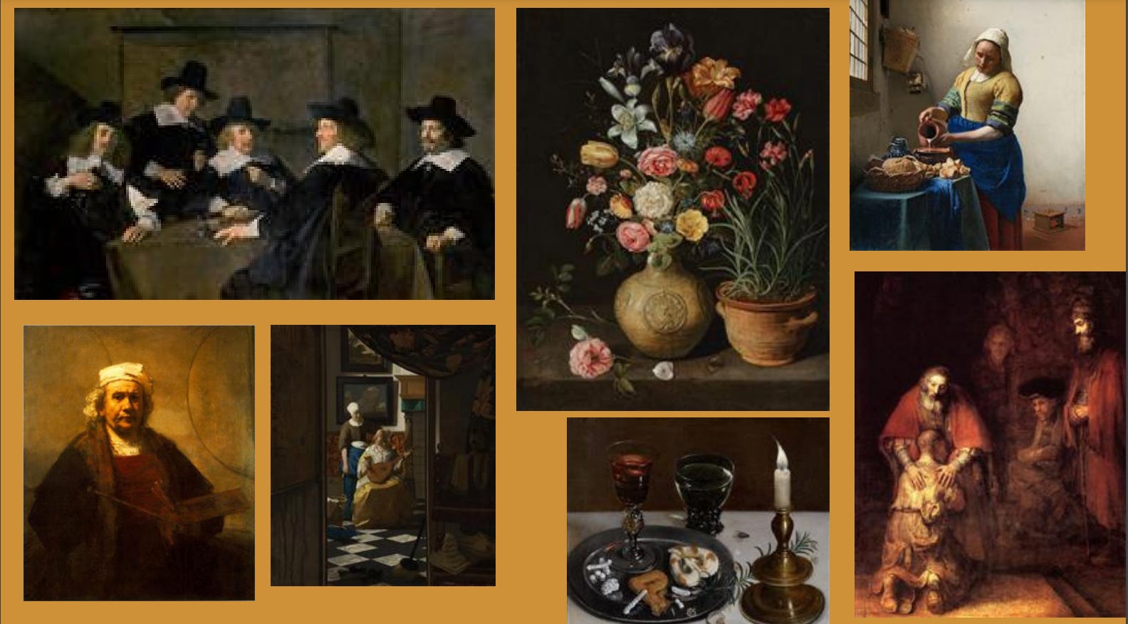
The Dutch artists veered into the deepest, most depressing browns and blacks. Their paintings were highly-contrasted in terms of value, with a tiny bit or two of brightness floating in a sea of despair-inducing darkness. Even that merry picnic scene above has the family members wearing what could be mourning clothes as they have their family picnic on what appears to be the set of The Walking Dead. These colors were undoubtedly the result of which colors were available at the time and the fact that they spent half their days in dark, candlelit rooms.
And I started imagining how that limited palette of the Dutch (and the Impressionists and painters of the Renaissance) could be used to our advantage as modern painters who often lean towards overly-saturated colors, no doubt affected by our highly-saturated social media feeds and LED lighting.
Laura Owens, Untitled, 2012
Olden Days Palette Exercise
If you are looking to shake up your own paintings you could try the same exercise that we did a few weeks ago in class and shake up your modern paintings by using palettes from days gone by.
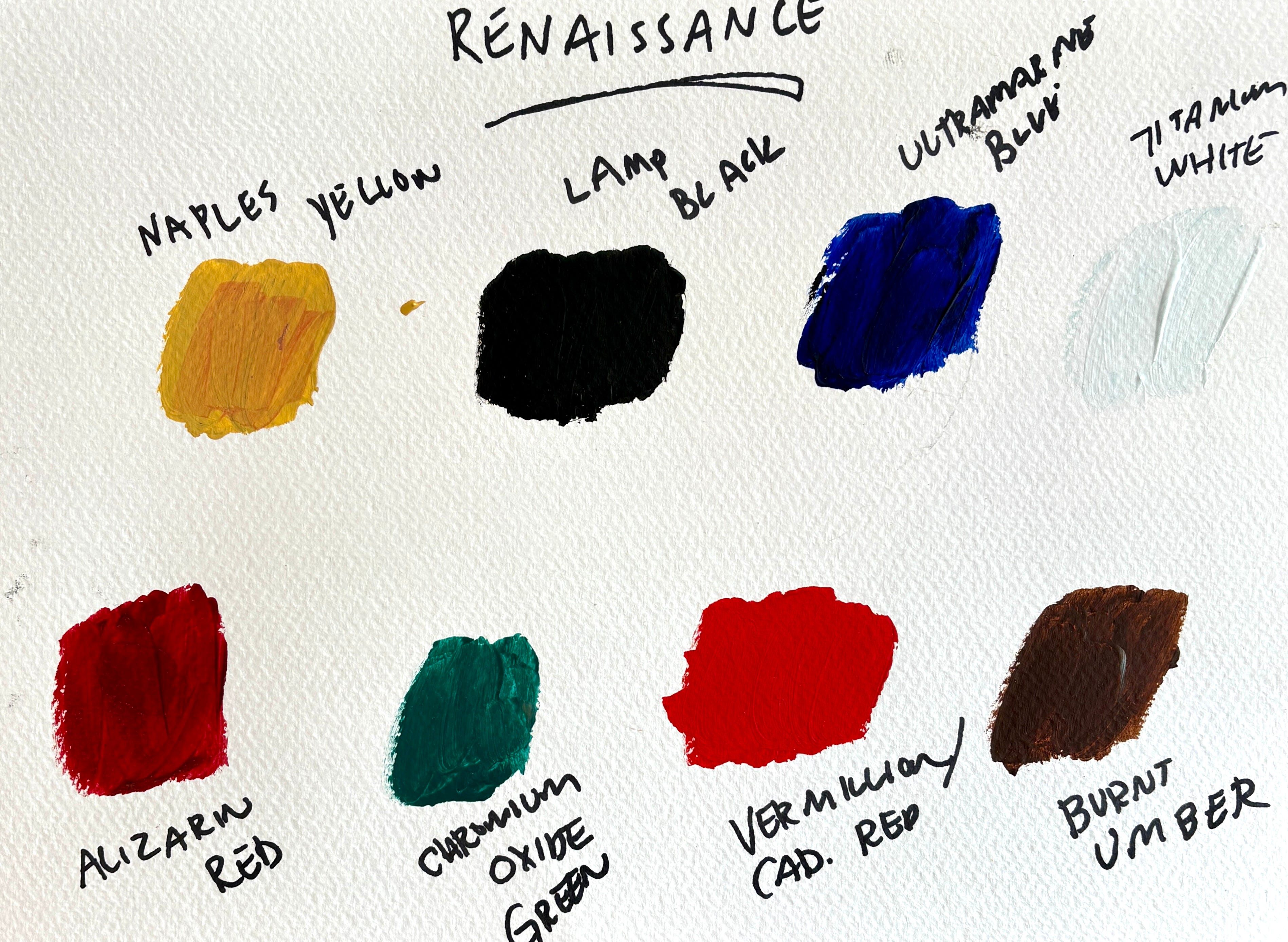
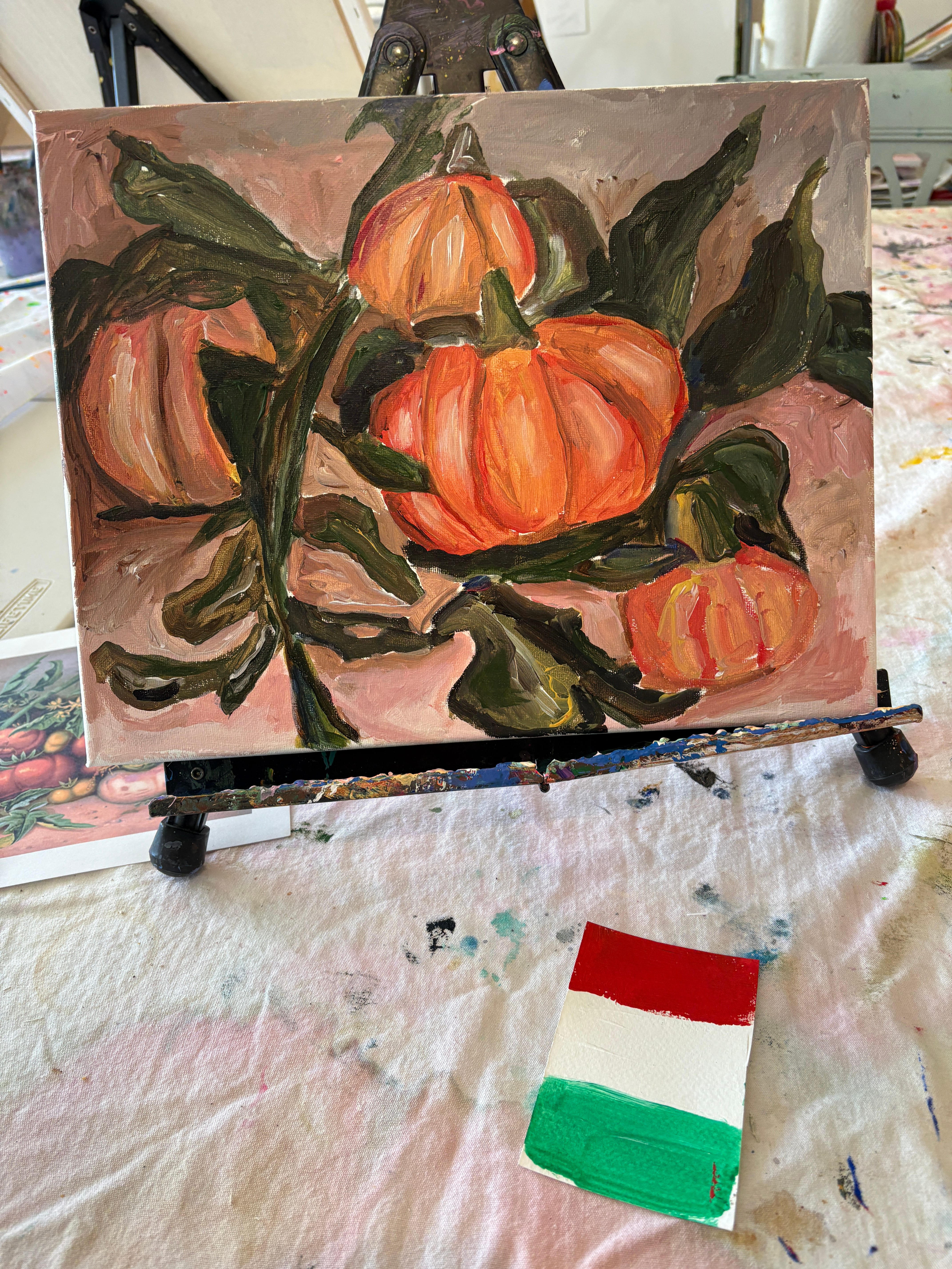
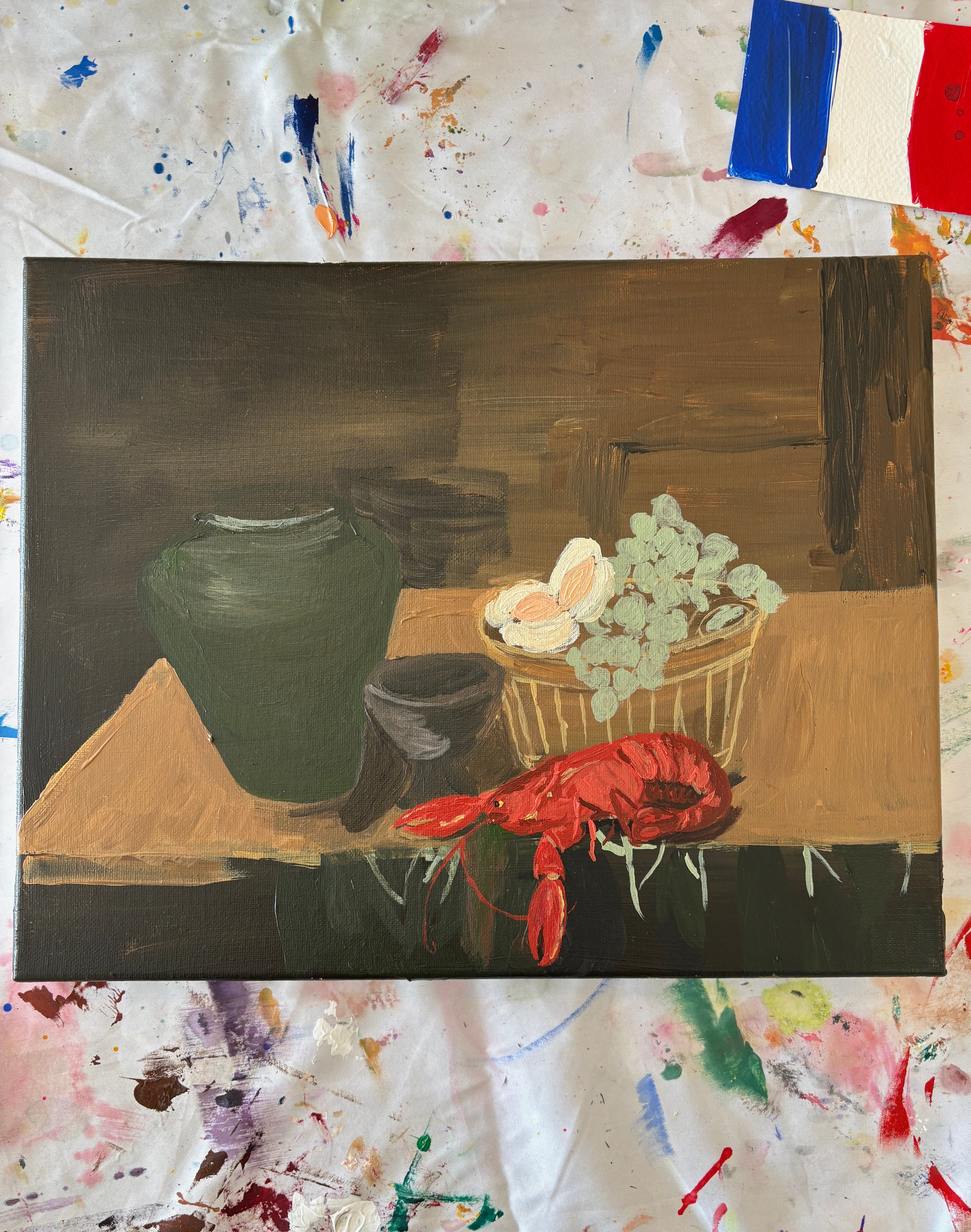
In class we gamified this exercise by hiding a flag from one of the countries (France = Impressionism, Netherlands = Dutch Golden Age, Italian = Renaissance) under each painter’s palette and they had to use the palette of the country represented by the flag.
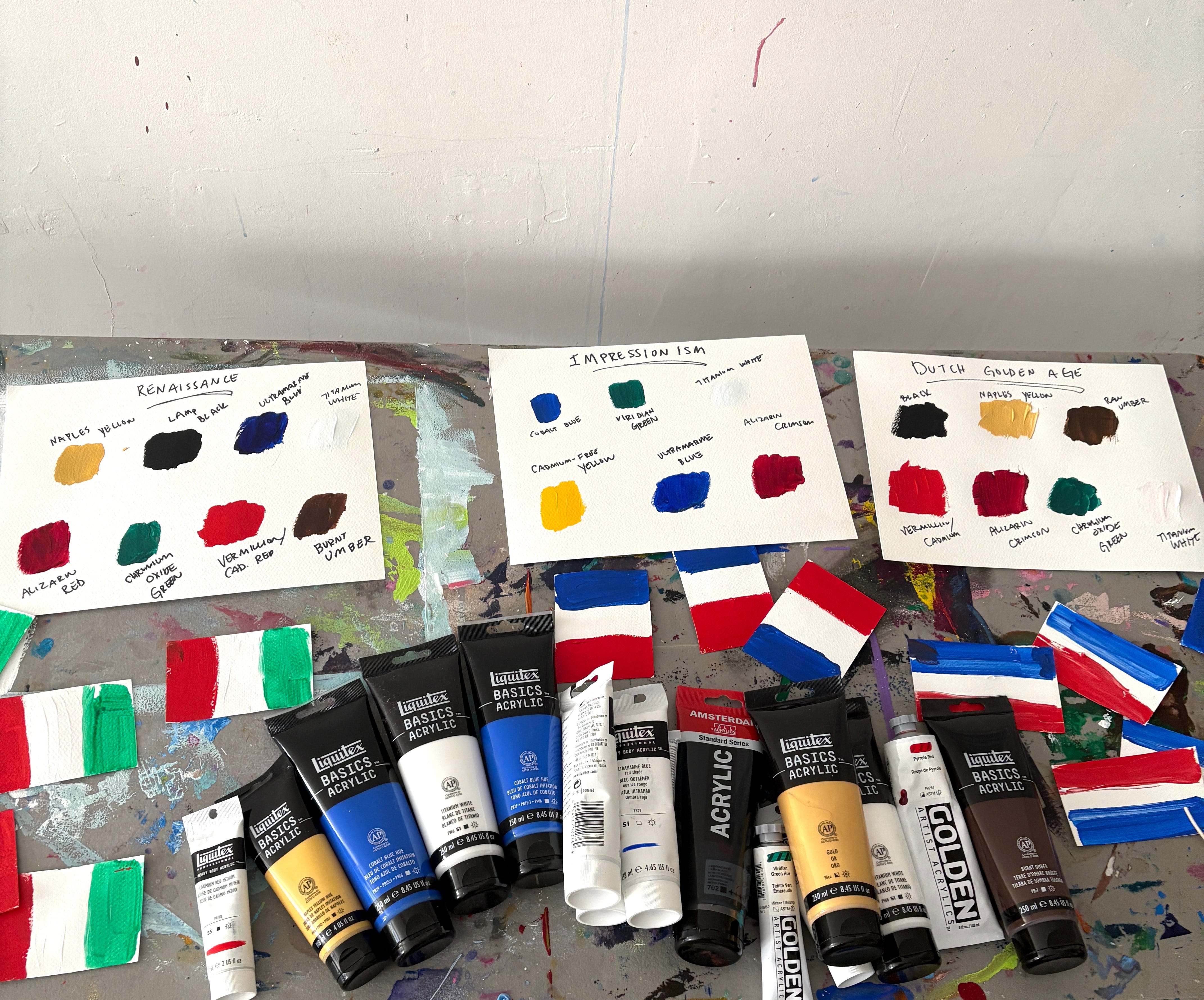
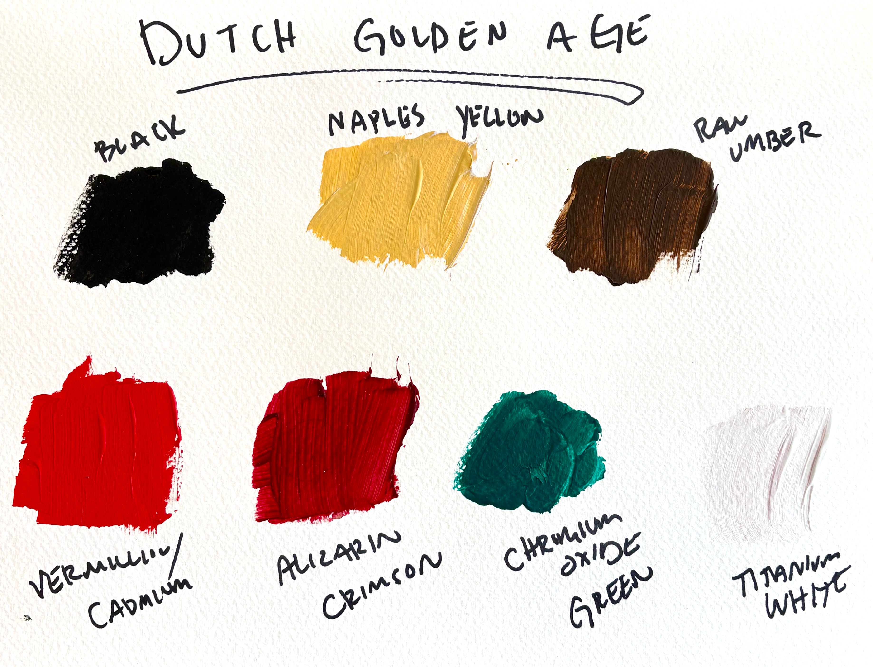
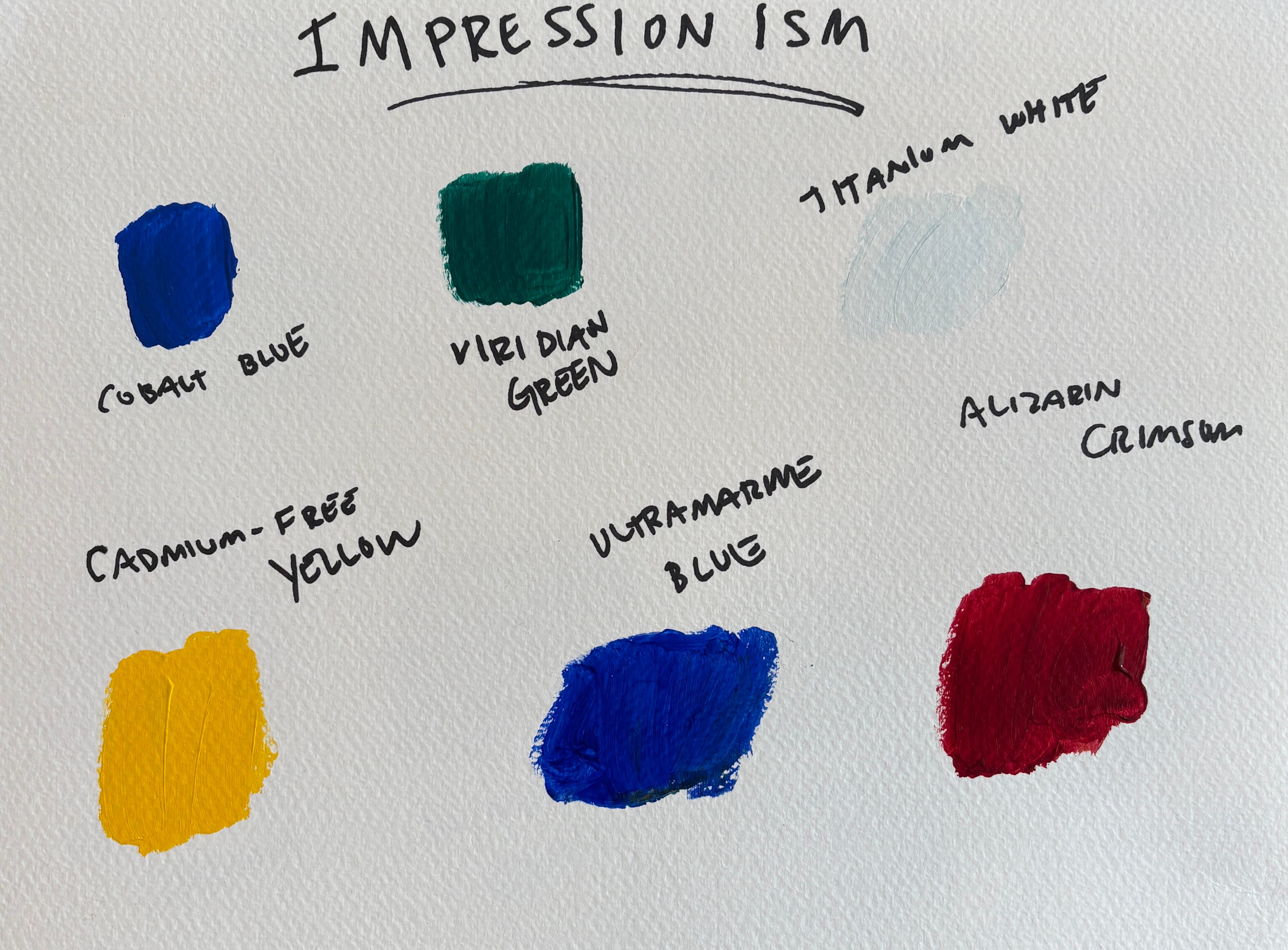
Below are some colors that were frequently used by artists from these eras, all of them are worthwhile colors to invest in if you can afford to purchase them. Colors like Naples Yellow and Raw Umber and Cobalt provide endless mixing potential.
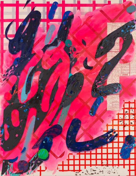
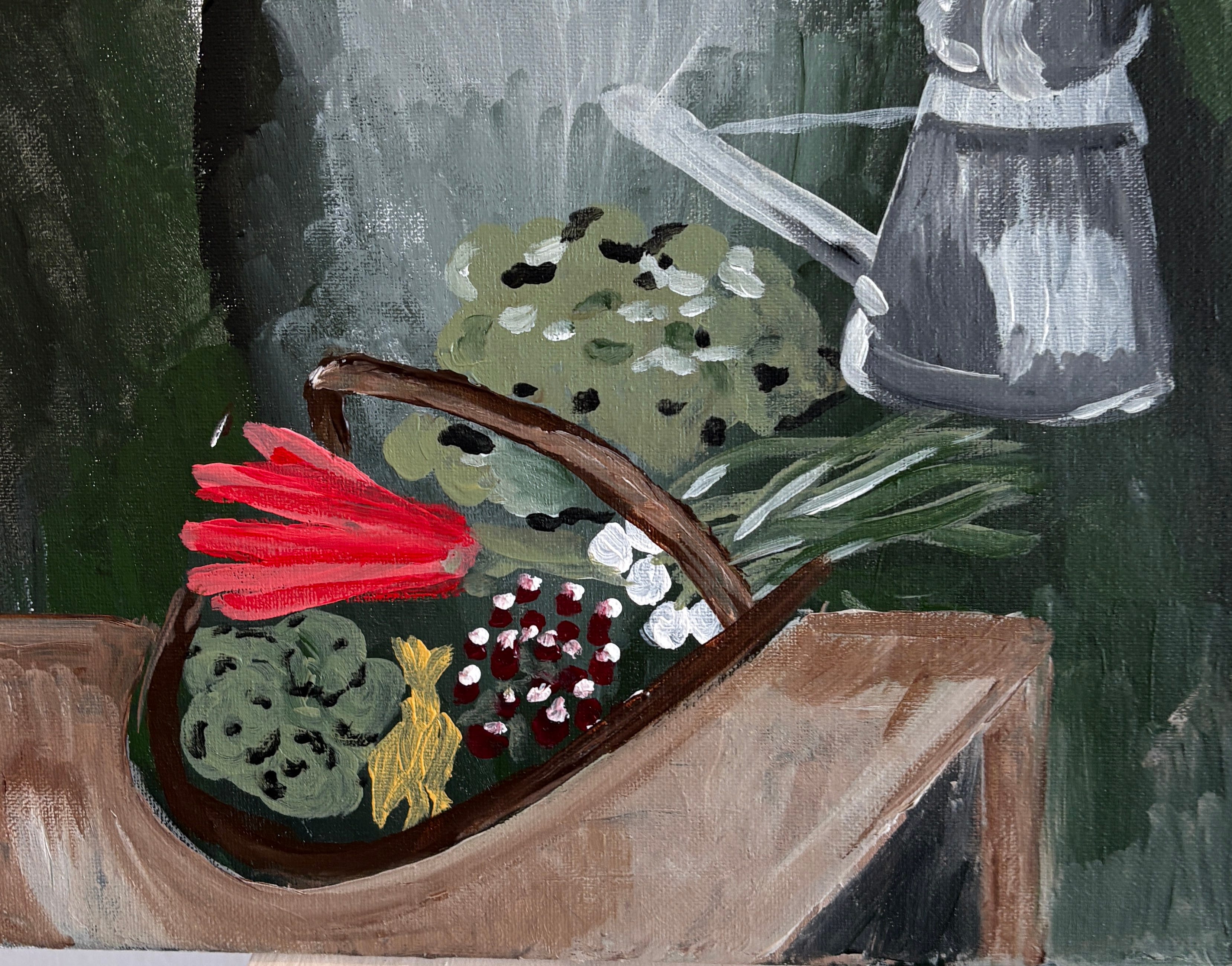
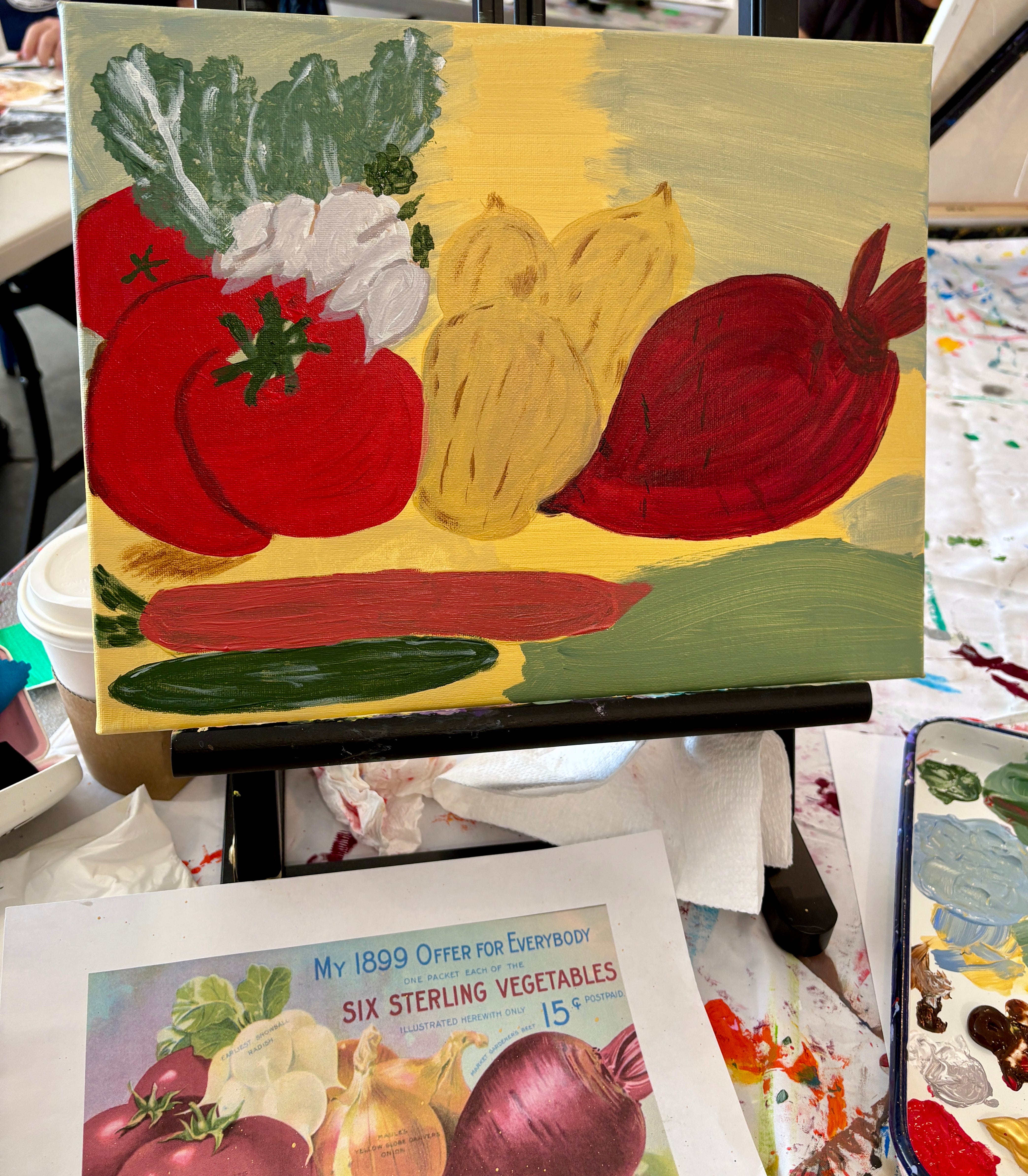
In class artists either used an image on their phone or one of the old photos of fruit and vegetables I had taken from old gardening magazines and seed catalogs. Here are some of the amazing paintings that were produced using Dutch Golden Age, Renaissance and Impressionist palettes. The Dutch palette was definitely the most challenging, but it also produced the most interesting paintings, as a blue option was not offered and people were forced to improvise in amazing way.
So take your modern subject matter, combine it with a palette from the olden days of Europe, and see what happens.
Happy Painting!
Sara
The Dutch were mistaken to school! So funny, so good.