
Color & Value
The secret weapon that will improve your paintings

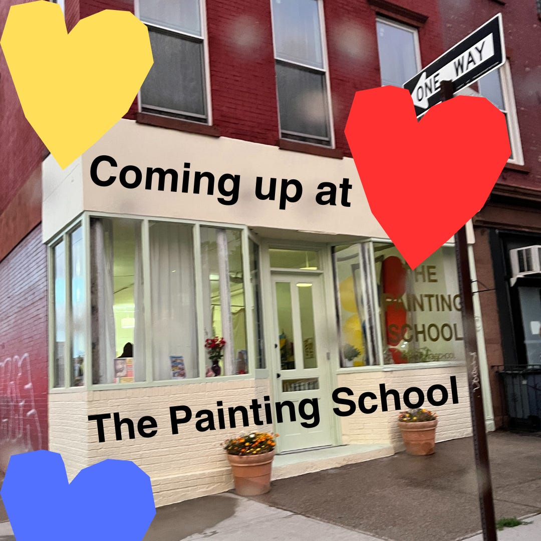
I would like to lead with some exciting news because I am too excited not to share it before heading into the color & value exercise. My fall classes are up at The Painting School. And I’m extra excited to share that I am doing my first-ever live online course in addition to the in-person classes at The Painting School! Please check out what we have planned, I would love to paint with you.
Okay, onto the main attraction: color & value.
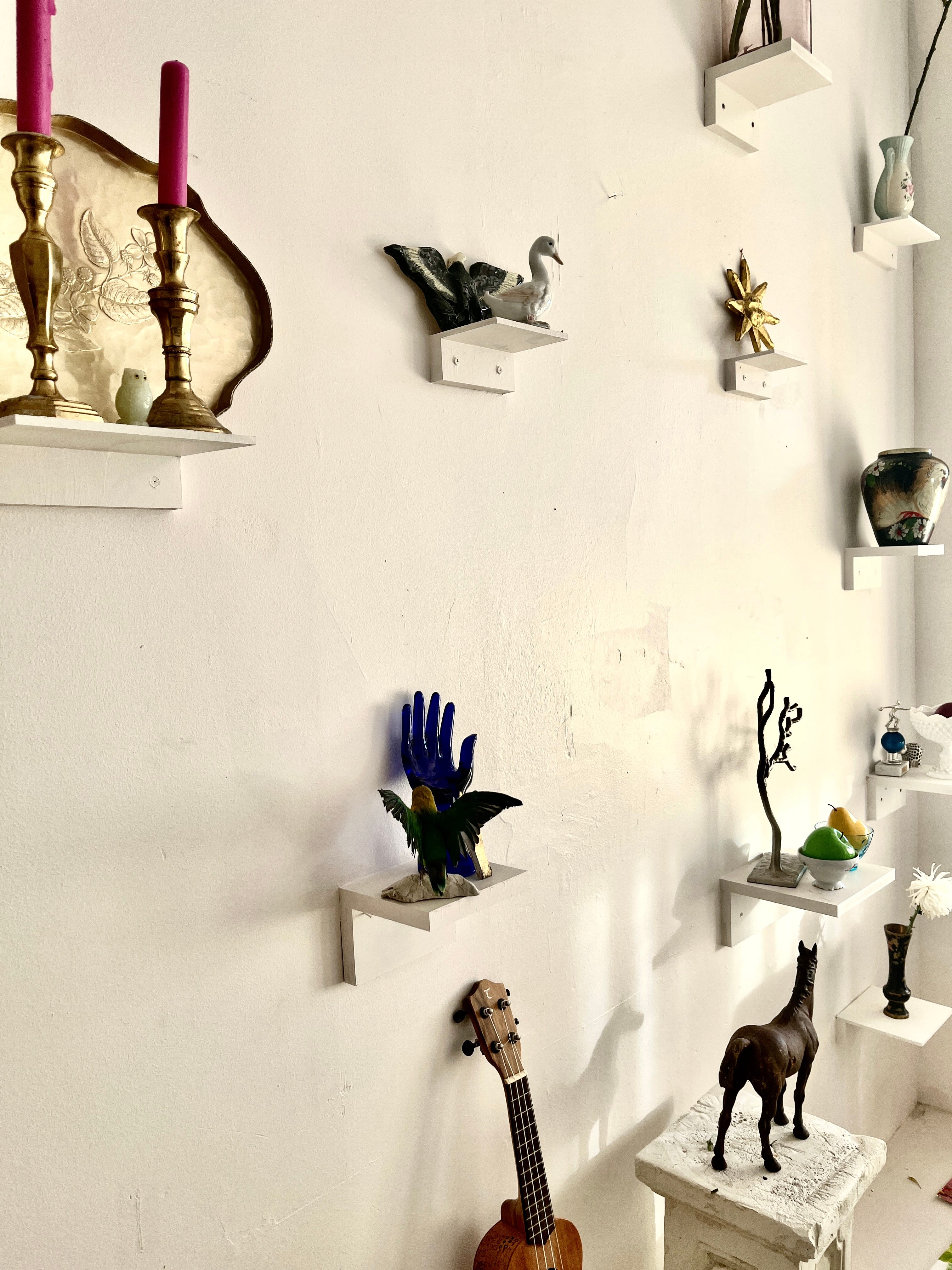
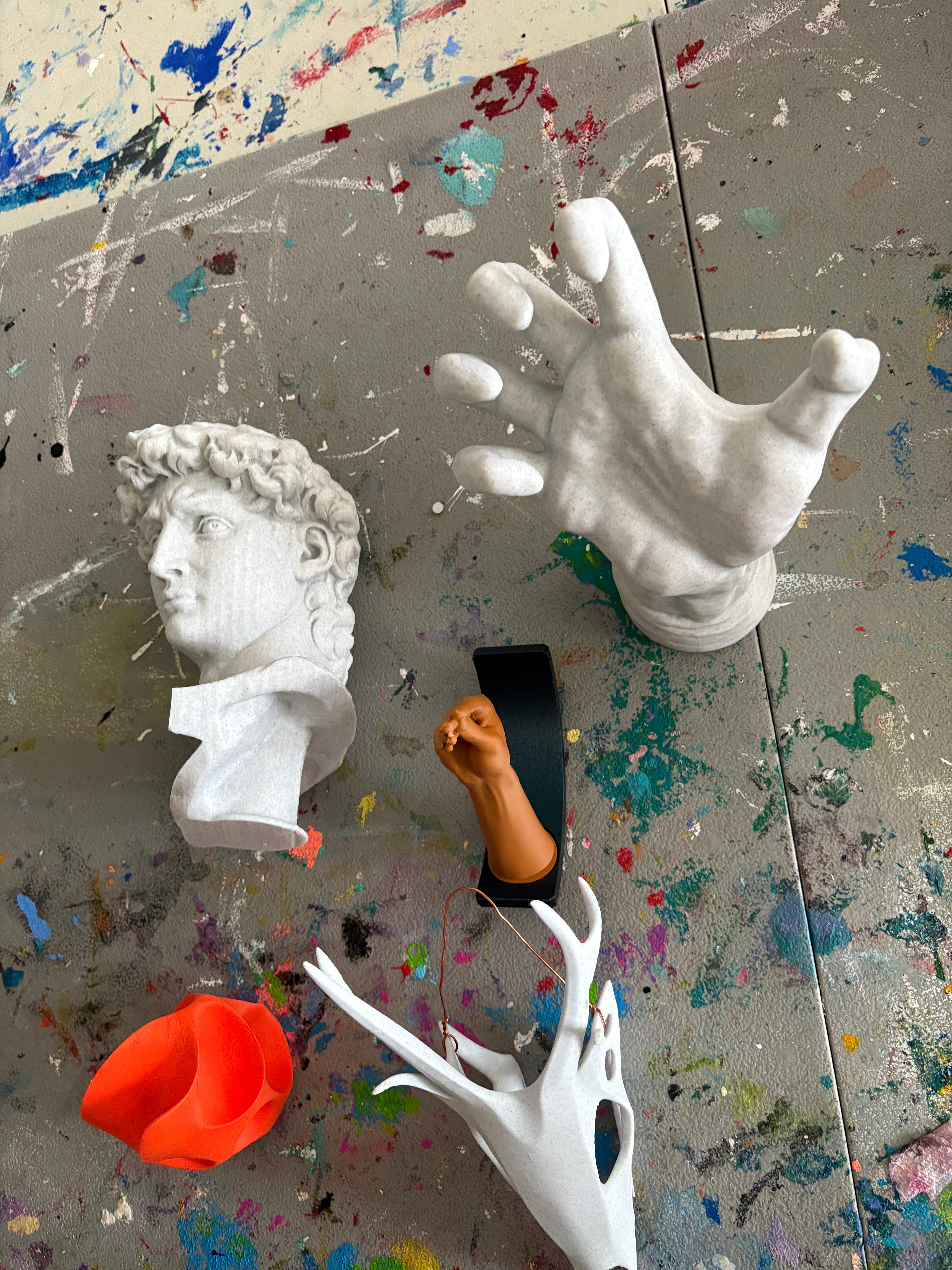
My brother-in-law, Pete, has been using his 3D printer to create some very cool objects for the still life wall at The Painting School, a wall that is full of globes and candlesticks and taxidermy parakeets, all on hand for the benefit of painters in need of inspiration.
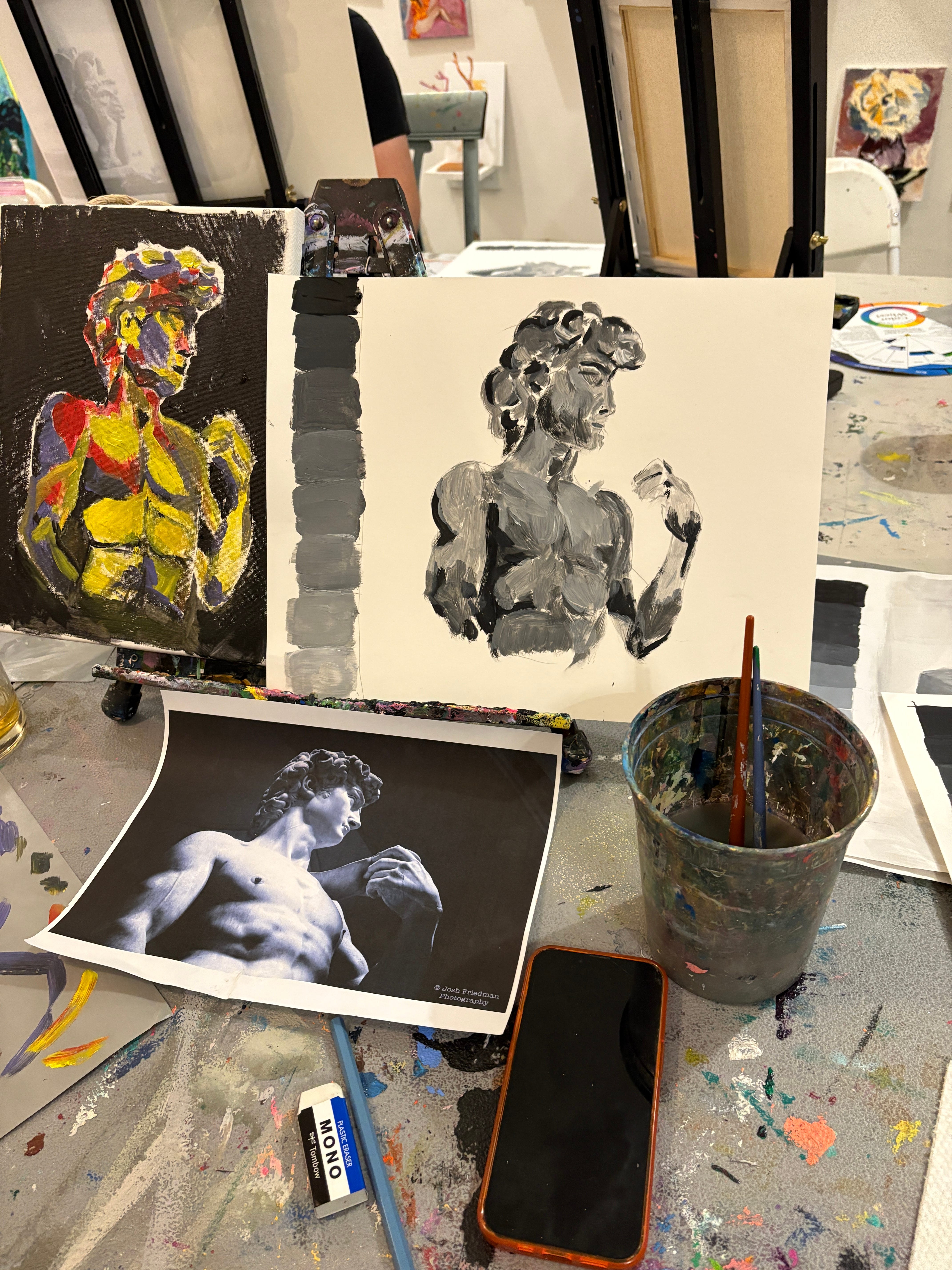
Some of the things that Pete has been creating for me are traditional art school objects that are usually made out of plaster, things like Rodin’s hands and Greek and Italian busts. (These are in addition to the tiny hand making a rude gesture that he also made me…)
These new classical elements inspired me to create a class about how painters can lean into the values of colors in order to create objects with lots of volume and depth.
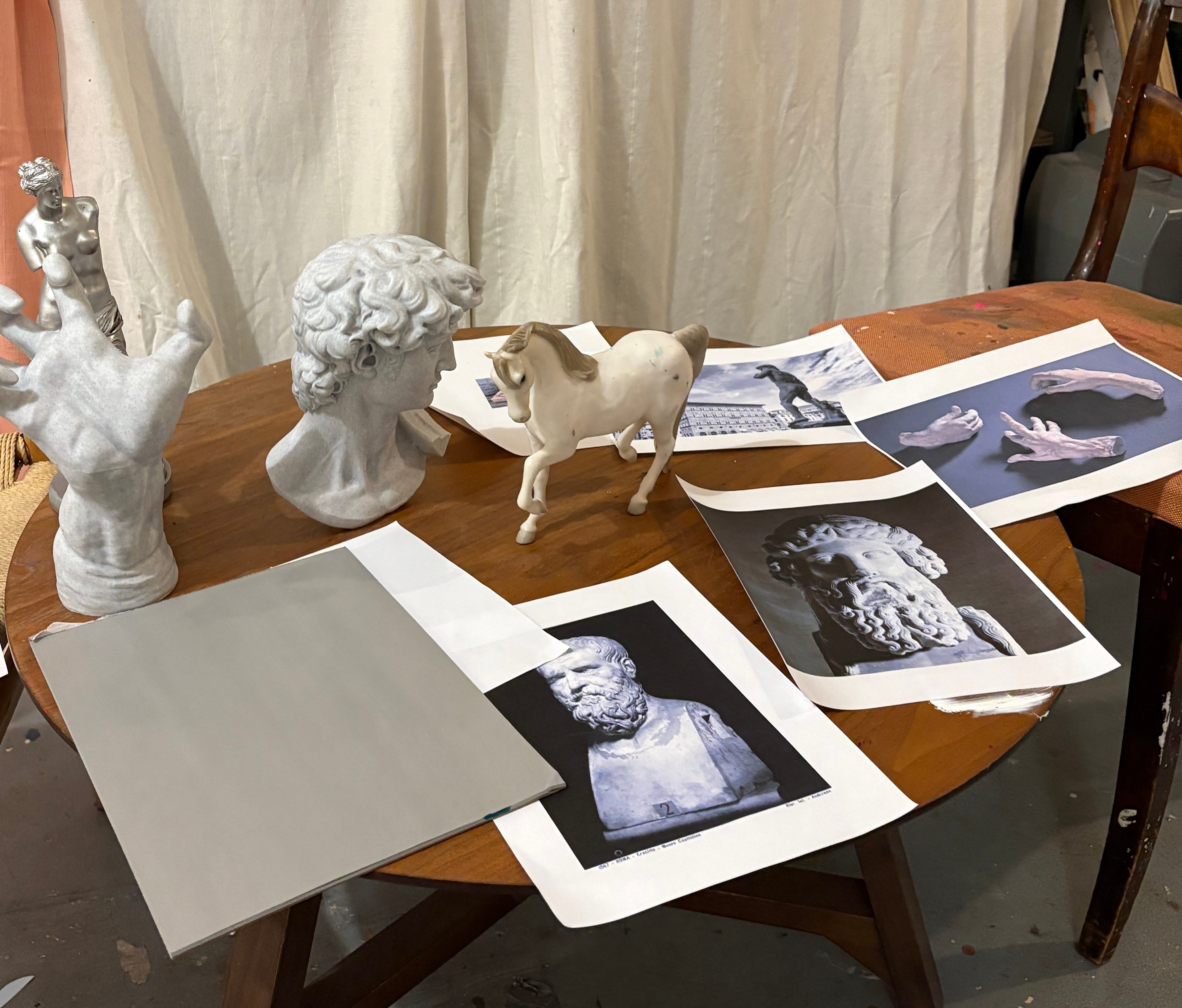
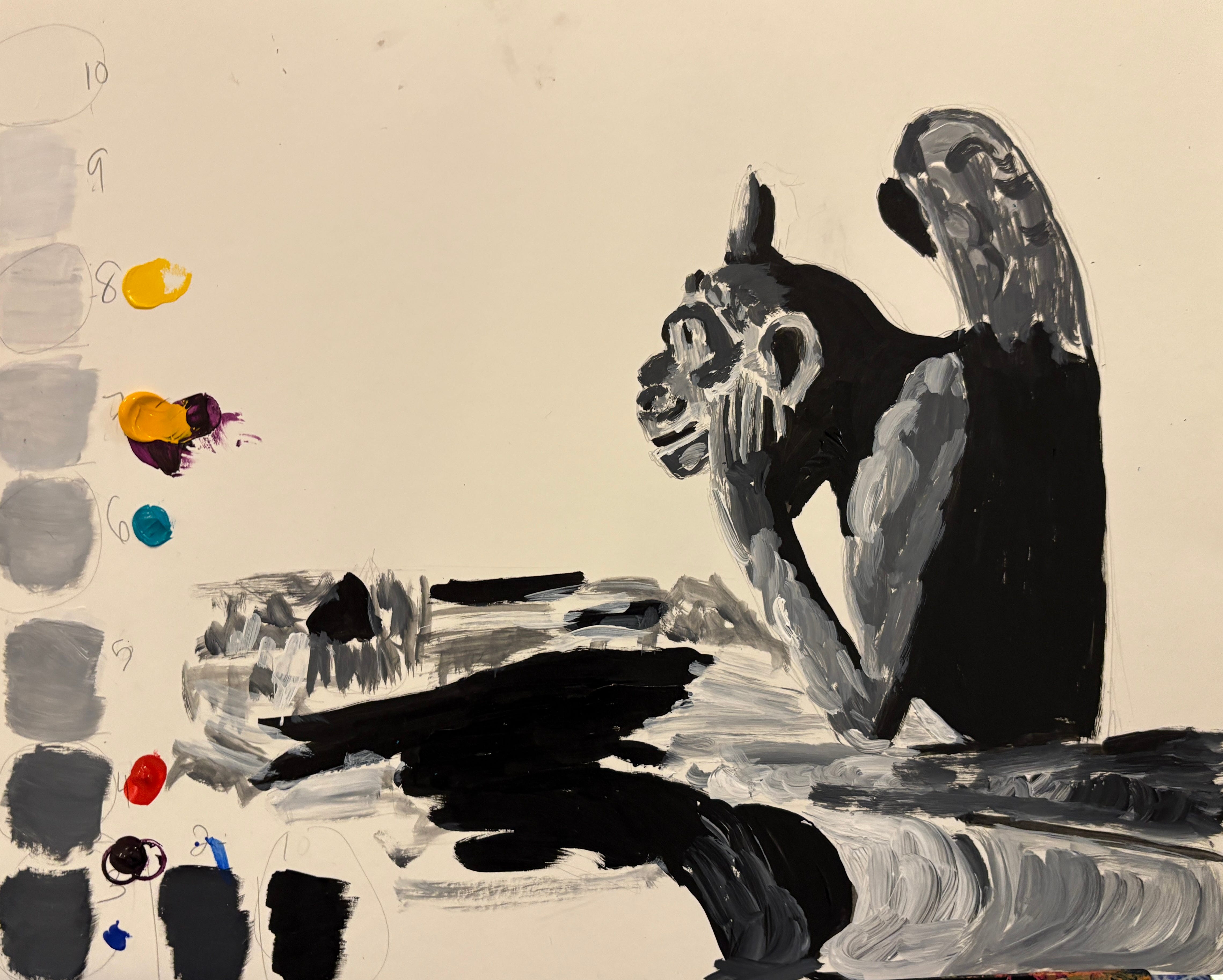
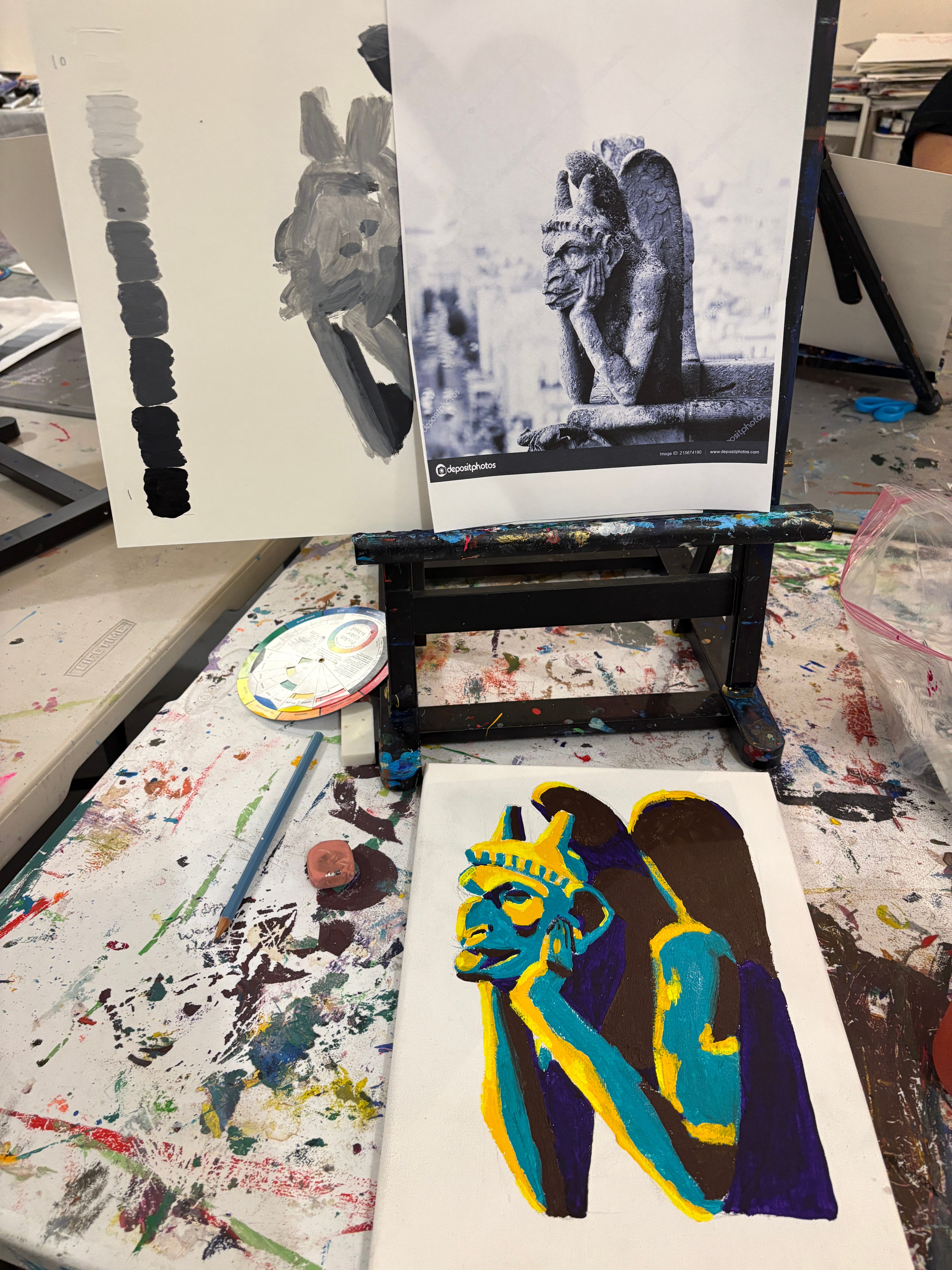
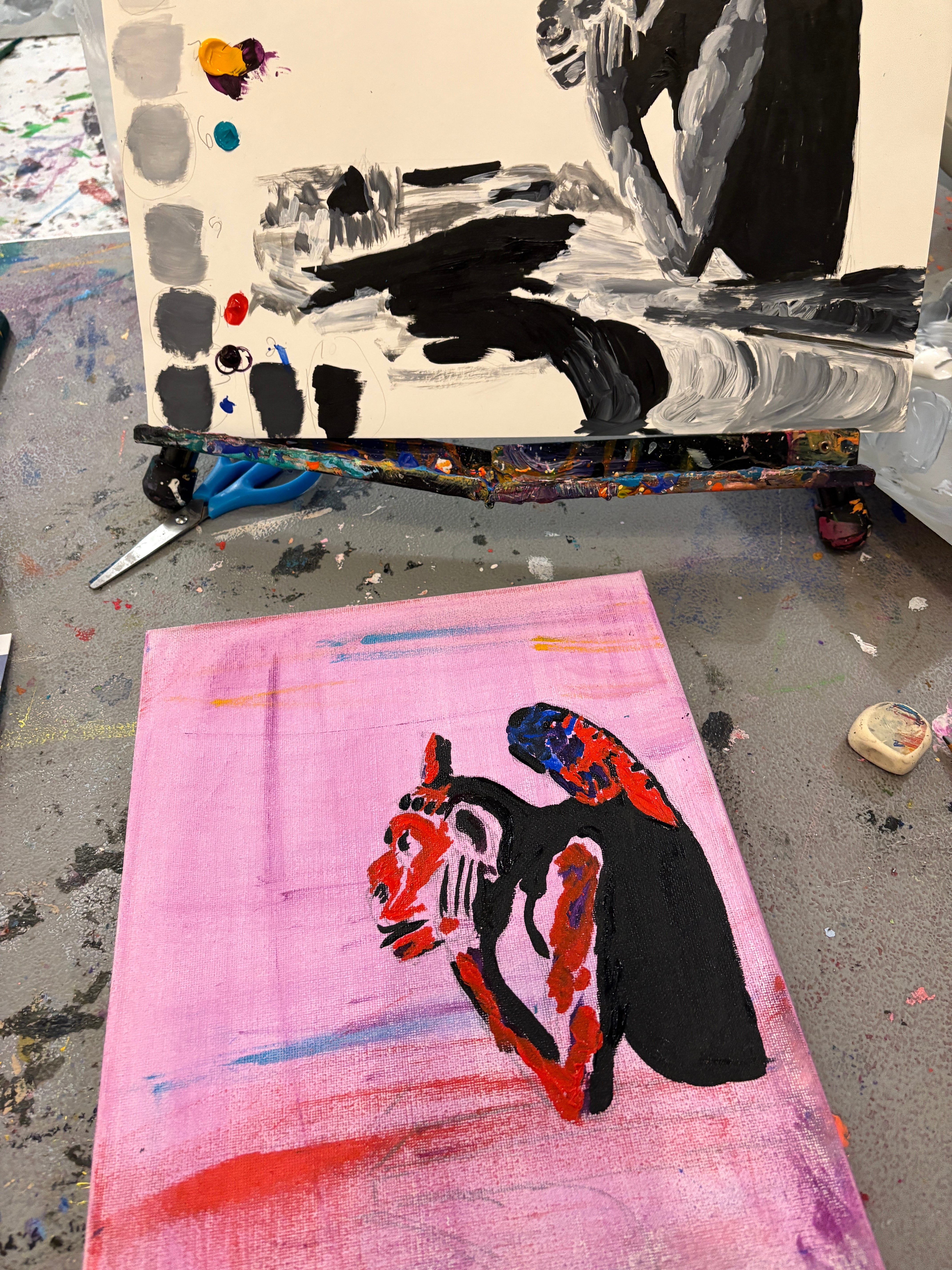
In the class each painter selected an object or an image of a statue or a gargoyle to paint, I selected these objects and images as our focus because they offer so much value contrast in the many little pockets of shadow in all those feathered wings and curly Greek and Italian haircuts and beards.
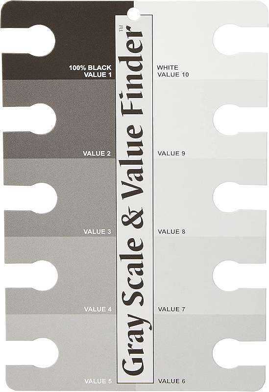
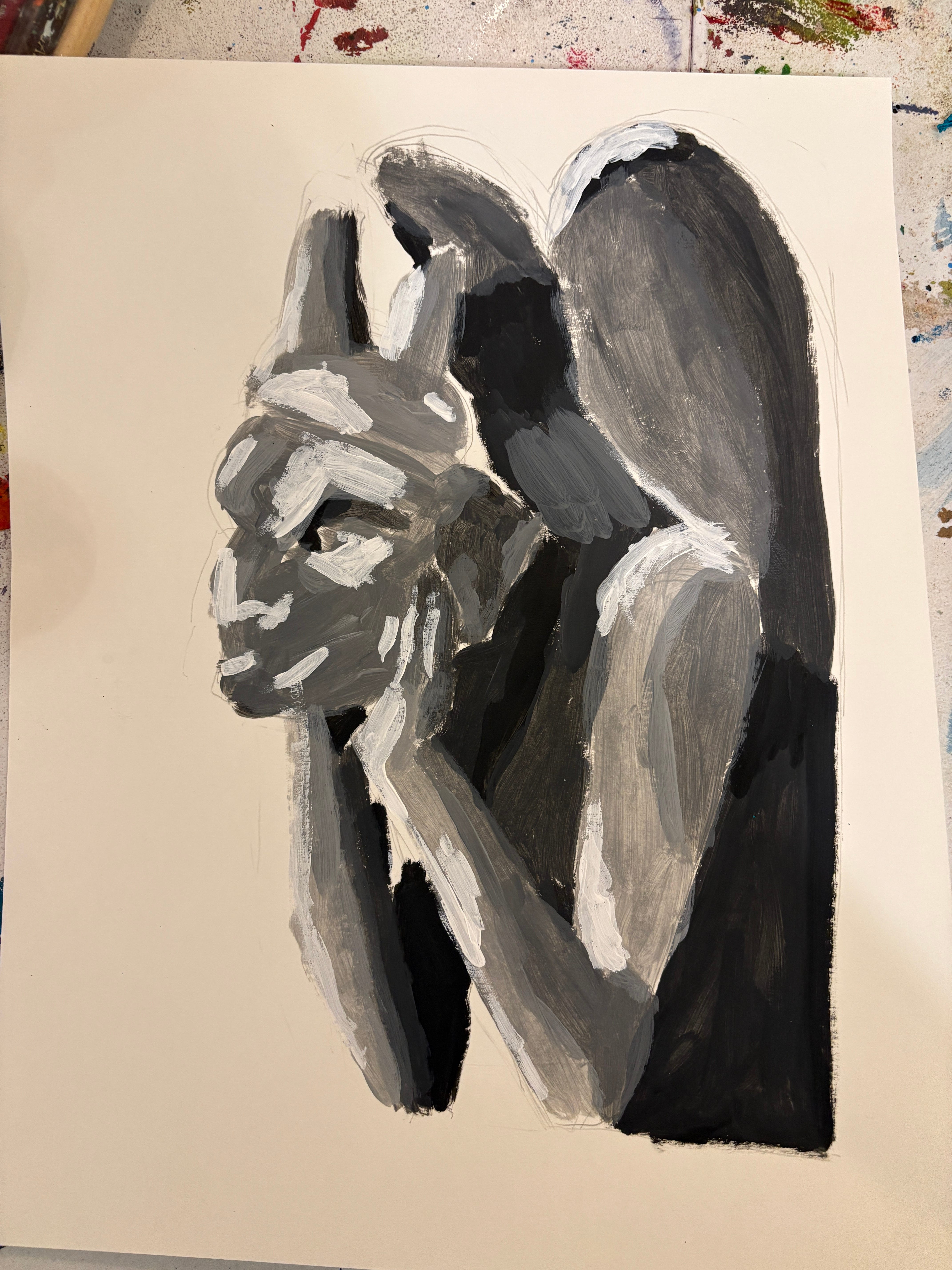
The painters first did a black and white value study of their object, with the goal of using the full spectrum of light and dark, from 1-10, to create an object with lots of volume. (Pro tip: It is worth investing in a value finder or a color wheel with a value scale on it because they will allow you to more easily figure out what the value of a color of an object or a paint color is.)
Once the painters completed their black and white study, they had a value map at their disposal. They could then turn from painting their object in black and white to painting that object in color. They would do this by remembering that each color (hue) has a different value. Lemon yellow and cadmium orange are on the lighter, higher, end of the value scale, while Alizarin Crimson and Burnt Umber are on the lower, darker, end of the spectrum.
For example, in the image of the Notre Dame gargoyle below, the artist has established that our level 10 value, the absolute lightest, would be found on the bits of the gargoyle most directly hit by light like the top of the wings, the top of the shoulders and the end of the nose. The darker values in this study are in the parts hidden from the sun, like the neck, back and shadows of the wings. Once the painters had created this map of their object, they had to figure out which colors had the same values as the values in their study of the object.
We next had to assign colors to each value level. I laid out pieces of paper for each value level (1 - 10) across a table and we tried to determine out which colors had which values and placed them accordingly.
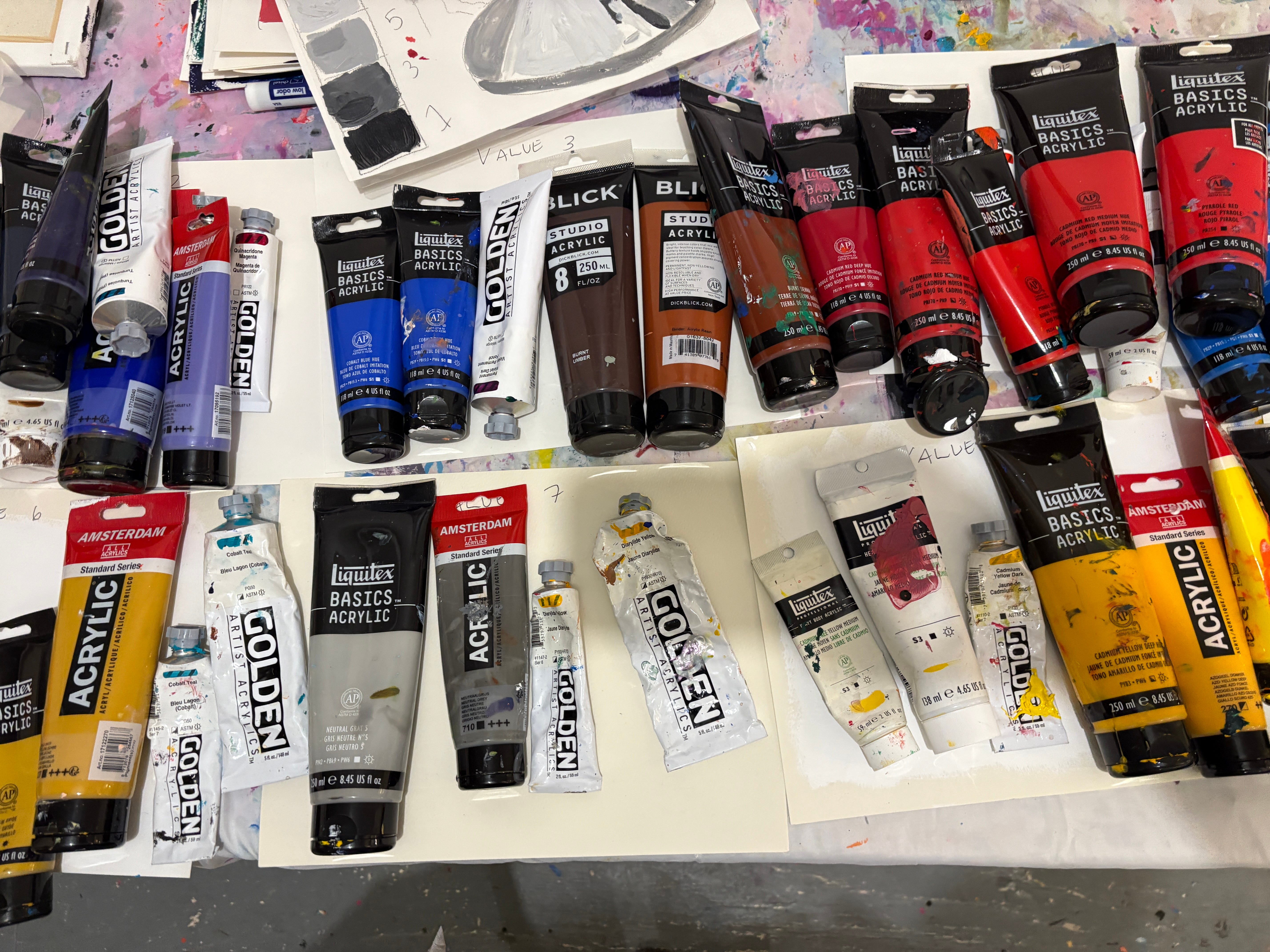
We discovered that cobalt blue and burnt sienna are about a value 3 and that neutral gray and diarylide yellow are a value 7.
Now comes the fun part. Because we did all the work at the front end with our black and white value study and our colors organized by values, we had basically created a paint-by-numbers experience where the artist could match the color with the values in their black and white painting. Whatever was value 3 in the black and white study we would paint cobalt blue or burnt sienna in the color painting. Anything that was value 7 we painted neutral gray of diarylide yellow.
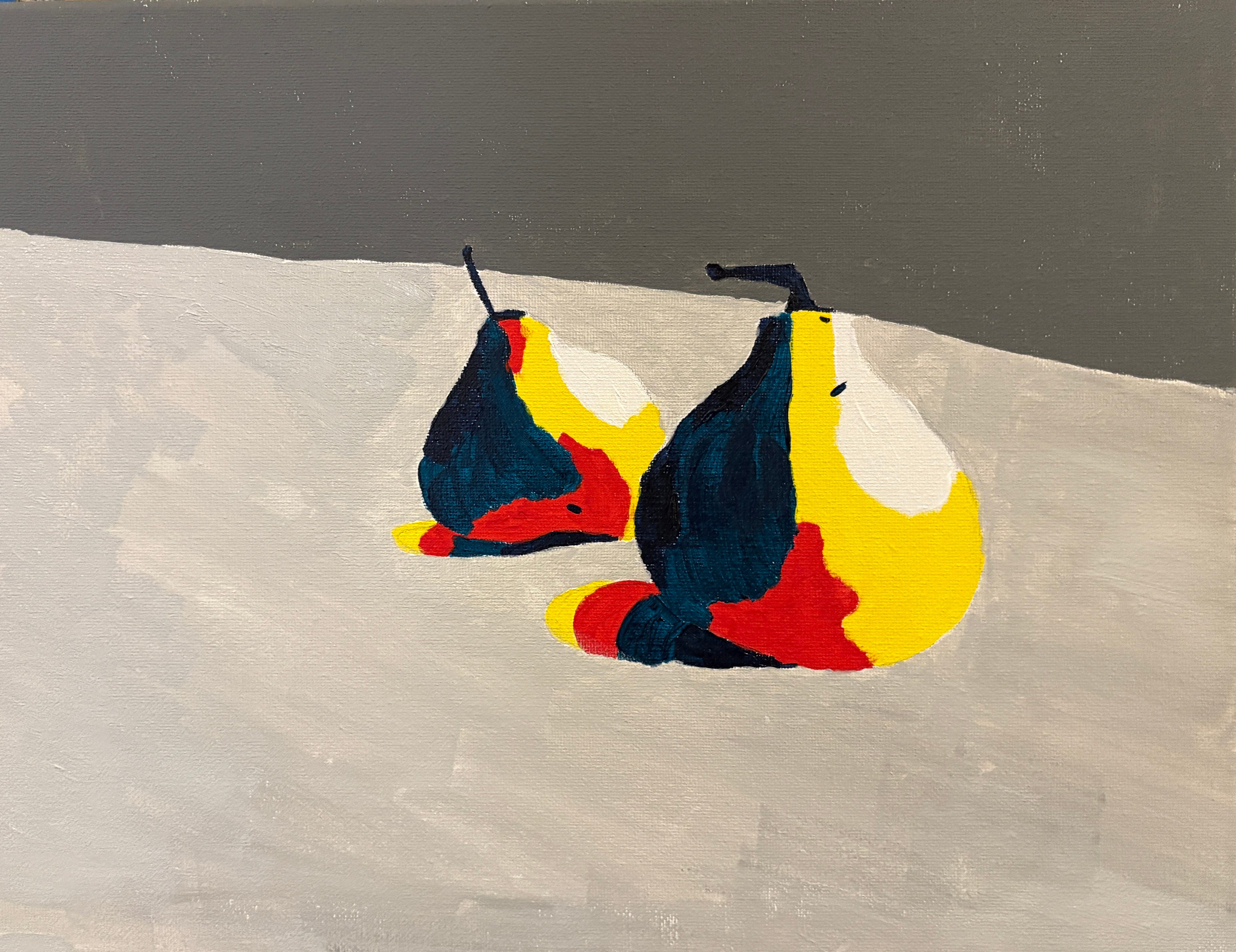
The final results were exciting in their surprising color choices and the artists were totally successful in how 3D and full of volume their painted Greek gods and garyoles (and some pears..) were.
Now the painters had the power to add volume and depth to any object or scene they might ever want to paint just by paying attention to the value of the paint color. A secret weapon indeed.
Exercise recap:
Find an image or an object with a wide range of lightness and darkness
Paint a black and white value study of that object, paying attention to where things are light, dark or mid range.
Create a palette that has colors with a wide range of values, the same range of values that you discovered in your black and white painting of your object.
Assign each of the colors you select to a certain value in your black and white painting. So if you are doing the gargoyle above, figure out what your lightest color is and apply that paint color to the area of the gargoyle that is the brightest. And whatever you darkest color is, if it is black, ultramarine blue or a dark purple, and apply that color to the darkest bits of shadow.
Watch a robust, full-of-volume, and colorful image emerge!
Happy Painting and let me know if you find this value exercise helpful!
Thank you! Sara
I just learned so much! Thank you. I wish you were with me at the Sargent show to explain and enlarge my understanding of his artwork. Ooh! Museum road trip?
Wow absolutely love the scope and beautiful results! I am glad your students were happy with their work, beautiful volume 😍