


Color Relationship Wisdom
And how it relates to Jaws

I spent a good portion of my teen years hiding out in our cold basement. There was a TV downstairs and my sister and I had our own “children’s line” (non Gen Xers might not know that if you had a parent who worked in sales back then, before call waiting or cell phones, you had to get a second landline so your parent’s customers didn’t encounter the constant busy signal resulting from having 2 teenagers in the house). There was a brown couch, an under-utilized stationary bike, and a refrigerator-size deep freeze where we kept stacks of frozen cuts of meat. One third of the basement was reserved for my mom’s quilting.
For hours a night I haphazardly did my homework while watching movies on AMC featuring Hepburn and Tracy, Ginger Rogers, Rosalind Russell and Cary Grant, like Stage Door and Auntie Mame, The Enchanted Cottage and Grapes of Wrath.
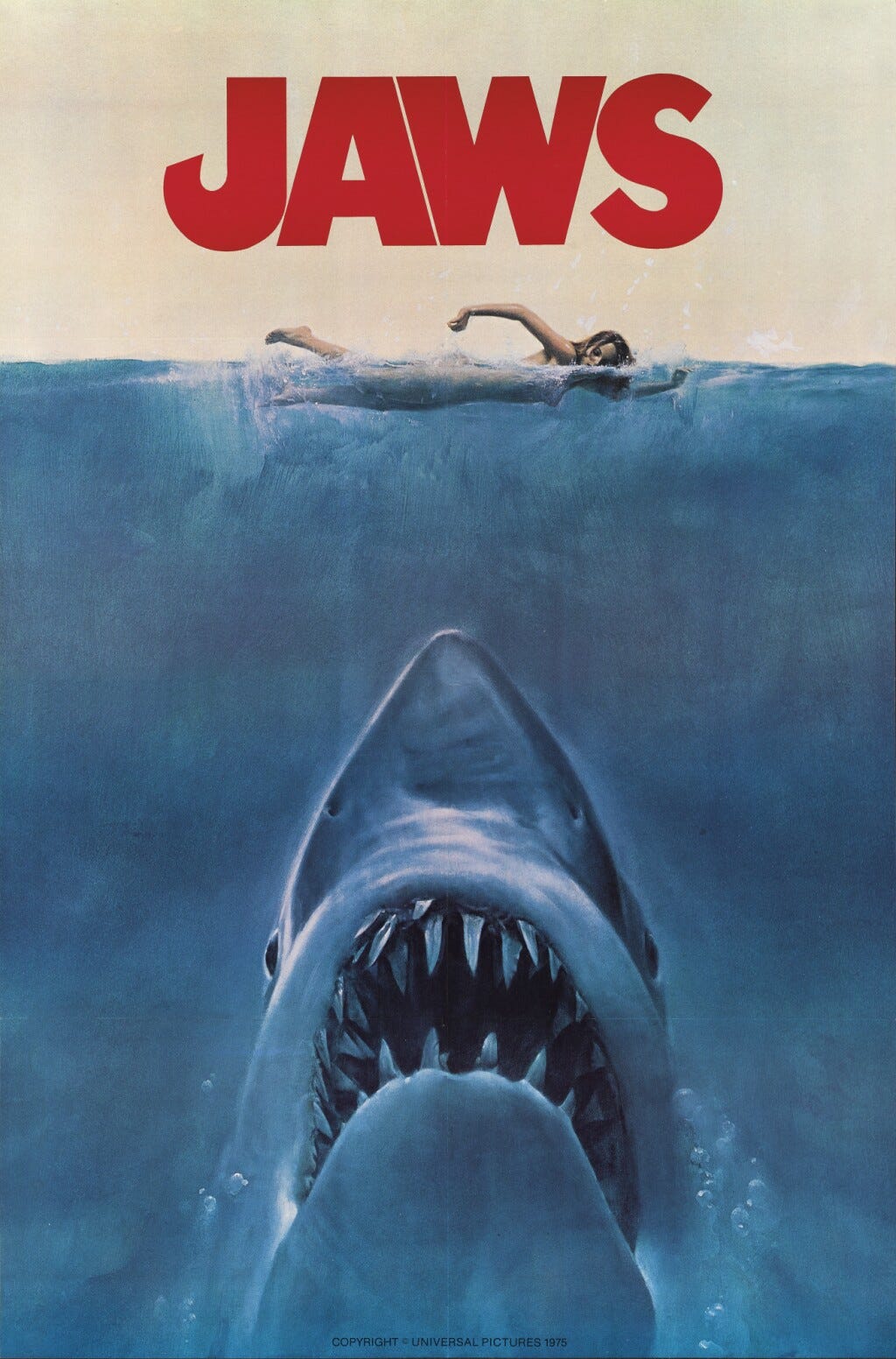
Watching all of those old films in my teen years might be the reason why I just devoured the recent HBO Max film history series, The Power of Film. One episode in particular has stuck with me in terms of its relevance to painting. The episode highlights the power of character relationships and how a character is defined by the other characters it is interacting with. Jaws alone in the ocean is meaningless, it is only when Jaws is placed in relation to its human victims that the cinematic tension emerges. Take the people out of the equation and you have a movie about a shark swimming around in the ocean.
This power of relationships is also true of the colors in your paintings.
Like Jaws and his human victims, one color only exists in relation to the other colors you position it next to. Consider the terrible graphic below (one that I am guilty of creating) and see how different each square of red looks based on the color it has been inserted into. Then notice the differences of the various pink squares, the green, the blue, etc..
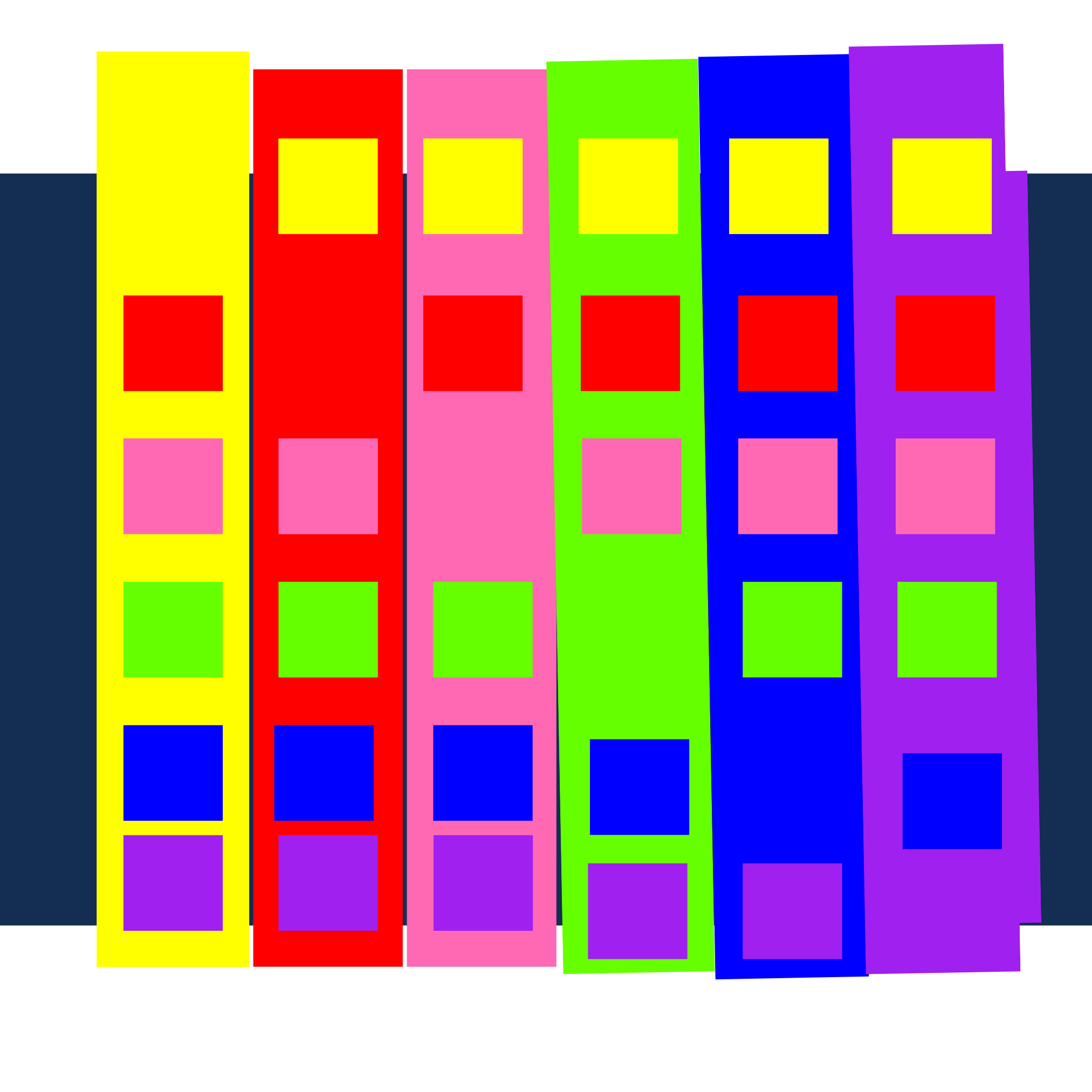
Color, in my opinion, behaves like man in two distinct ways: first in self-realization and then in realization of relationships with others. - Josef Albers
The exciting thing is that these relationships can be manipulated to result in stronger paintings. Let’s look at a few of the types of color relationships that you should get smart about leveraging:
VALUE CONTRAST
A great way to direct the eye in a painting is to put a light color in a sea of dark colors or a dark color in a sea of light colors. Our eye has no choice but to be drawn to that high contrast and the tension is creates.
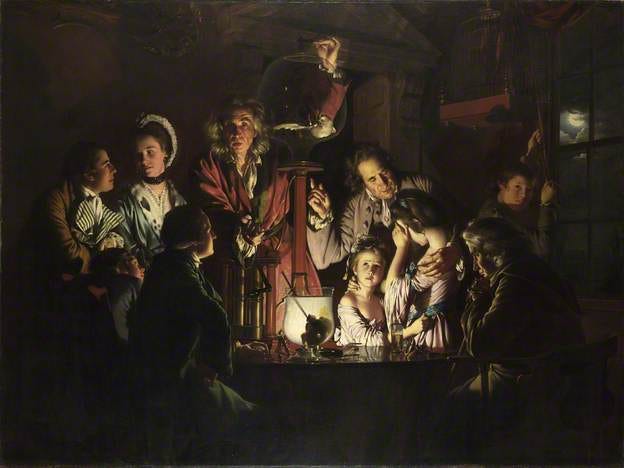
An Experiment on a Bird in the Air Pump, 1768 National Gallery, London,
Of course this was one of Rembrandt’s favorite hacks, he was always putting a candle in the middle of a dark and ominous room so that the viewer peers into that bit of light and wonders, “What the actual hell is going on?”
SATURATION CONTRAST - Dull & Vivid
The saturation level of a hue is how intense a color is. Highly saturated colors are brighter and less saturated colors are muted and dull because they have been mixed with other colors.
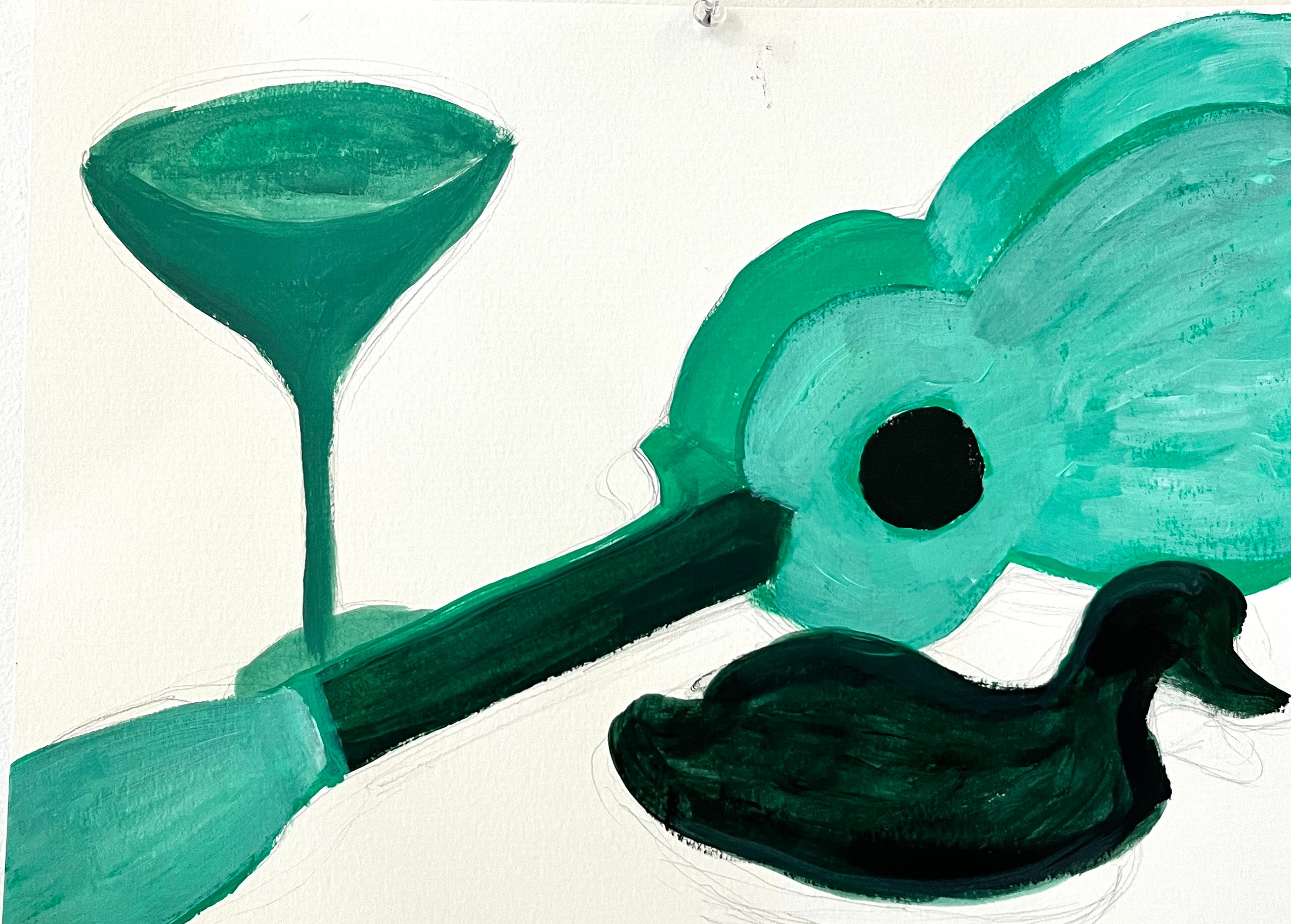
Using a bit of highly-saturated color in a sea of less intense colors is a great tool to direct the eye and create tension, as you can see in this painting done by an amazing student of mine. The eye goes directly to the highly saturated, vivid, bird that stands out in a sea of blended, or dull, colors.
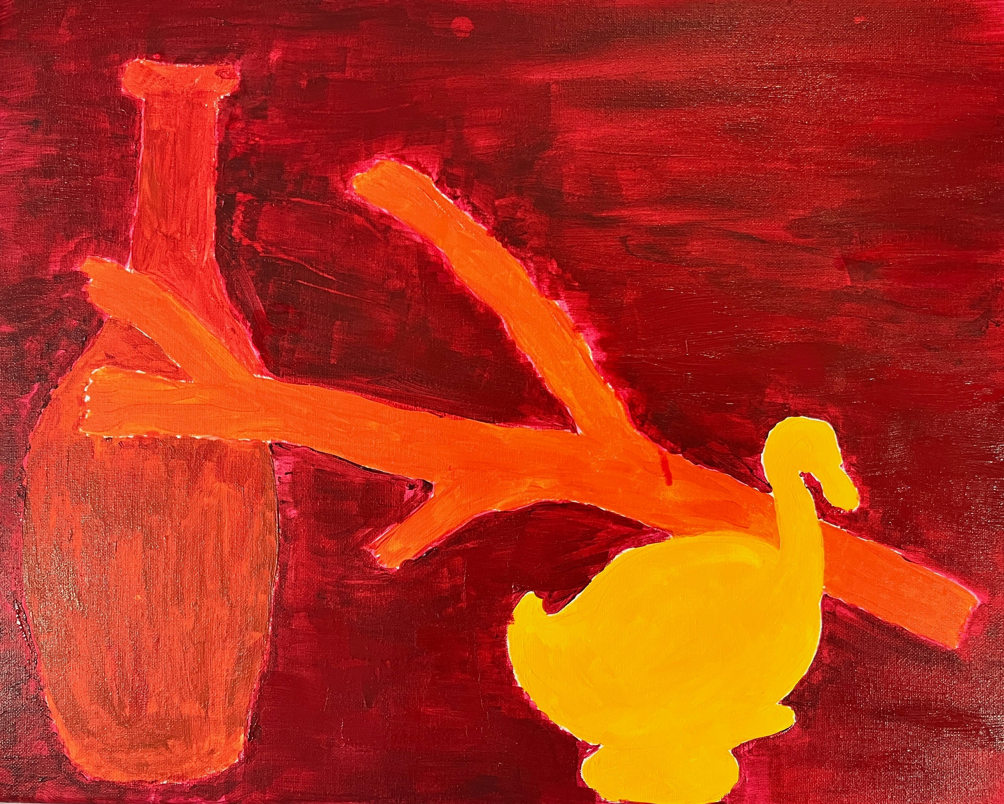
You can see the power of saturation in the two more-saturated orange vessels in this Morandi still life as well.
Giorgio Morandi, Natura Morta
COMPLEMENTARY COLORS CONTRAST
Now let’s talk about Van Gogh’s favorite painting hack; painting with complementary colors. Place a color next to is complementary color, the color on the opposite side of the color wheel from it, and you create something called simultaneous contrast.
This tension and energy created in a painting when you put one color next to its complement on the color wheel is the result of the faster wavelengths of the warm color hitting our eyes first and the lazier wavelengths of the cool colors bringing up the rear and how that tension between their arrival creating a little excitement in our brains.

This power of complementery color relationships is why Van Gogh was always putting red next to green…
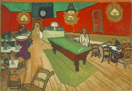
Vincent Van Gogh, The Night Cafe, Arles
Blue next to orange….
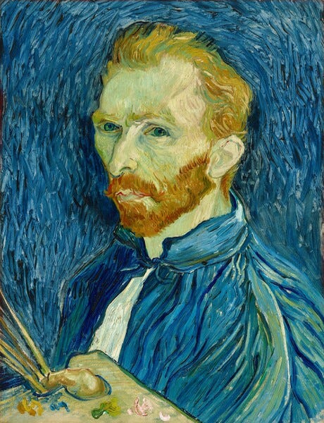
Van Gogh, Self Portrait
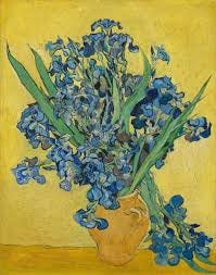
And violet next to yellow.
PROPORTION CONTRAST
Artist and art theorist Josef Albers painted over 1,000 squares in his “Homage to the Square” series that explored all of what we already looked at here in terms of color relationships, but also played with the power of altering color proportion. Drop a giant square of yellow in a bit of gray and that yellow looks like one hue, reverse your proportions and that yellow looks duller, dimmer, more pale, despite it being the same hue.

A great exercise to experiment with color proportion is to paint the same painting twice, but flip the proportions of your color in each painting. Let’s say you are painting a bunny and a frog in a field of grass. In one painting make the largest portion of your painting, the background of grass, a desaturated, blended color and paint the bunny and frog using colors straight out of the tube, which means they are highly saturated. Then paint a second painting where you reverse the proportions, making the grass the highly-saturated color and paint the two objects the duller color. Albers thought of these kind of proportion shifts as a change to the visual weight of a color.
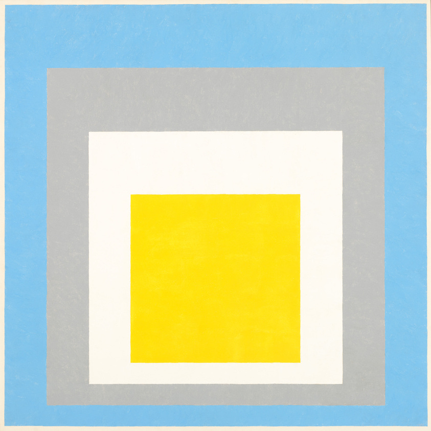
Josef Albers
Homage to the Square: "Ascending"
1953
COOL & WARM CONTRAST
The relationship power of putting a cool color next to a warm color is similar to the power of complementary colors. But his is not limited to just colors on opposite ends of the color wheel. You can get some great energy by putting any warm color (red, yellow, orange) next to a cool color (green, blue, violet).
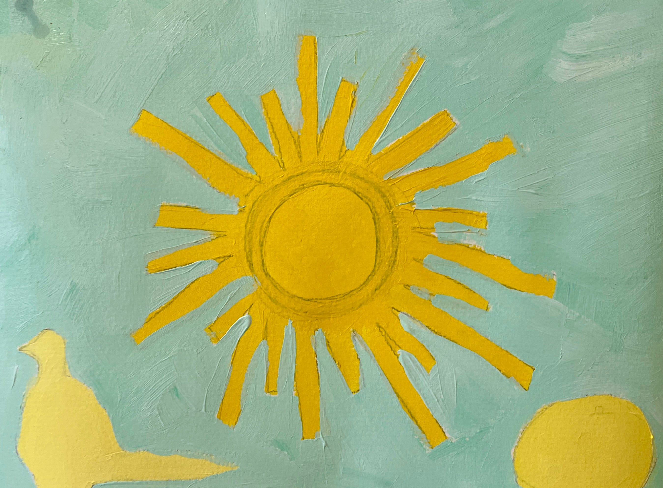
In this exercise by an amazing student of mine, the yellow and orange objects pop out of the cool background.
And in Matisse’s famous series featuring dancers in a circle, the warm colors of the bodies pop out from the cool blues and greens that surround them.
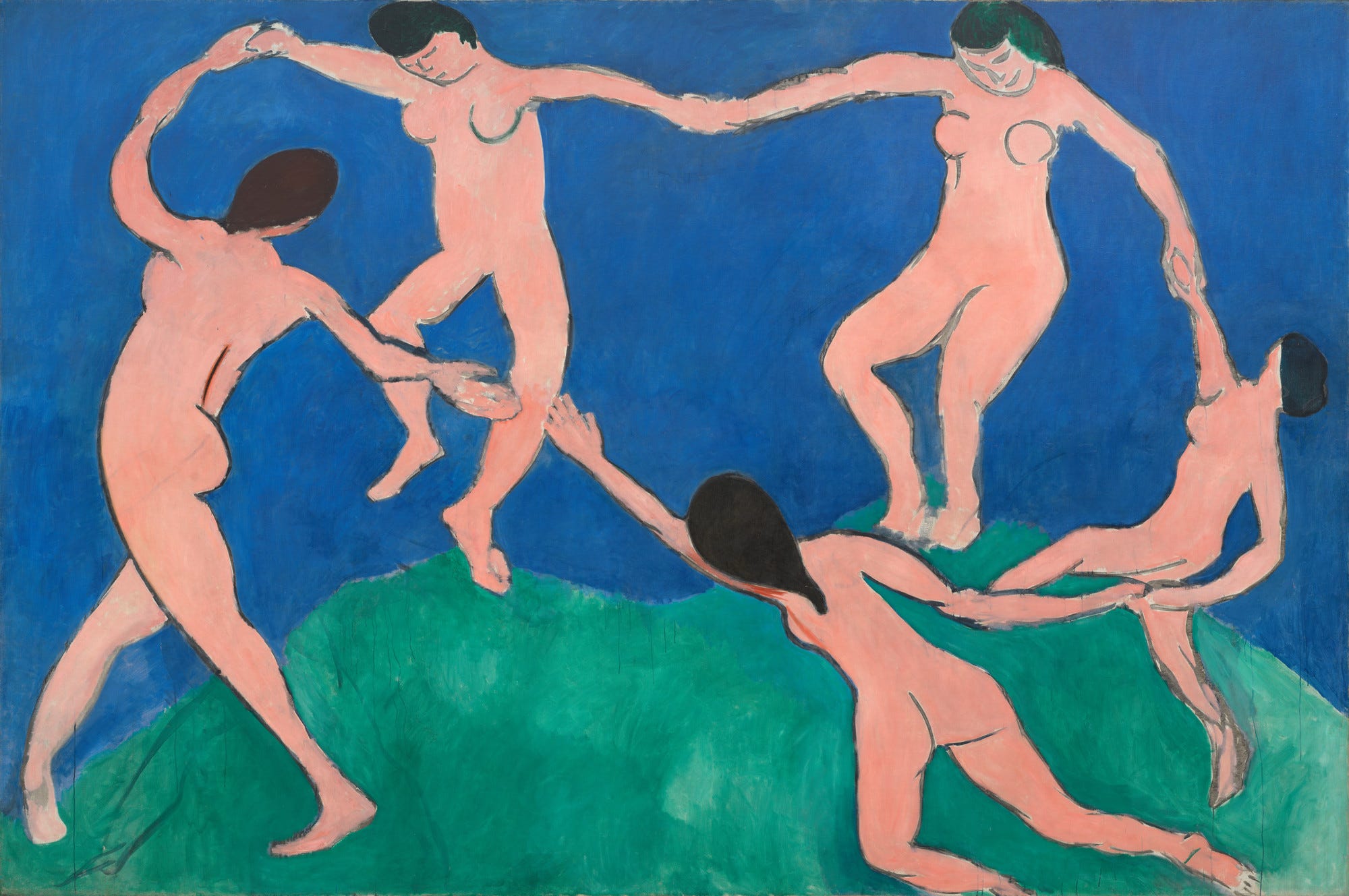
Henri Matisse, Dance I, 1909
Those 1,000 paintings by Albers are proof that you could paint nothing but one color next to another for the rest of your life and never run out of paintings to paint.
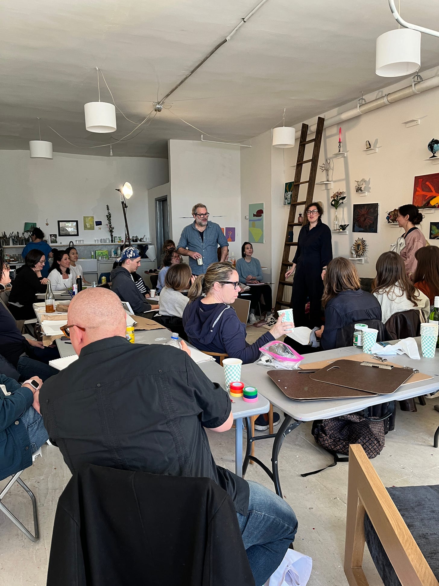
What’s going on at The Painting School?
It is not even 3 months since we opened and we have had so many wonderful workshops and classes and live model sessions.
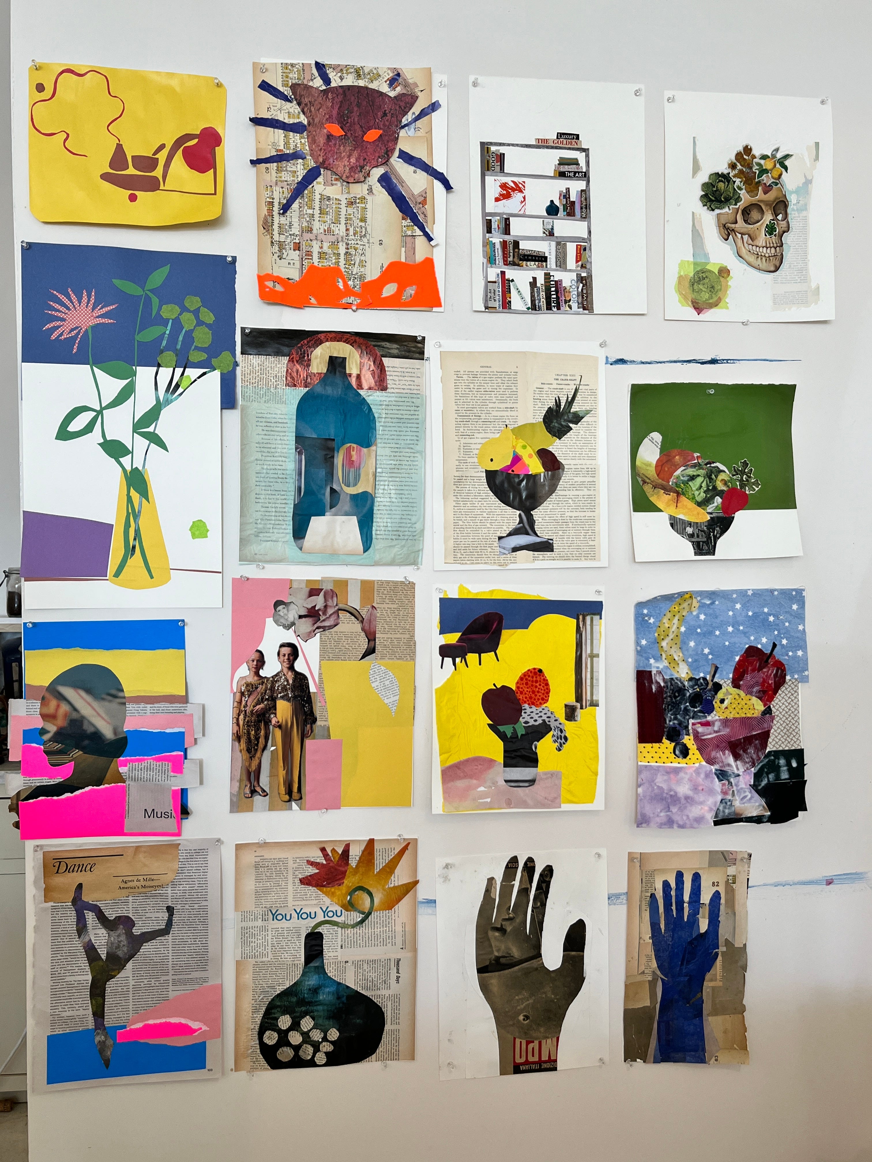
We had an amazing collage workshop with James Gallagher.
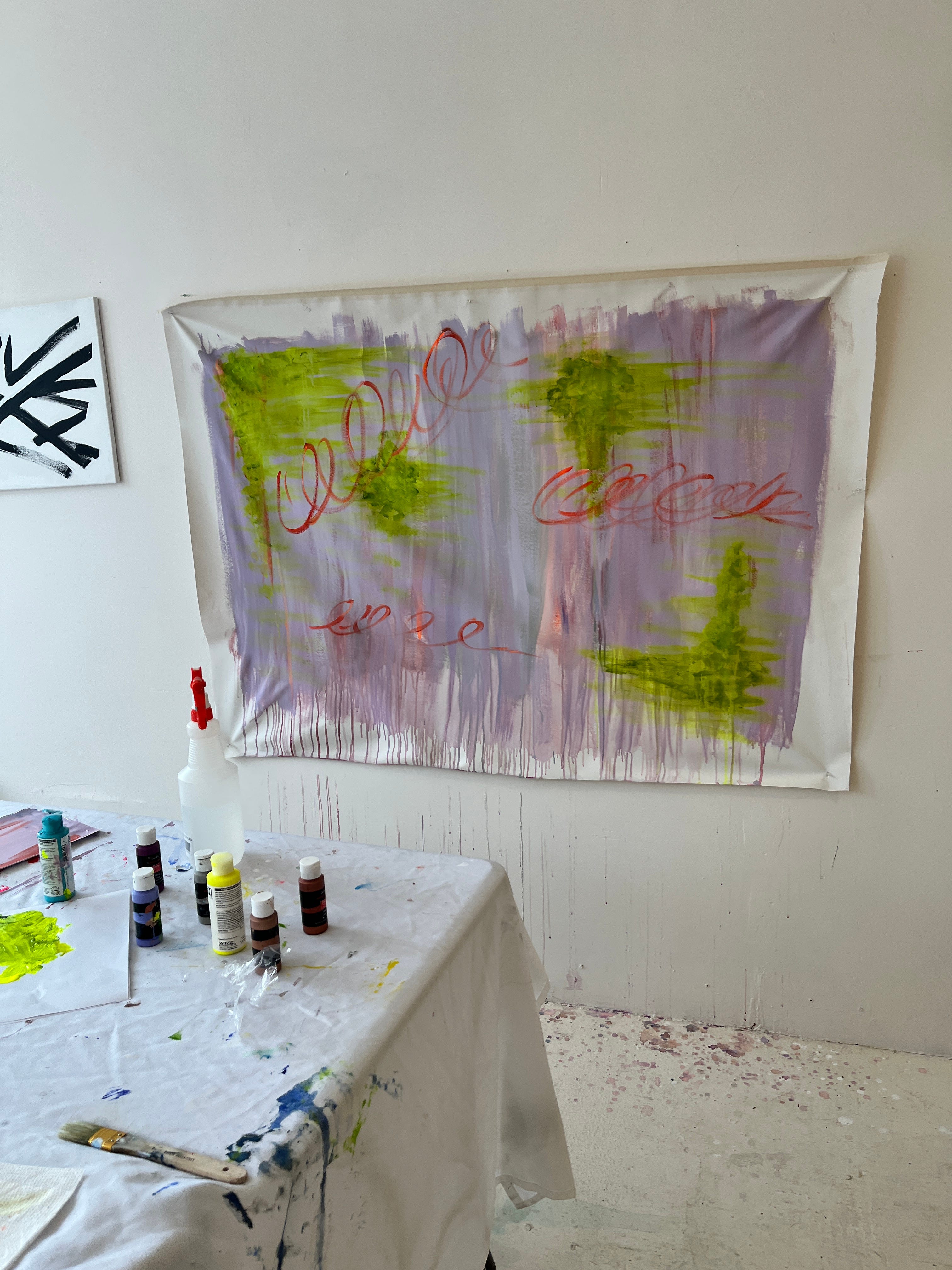
We looked at Franz Kline, Cy Twombly and Ray Parker in our Abstract workshop.
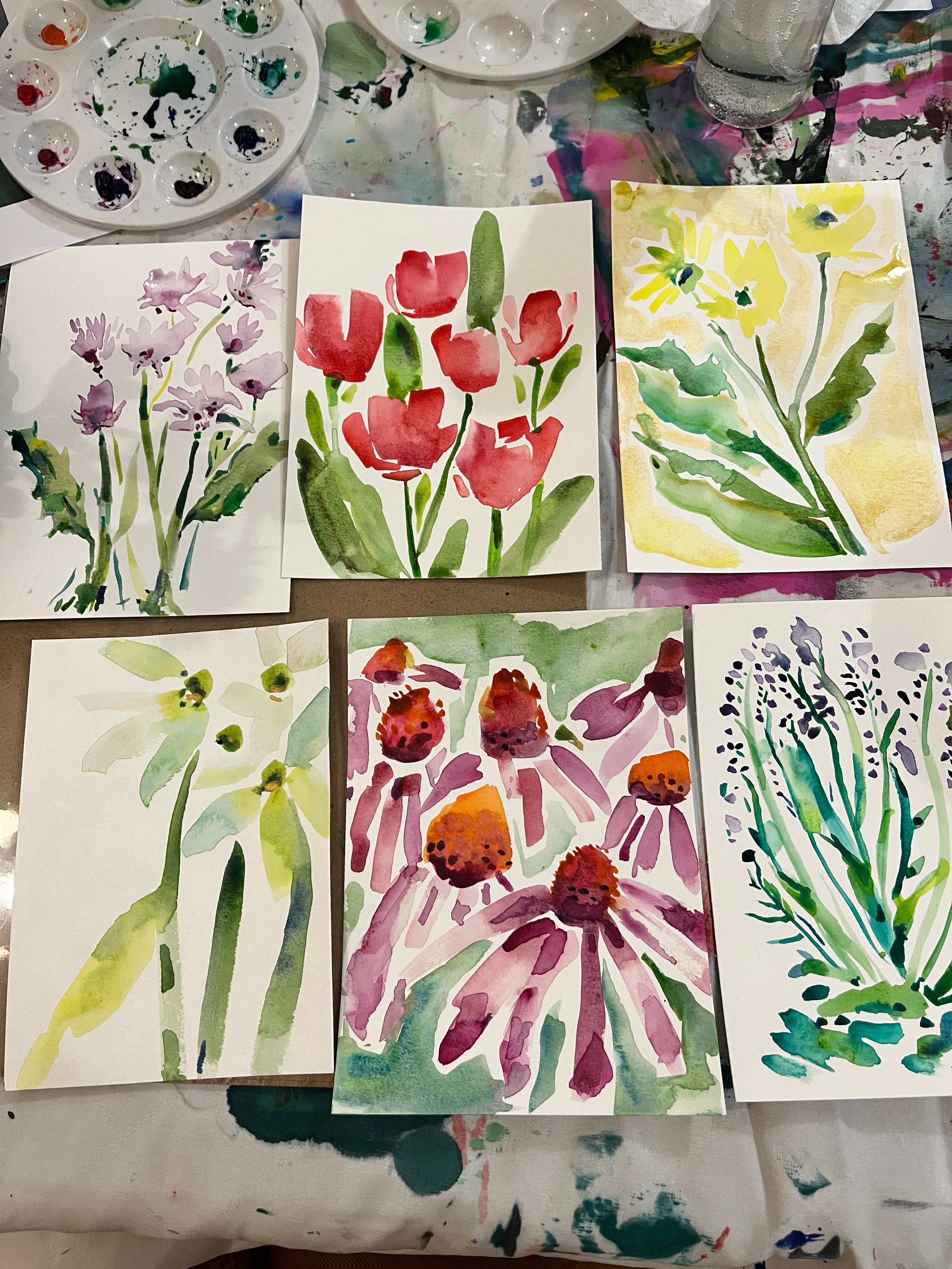
After a lifetime of never being able to make a watercolor painting, guest instructor Jodie Niss helped me finally figure out watercolor (turns out watercolor is closer to drawing than it is to painting, who knew?)! (These are mine!)
Great paintings were made at our Whiskey + Paint - Painting 101 night.
James Gallagher and Julia Rothman launched their new bi-monthly live model series at the space…
AND HERE IS SOME OF WHAT IS COMING UP!
Sunday, April 14th, 1-4 Yuri Shimojo’s Creating Meditative Art - 2 spots just opened up for this workshop, which will truly be a one-of-a-kind experience with art making, cherry blossom drawing, ink and pencil, plum wine, tea and music.
Aquas Fresca & Fruit - A Painting 101 Class -- Thursday, May 16th Not a paint and sip, not a workshop - something in between. There will be both non-alcoholic and spiked aquas fresca options.
Tuesday Morning Paintings Basics Adult Class - 10-12 - Just added!
Playing with the Figure - New Ways of Depicting the Body on the Canvas - Sunday May 5th, 2-5 - I’m teaching this workshop and I could not be more excited! You don’t have to know how to paint the figure for this one, we will play with hands and bodies and shadows in all new ways.

Paint the Natural World Workshop - The Painting School Catskills - June 1, 1-5pm This will be our first workshop of the summer at our Catskills venue. We will paint on the porch, find treasures on the 4-acre property, hopefully go on a hike, and then end the day with some refreshments and community building.


“Make Something for Mother’s Day Open Studio for Kids! Will take place the Sunday before Mother’s Day, Sunday, May 5, 10-12. So if you want a cool painting for Mother’s Day, drop off your kid!
Stay tuned for an announcement of a Mother’s Day painting event, our first drawing workshop with an exciting guest lecturer and lots of news about our summer programming.
Happy Painting!
Sara
My book - Painting Can Save Your Life: How and Why We Paint The Painting School
I have to read this again! So much to know and understand — and it feels accessible. Thank you! 🩷