


Contrast is king.
Whether you're Caravaggio, Frankenthaler or Tolstoy.

After not completing an almost-completed undergraduate visual art degree in my early 20s, I returned to college in my 30s to study creative writing. At The New School in New York I was lucky to find myself in a creative writing class with writer and editor Alexandra Shelley, who later became a writing mentor and a friend.

During one writing workshop Alexandra handed out print outs of the scene in Anna Karenina that describes Levin mowing the fields with his scythe.
"Another row, and yet another row, followed—long rows and short rows, with good grass and with poor grass. Levin lost all sense of time, and could not have told whether it was late or early now. A change began to come over his work, which gave him immense satisfaction. In the midst of his toil there were moments during which he forgot what he was doing, and it came all easy to him, and at those same moments his row was almost as smooth and well cut as Tit's. But so soon as he recollected what he was doing, and began trying to do better, he was at once conscious of all the difficulty of his task, and the row was badly mown.”
I was unimpressed to say the least. Who wants to read several pages of the internal monologue streaming through a man’s brain as he cuts the grass?
But Alexandra had pointed out that Tolstoy had included that passage because sometimes you have to slow down the pace of the plot, interrupt sections of dialogue, and remind the reader that human beings function on many planes, including the plane where our secret thoughts live and the plane where we do mundane tasks.
You wouldn’t want to read an entire book with chapter after chapter of lawn mowing, but you wouldn’t want to read an entire novel of nothing but action or dialogue and no inner monologue either. That lawn mowing section is a foil for other sections. It exists in contrast with the other types of writing in the novel.
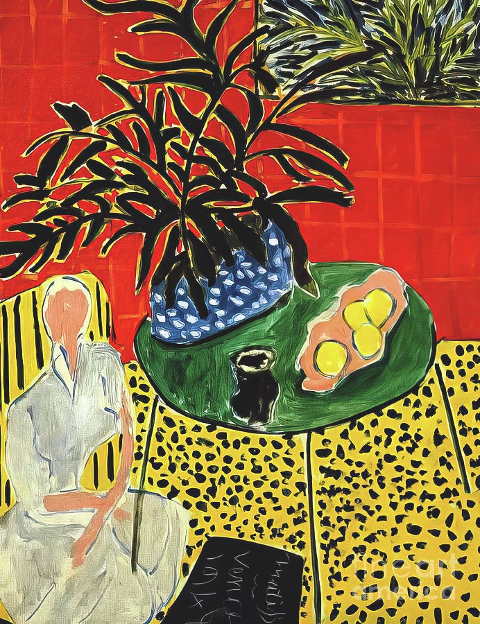
Interior with Black Fern, Henri Matisse
Paintings often rely on a similar contrast. This Matisse painting only works because the black leaves, the white dress and the desaturated flesh tone give our eyes a few places to rest after looking at the bold yellows and reds. We need this visual equivalent of mowing a lawn with a scythe so we are not overwhelmed by the many vibrant colors and the patterns.
The following painting by Bosch is notoriously jam-packed with fantastic depictions of all sorts of deviant behavior, but notice how many patches of muted, solid yellow-green or light blue there are. They are the places where we take a visual break from the bold-colored mayhem and deviance.
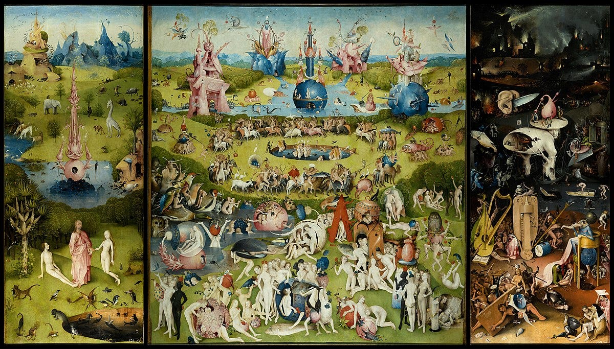
Hieronymus Bosch, The Garden of Earthly Delights
In this Helen Frankenthaler the vibrant orange is made all the more vibrant by its placement next to its complementary color, blue. But look at all of those dull, less vivid colors surrounding the bright blues and oranges. They provide a different kind of contrast. Imagine this painting without those muted, desaturated sections. In its current state this is a painting that seems to be in motion. Thanks to the contrast of the muted colors, it feels as if the paint is moving around the canvas, puddling to be thicker, duller and darker in some areas, thinner, more vibrant and more transparent in others. But if we removed those muted colors and it was nothing but bold oranges and blues, the painting would feel flat and graphic, like an auto decal.
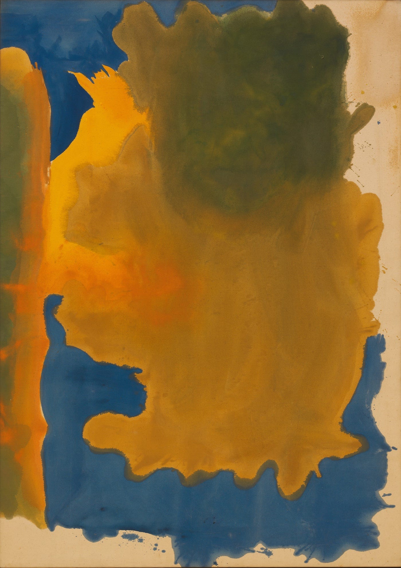
Helen Frankenthaler, “Canal” (1963)
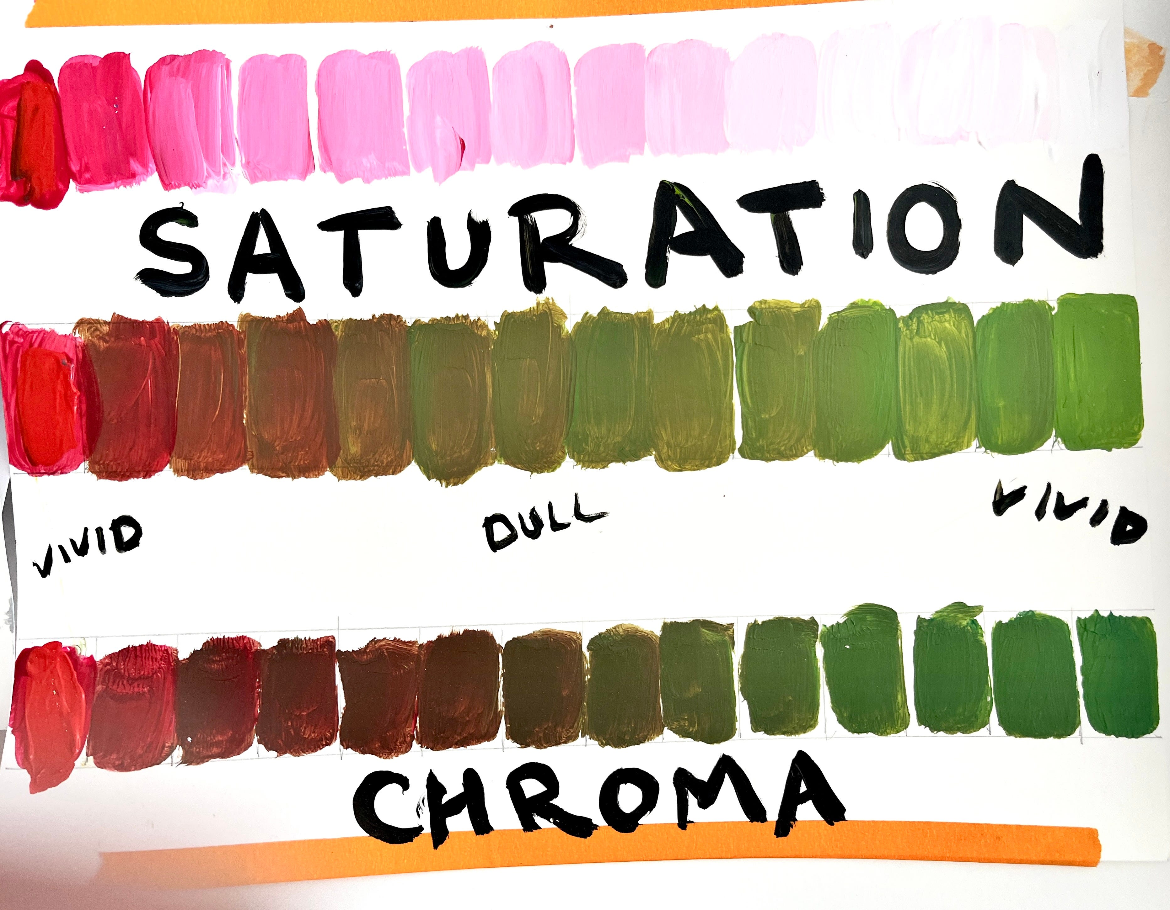
Frankenthaler’s painting is a great example of contrast between dull and vivid, desaturated and highly saturated. But as I teach my students in our Color Relationship class, there are 5 kinds of these visual contrast juxtapositions, not just dull vs. vivid.
Here are the other 4, all of them deserving of their own newsletter, so check your inbox, they’ll be coming your way soon.
Simultaneous contrast - This is the phenomena of a color altering the color of the color next to it. Sonya and Robert Delaunay and Josef Albers all worked with that concept in their artwork. They knew that a color only exists as we see it because of the colors that surround it. A blue surrounded by green is going to look very different than a blue surrounded in orange.
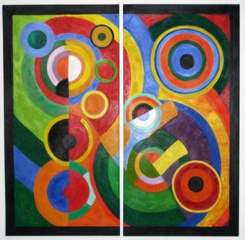
Robert Delaunay, Rhythm (1912)
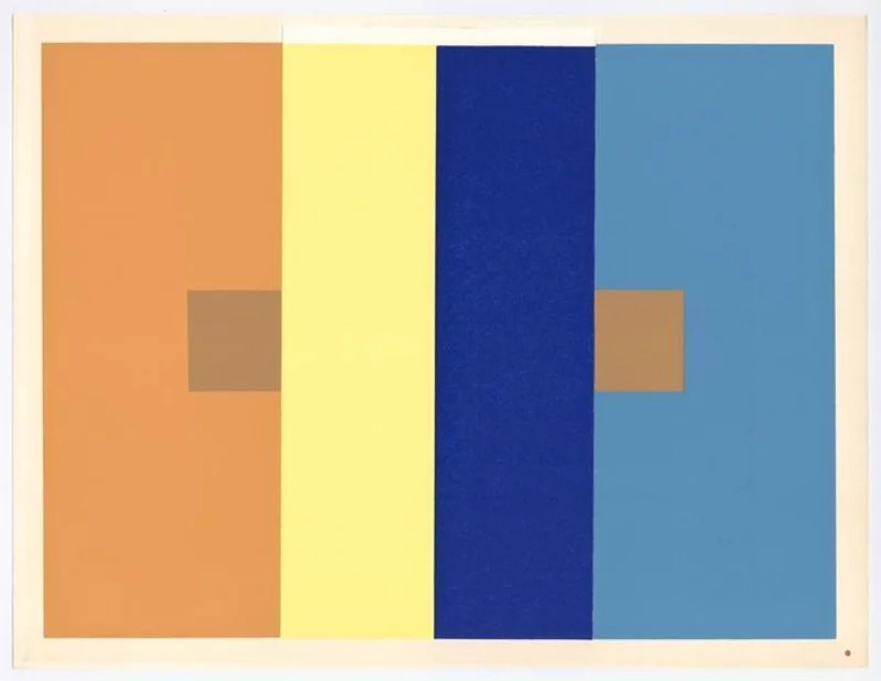
Josef Albers, Interaction of Color, 1963
In this Albers piece the small brown squares are actually the same color, they only appear to be different because of the colors they are in embedded in. There is a whole, cool optics explanation behind this phenomena that involves one color pulling or pushing color out of the color next to it, but that’s for another day. Just know that no color is an island.
Cool & Warm - The color wheel tells us that warm colors, like red, orange and yellow, and cool colors, like blue, violet and green, live on opposite sides of the spectrum. Being color opposites allows for all sorts of interesting tension when you put a cool color next to a warm one because the warm one is emerging from the canvas while the cool one is nestling in.
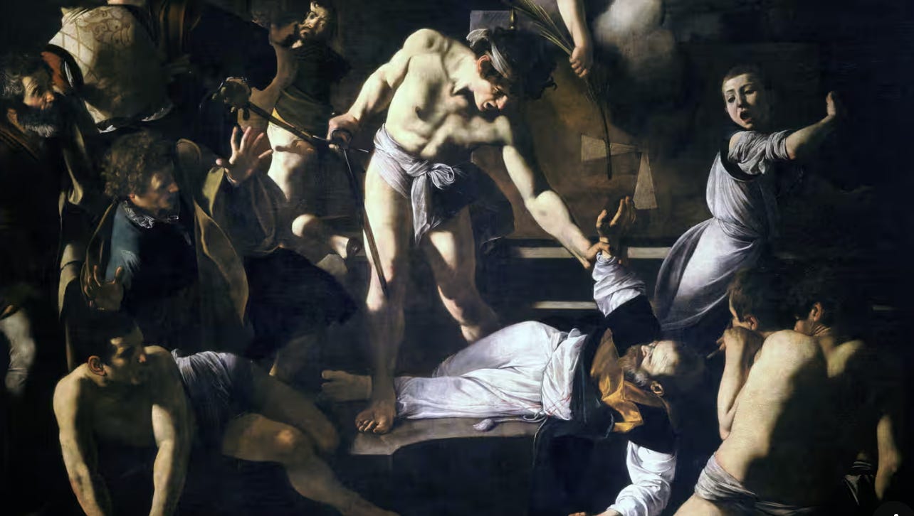
Dark & Light - I mean, just look at any Caravaggio ever and you see the power of this type of color contrast.

Young Sick Bacchus, Michelangelo Merisi da Caravaggio.
Proportion - Consider a Mark Rothko painting if you want to see proportion color contrast at play. What would this Rothko look like if the proportions of the colors were flipped?
Imagine this painting where the rust color becomes the size of the large black square and the black is the size of the rust. Imagine the gaps in between the 3 colors much thicker. We lose the tension, we lose the ominous sense of the black, the darkness, spreading to the edges of the painting and pushing out the red. It would be an entirely different painting and an entirely different art viewing experience.
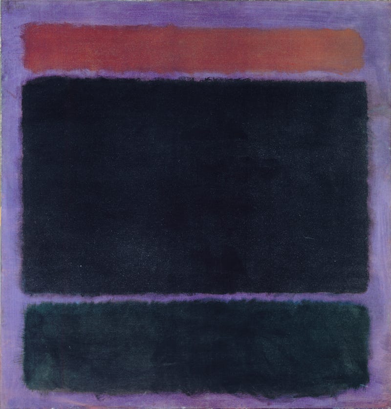
Untitled (Rust, Black on Plum) Mark Rothko
Contrast is king when it comes to creating a dynamic painting. And if creating a painting that people want to engage with is your goal, you have to be smart about how you use contrast.
This is the first of a bunch of newsletters about contrast. As you know, I am dedicated to helping you become a better painter, and you can’t become a better painter without being smart about leveraging of the power of color contrast. Stay tuned for more!
And I hope you’re finding some time this summer to make some art.
Happy Painting!
Sara