
Elevating a painting from good to great
Making 2025 the year of pseudo-perfectionism

Before we talk painting, I want to send love to my family and friends in Los Angeles, especially those members of the art community who have been impacted. If you would like to support the rebuilding efforts of the artists and art workers in LA, there is a Go Fund Me to help those who have been impacted by the fires start over.
The first 20 people who make a donation to this fund, or another LA fires relief fund, and send a copy of their receipt and their mailing address to paintingisgoodforyou@gmail.com will get a small painting on paper in the mail. x
A million years ago I lived with a very intense installation artist. (And if you know any installation artists, you will recognize that as a redundant statement…) Unlike me, my friend didn’t waste time on a dramatic and immature love life or bad TV, the only thing she did was create elaborate and expensive artworks that filled entire galleries and required contractors, seamstresses and probably Broadway lighting professionals. Her work consumed her and she was very hard on herself. Her self-loathing sent her to bed for days if she spotted the smallest flaw on her artwork.
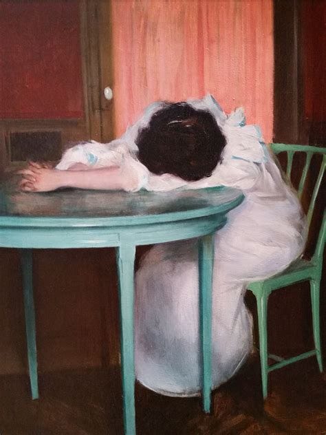
Ramon Casas, Tired
I am the complete opposite. While my desire to make great paintings is one of strongest longings in my life, I do not innately have my old roommate’s ability to rage at imperfections. I am kind of a hippie about the whole creative thing, more interested in the creation of the piece and its heart and soul than I am in the perfection of the final product. If my old roommate is Brahms, I am Phish.
But lately I am have been focused on keeping the sweet vibes strong while also perfecting the details. I am being smart about color theory while also letting go emotionally. This is a challenge for me, but in the spirit of Van Gogh I am seeking and striving towards perfectionism.
“I am seeking, I am striving, I am in it with all my heart. - Vincent Van Gogh
And there are a few things that I will lean into in my painting practice this year to ensure that I don’t leave anything on the floor when it comes to finalizing a work of art. May I suggest that you consider doing some of these things as well?
Complicate your painted world with reflections & shadows
The objects in your painting do not exist in an imaginary world (unless they do exist in an imaginary world of course...) They are people and things that cast shadows and are reflected in the water and shiny surfaces around them. People can forget that fact when at the easel.
In a recent class on reflections I shared a lot of Peter Doig images, a contemporary painter whose entire genre is about reflections.
Imagine how prosaic Doig’s nod to Van Gogh’s Starry Night would be without the long line of reflections. The reflections bring magic realism to the artwork and a parallel and haunted world, flipped over and contorted, emerges from the water.
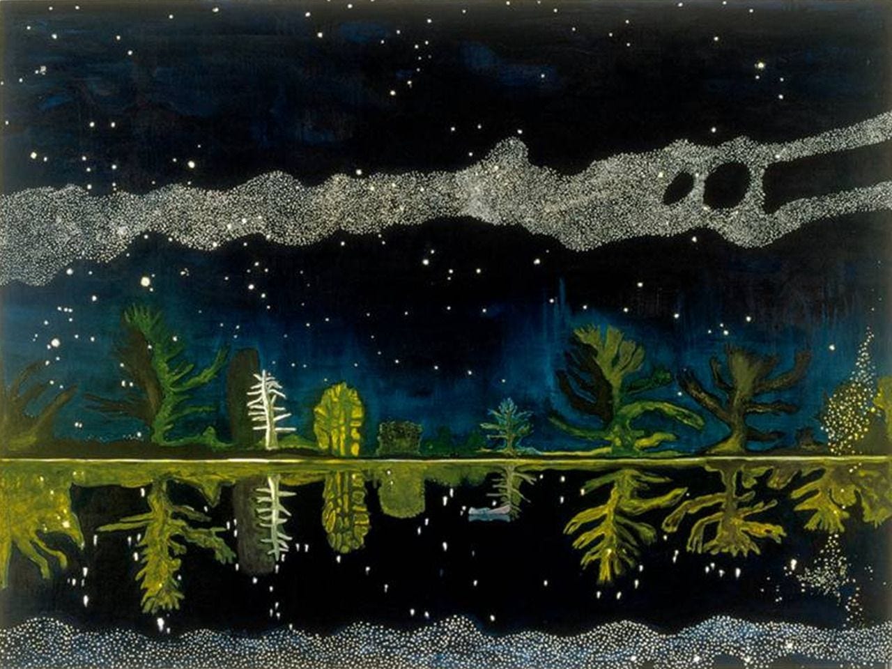
Peter Doig, Milky Way
In some work, like the painting below by Klimt, reflections provide a bit of symmetry as they mirror the world next to them. The reflections turn Klimt’s typical day at a city park into an abstract, harmonious, green quilt of color.
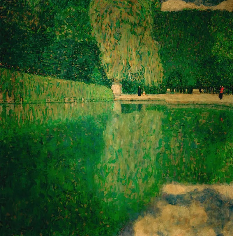
Gustav Klimt, Park of Schonbrunn
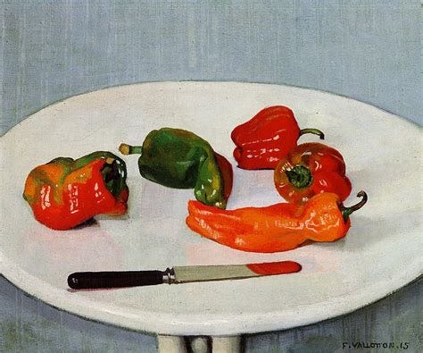
Felix Vallotton, Poivrons Rouges / Red Peppers
A single red reflection on the blade of the knife inserts abstraction into this still life of peppers in this Felix Vallotton. What could have been a very typical still life now includes a bit of color field and moves from mundane to modern.
Just remember a few golden rules about reflections:
They are usually not as crisp as the world they reflect. Think soft, blurry edges.
They tend to be lighter or darker than the world they reflect.
They provide an opportunity to add an abstract element to a realistic world.
Use more contrast in your color relationships
Color relationships are the focus of the most-viewed video on my YouTube channel and something that I think all painters of all levels of experience need to focus on more in order to make our art engaging to the viewer’s optic and nervous systems.
Our eyes and brains like to see contrast in a painting. We like the visual drama and tension that results from a dark color next to a light one, a vivid color next to dull one, and a warm next to a cool.
A few contrast options to consider:
Saturation - Put a vivid color into a sea of dull, desaturated color, as Brice Marden does in the painting below. Or surround a dull brown in a sea of hot pink.
Brice Marden, Epitaph Painting 1
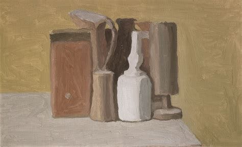
Value - I have an entire section below focused on the importance of playing with the light and dark in your painting, but look at the paintings by Giorgio Morandi and Danielle McKinney to see what happens when you have one bit of extreme value in a sea of mid range or opposite value.
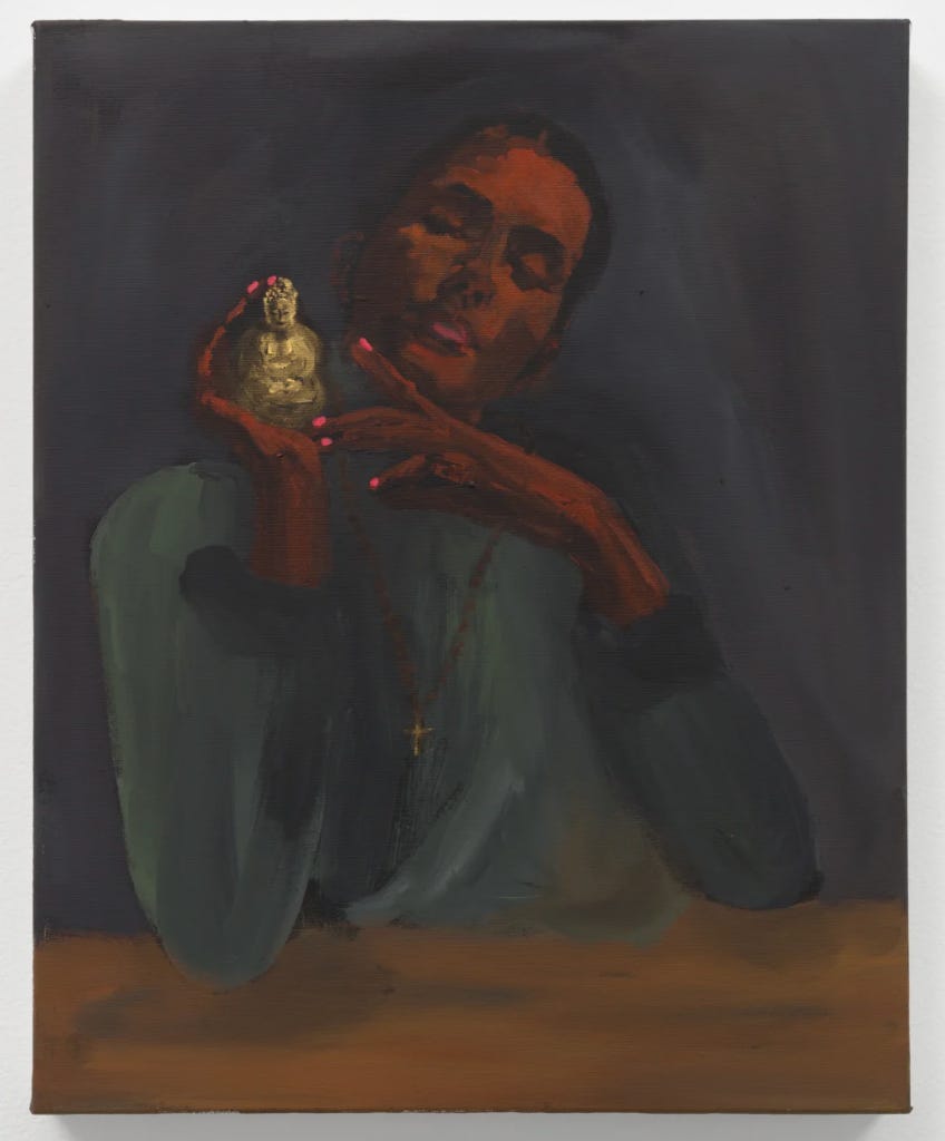
Danielle McKinney, Dogma
Temperature - Playing with warm and cool is Van Gogh 101. He was always putting a hot yellow in a sea of cool blue, surrounding warm red lines with cool greens.
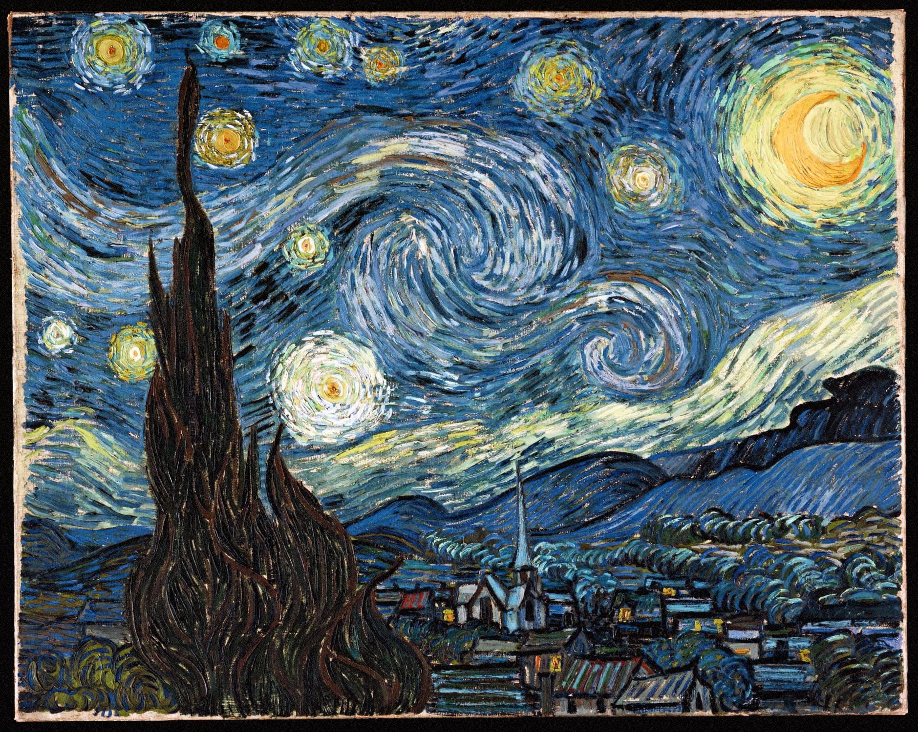
Starry Night, Vincent Van Gogh
Complementary colors. Do not be afraid to lean into the most simple and most effective color combinations - red and green, blue and orange, violet and yellow. If they live on opposite sides of the color wheel, they are innately high contrast and were born to create great energy when they come together.
Get out your tiny brush
Look at this painting by Manet. Take in the details.
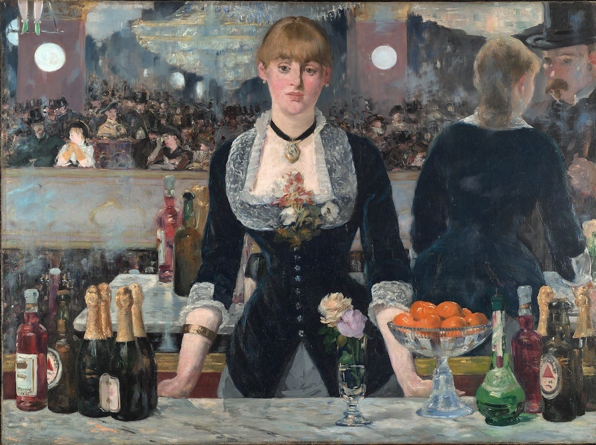
Consider the painting without the small glints of reflected light on the choker or the intricate lacework on the bartender’s bib. Look at the texture of the skin of the oranges. Now imagine those details gone. Imagine the flatness of the painting. If we lost the congestion of the crowd painted in the background we would also lose the sensation that we can almost hear the laughter, the arguments, the clinking glasses and live music taking place. The shine on the gold foil of the champagne bottle is there to help us feel that we can reach into the painting and take a swig from the bottle.
When you think you are done with your painting give it one more session where you use your smallest brush and your smallest brush only.
Pay more attention to value
Value is the lightness or darkness of a color. Contrasts in value are created by light and shadow, the more something is hidden from the sun, the darker it is. And this value created by light and shadow is what gives 3D form to an object and depth to a landscape. Playing with it can create an amazing amount of tension and contrast.
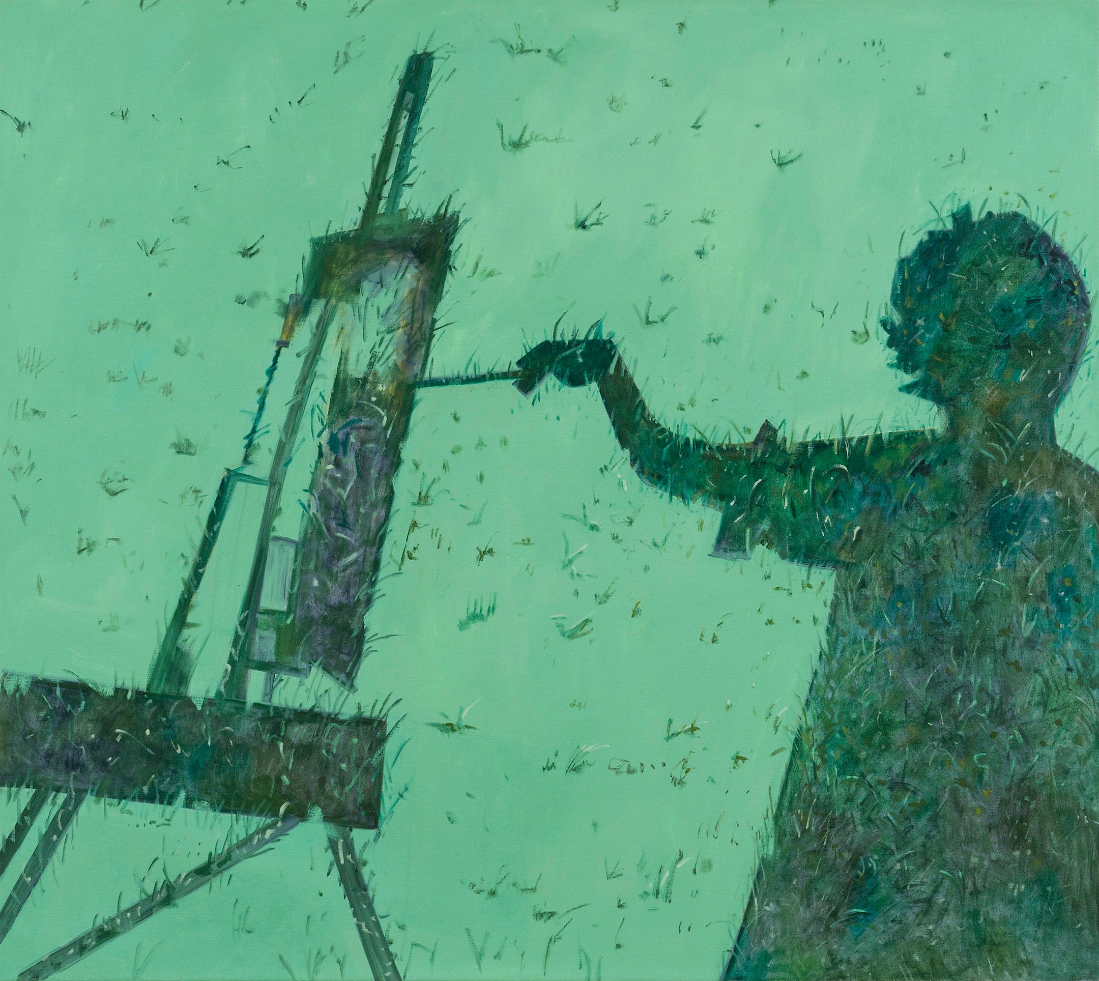
Shadow with Easel, Lois Dod
Painter Lois Dodd often depicts pretty everyday content in her work. She loves a good mundane moment like a billowing curtain on a kitchen window or a boring staircase. But they are incredibly engaging and appealing to look at. My humble opinion is that a lot of their appeal is her frequent use of highly-contrasting values.
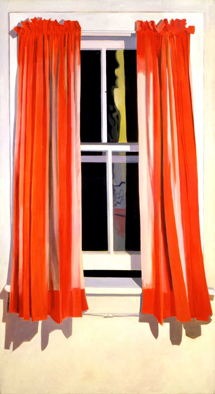
Lois Dodd, Night Window, Red Curtain
Try a window painting of your own with highs and lows in your value layout and composition. Clever placement of your darkest or lightest values can do wonders for a painting and direct the eyes viewers where you want them to go.
Happy Painting.
xox
Sara
Book: Painting Can Save Your Life: How and Why We Paint