


My 6 best color tips
The light in the artist's brain

“Not only can color, which is under fixed laws, be taught like music, but it is easier to learn than drawing, whose elaborate principles cannot be taught.” Eugene Delacroix
There are many bits of color-related advice you will be offered throughout your painting life from painting teachers, fellow students, art history or Bob Ross. Today I humbly offer you some of my favorite tips that have improved my own painting and I have seen help improve the paintings of my students.
Some of these tips about color are more basic than others. Some tips made it into my book and some did not because I just recently discovered them myself. Some are based in color theory and others are from personal experience. Enjoy.
1. Warm colors emerge, cool colors recede. The most basic bit of color theory for painters to understand is that if you have two circles painted on a grey background, one red (warm) and one blue (cool), the red circle will look like it is emerging from the page and the blue circle will look like it is moving back into the page. That is because the color waves of warm colors are shorter than the waves of the cool colors so they arrive at our eyes first.
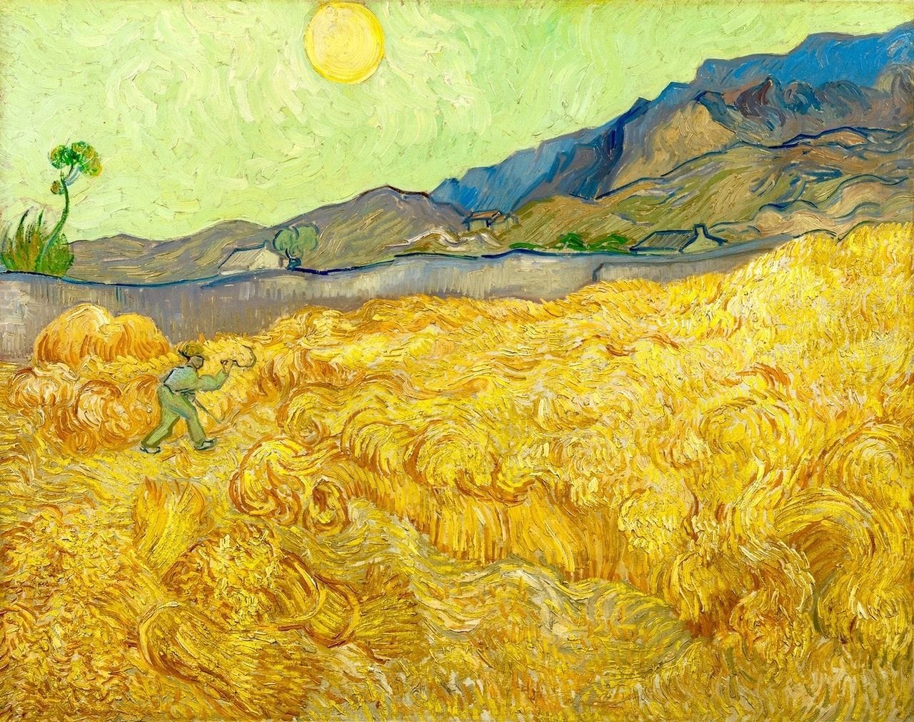
Vincent Van Gogh, Wheatfield With a Reaper, September, 1889
What does this mean for your painting? If you want to create depth in a painting and make it look like the sky and the sea go far into the horizon and that the rocks and driftwood in front of the painting are so close you can touch them, one of the most surefire ways to do this is to paint the objects in the foreground a warmer color and the background a cooler color.
2. Rely on color wheels for (almost) fail-safe color palettes. I am a recent devotee of the color wheel. I didn’t use one for years after buying a color wheel for my college foundational color theory class (which, btw, I ended up failing on account of the color theory class happening at 9:00 on Saturday mornings, just a handful of hours after I usually rolled home from a Friday night party). But I have returned to this remarkable tool and often rely on it to help with the tricky decision of what color to paint next.
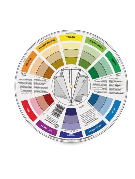
With the harmonious color themes a color wheel provides, like complimentary colors, split complementary, tetrad and more, a painter can leap frog from staring at their blank canvas to mixing a variety of colors on their palette.
For example, if you know the one color you want to capture in a painting is the bright green of the slice of lime in the gin & tonic from your last beach vacation, but you are not sure what other colors would work with that bright green, the color wheel is what you need. By lining up the geometric shapes on the back of the wheel you can come up with a variety of color schemes using 2, 3 and 4 colors. And since the color wheels tells us that lime green would go great with yellow-orange and violet, maybe you paint your sky violet and the sand a yellow-orange, maybe accenting it all with black and white.
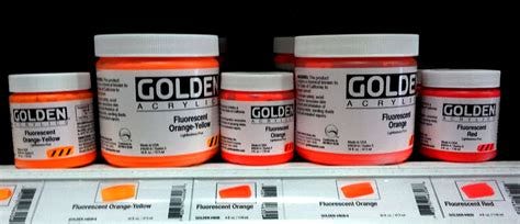
3. Mix like with like. All paint colors come in a range of warmth. In acrylic paint you have a wide range of blues and some of those blues are going to be warmer than others. That is true of all of the colors. This is important to know when mixing secondary colors like purple, green and orange. To mix the most vibrant secondary color you need to mix like with like. So if you are mixing a cool secondary color like green, then you need to use the coolest yellow option and coolest blue option you can find. For a warm color like orange you mix the warmest red and the warmed yellow.
Many acrylic paint companies have charts that show you which colors are warm and which are cool, like this one from Golden. From this chart I know that to mix my green I should use a yellow closer to the green (cool) side of the bias, so something like a Cadmium Yellow Primrose would mix a more vibrant green than a Hansa Yellow Medium.

Play with fluorescent colors. I have become a big fan of fluorescent colors. I use them sparingly in their pure form to add a bit of drama to a nocturne. Fluorescent pink or yellow on a sea of black or dark blue creates a dynamic, buzzing night sky. And tiny bits of fluorescent green scattered throughout a field of flowers can mimic light hitting flowers stems.
But that light in the fluorescent paint also makes it a great mixing option for those moments you want a vibrant, glowing color. Trying adding white to fluorescent pink and see the glowing, light pink it creates. Mixing a fluorescent yellow to a lighter color will make it seem to shine. There is a luminousness in this paint that brings out the glow in so many colors. If nothing else, you can now accurately paint those neon socks you wore to middle school in the 1980s.
"They'll sell you thousands of greens. Veronese green and emerald green and cadmium green and any sort of green you like; but that particular green, never." -Pablo Picasso, 1966
5. Buy a new color every time you go to the art store. I realize that paint is expensive but if you can afford it, when you go to the art store to grab your reliable basics, consider picking up the smallest size tube of a color you would never, ever chose. Grab that strange blue-gray if you hate gray, or select a dark green that you see no reason for or a safety orange that you can’t imagine anybody in their right mind painting with.
Then try to make yourself use it on your next painting. You might be blown away by what it does to your regular palette. Or, you might hate it and have to find a way to use it as a mixer for your perennial favorites.
Steal palettes. I spend a lot of time on art history and contemporary art in my book, Painting Can Save Your Life, and my classes at The Painting School. I find that showing new painters the work of great artists not only inspires them in terms of subject matter and style, but they also find inspiration in the palettes of these great artists. And if you come across a painting with a combination of colors that stops you in your tracks, I beg you to steal that palette!
You could steal this palette of dark reds and slightly muted yellows, with dark blue and black scattered here and there.
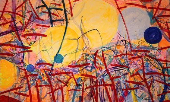
Jadé Fadojutimi, And that day she remembered how to purr
You could steal from Manet and fill your canvas with whites and grays full of yellows and mossy greens, accenting it all with a muted orange-peach and intense stripes of black.
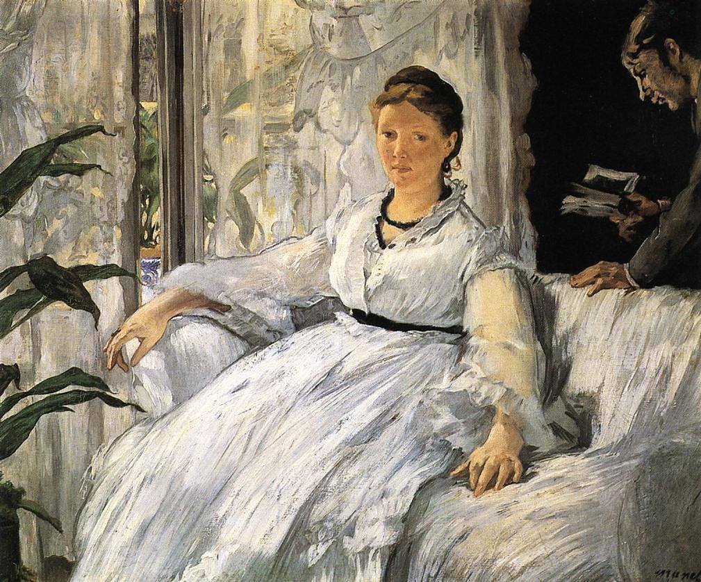
Edouard Manet, Reading 1865
And if you are like me and tend to overdo it with the intense colors, look no further than Florine Stettheimer. Try hot pinks, blues and unmixed reds. Throw in cadmium yellow and teals, turquoises and a lot of pure white.
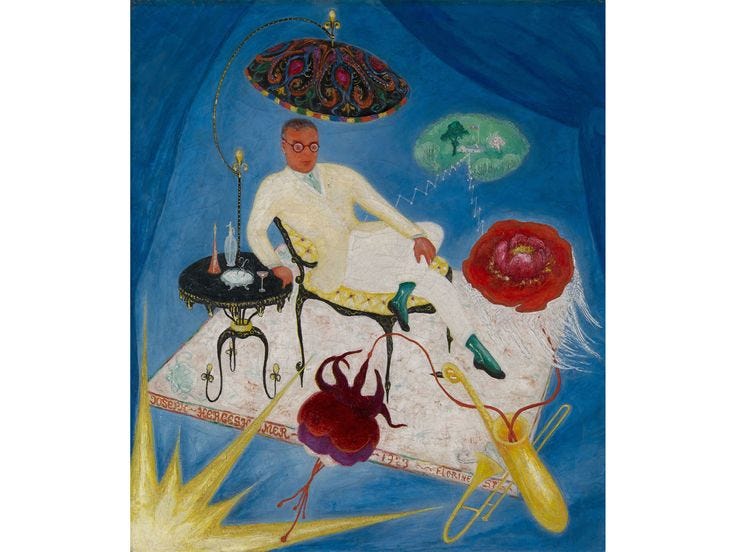
Florine Stettheimer : Joseph Hergesheimer
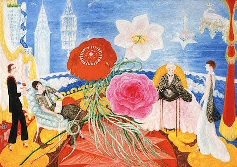
Florine Stettheimer, Family Portrait II
Color theory is complicated and mixing a palette can be overwhelming. But it is worth the effort to get better at color. Elevating your use of color in your paintings should be every painters central goal.
Thank you for reading!
Sara