


Textiles & lemons & the chance to learn from Matisse
The perfect late summer, at-home painting exercise

Maybe it is because my mother is a quilter that I have a fondness for fabric. Growing up I often accompanied her to JoAnn Fabrics in the Western Mall where she moved through the long rows of bolts of fabric looking for just the right piece of cloth for her most recent project. The fabric she selected was then brought home, folded or cut into squares, and neatly stacked in the shelves in her sewing area in our basement.
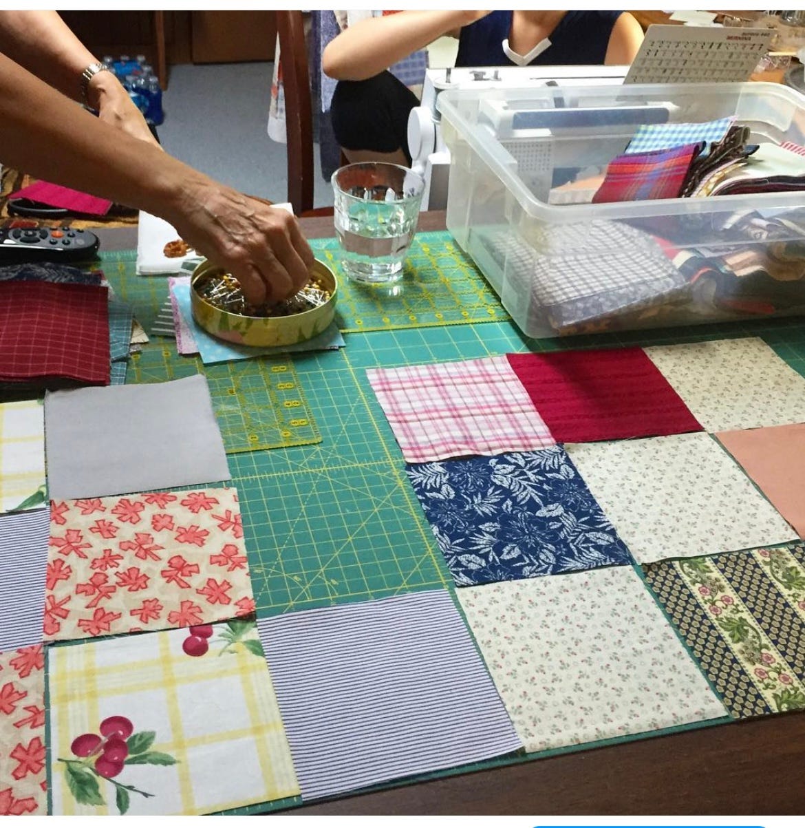
My mother helping my daughter make her first quilt.
Henri Matisse had his own collection of textiles, something he called his “working library”. Descended from many generations of people who worked in the textile industry, Matisse often turned to textiles to serve as backgrounds in his paintings, sources of visual inspiration and a basis for his color exploration. The textiles from his collection are the stars of so many of his greatest paintings.
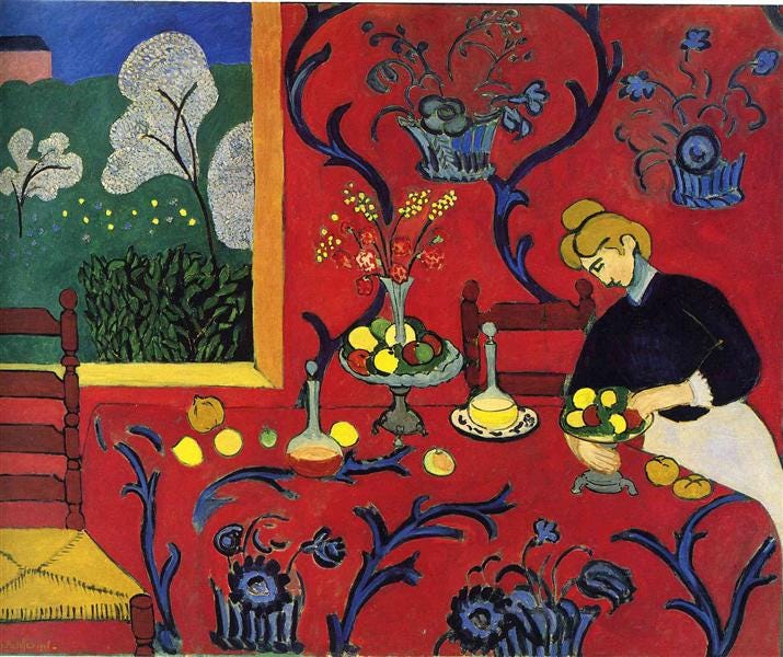
Harmony in Red, Henri Matisse
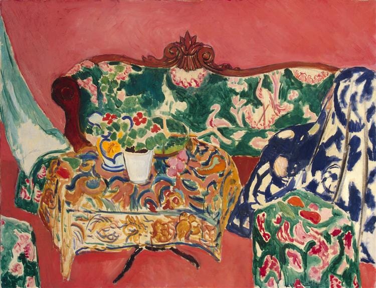
Seville Still Life, Henrie Matisse
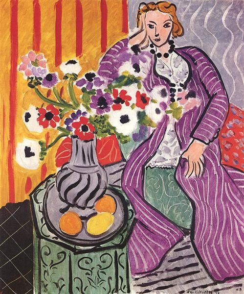
Purple Robe and Anemones, Henri Matisse
My mom recently sent me a shoebox full of fabric squares and I realized that it was the perfect box of inspiration for a painting class built around Matisse and his textiles and planned a workshop.
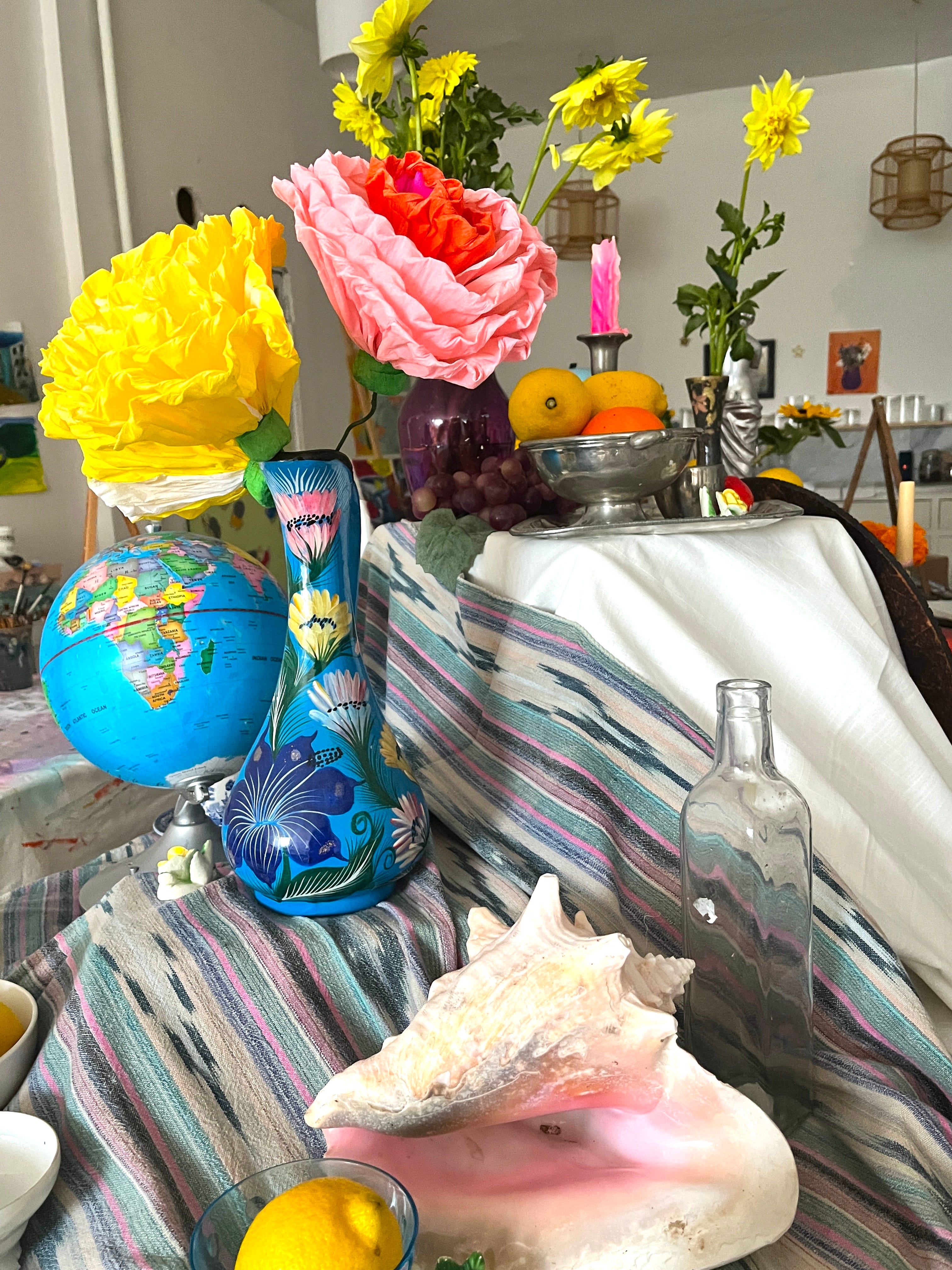
I started by building a still life with various elements that Matisse often included in his paintings like lemons, vases, flowers and, of course, textiles.
The workshop began with each painter selecting 3 pieces of fabric. I instructed the painters to use those bits of textile as the inspiration to cover the background of their canvas.
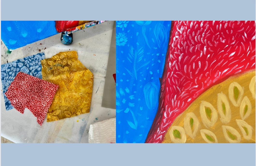
All of the paintings ended up having a real sense of movement as the result of how the artists laid out their sections of textiles, and we talked about how to take advantage of that natural movement in order to move our eyes across the page.
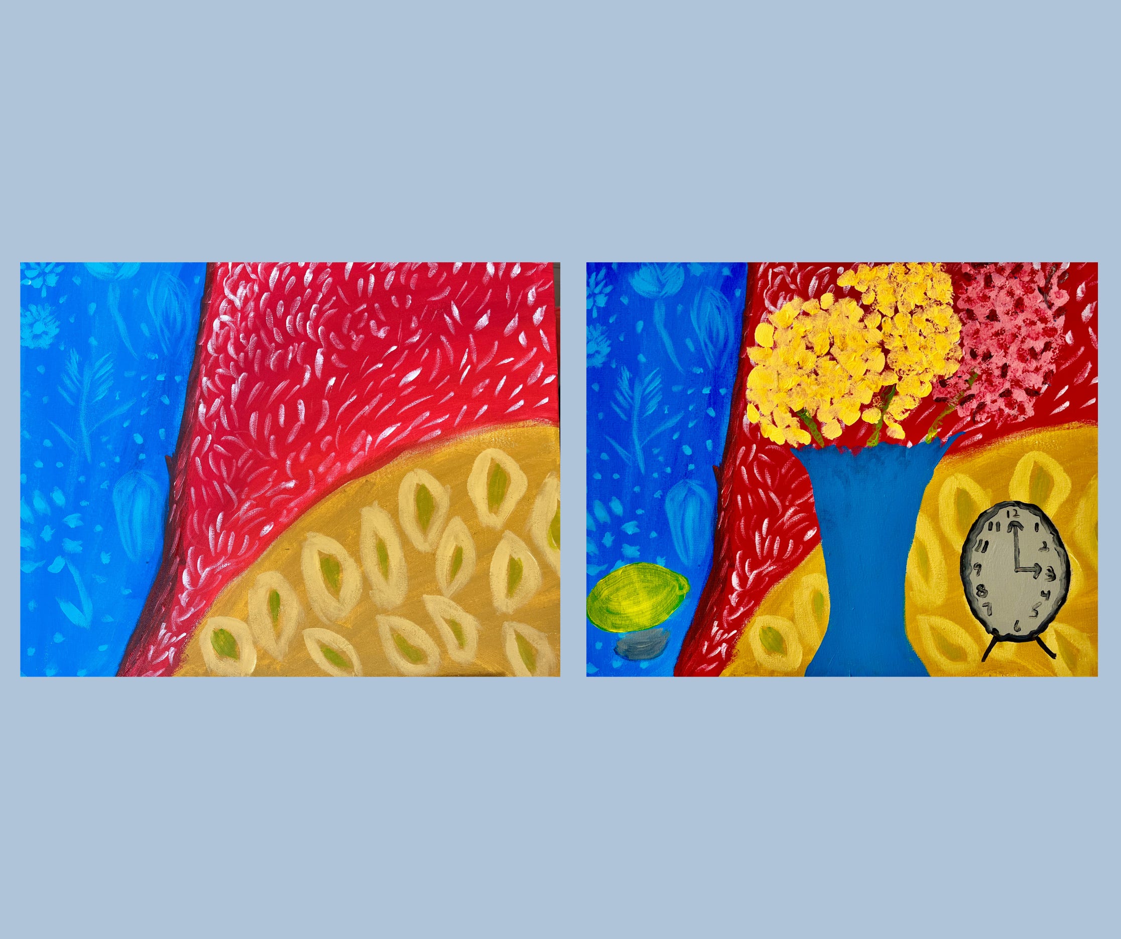
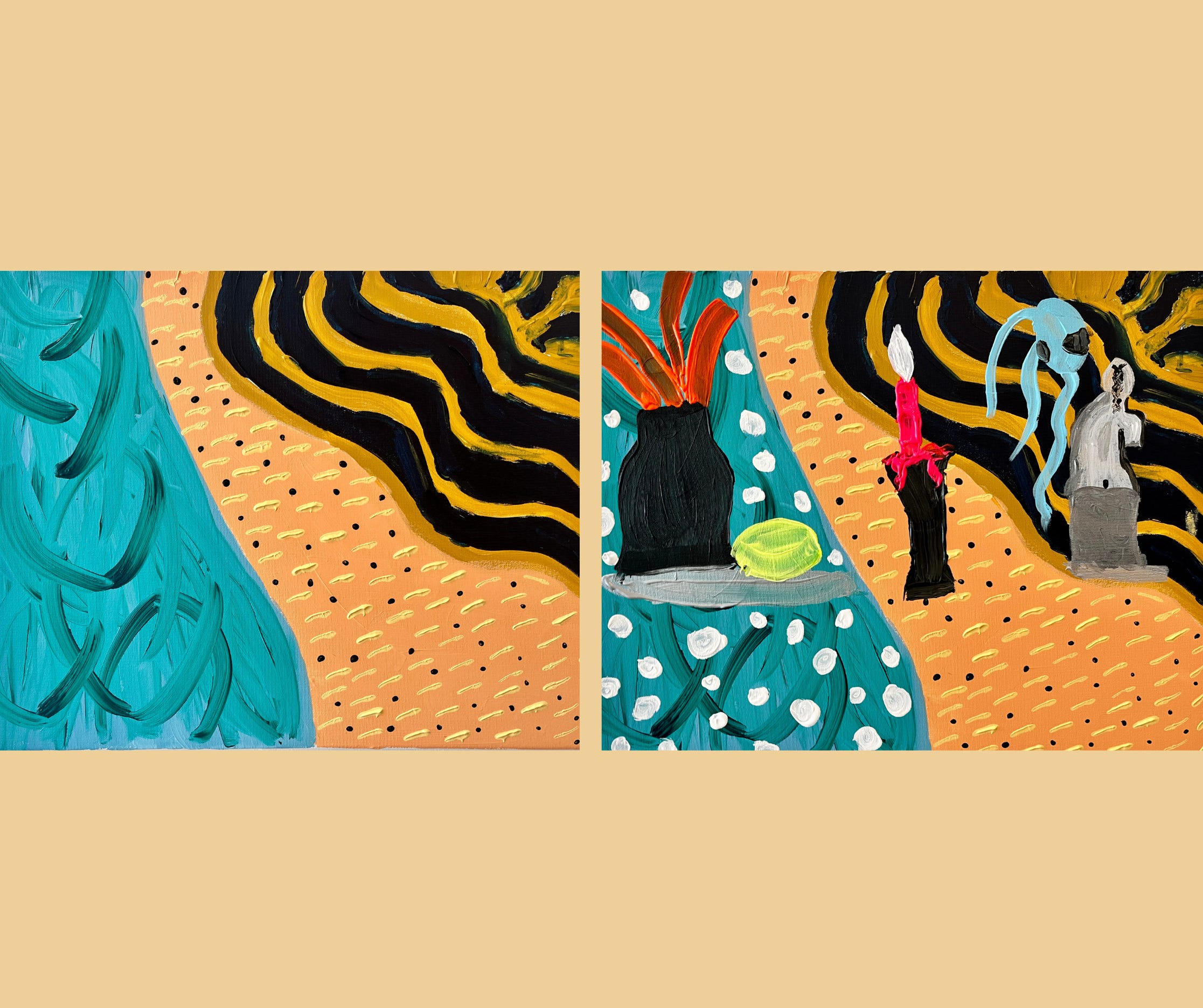
The painters then added elements from our still life into the painting in places that they would play well with the patterns and that eye movement.
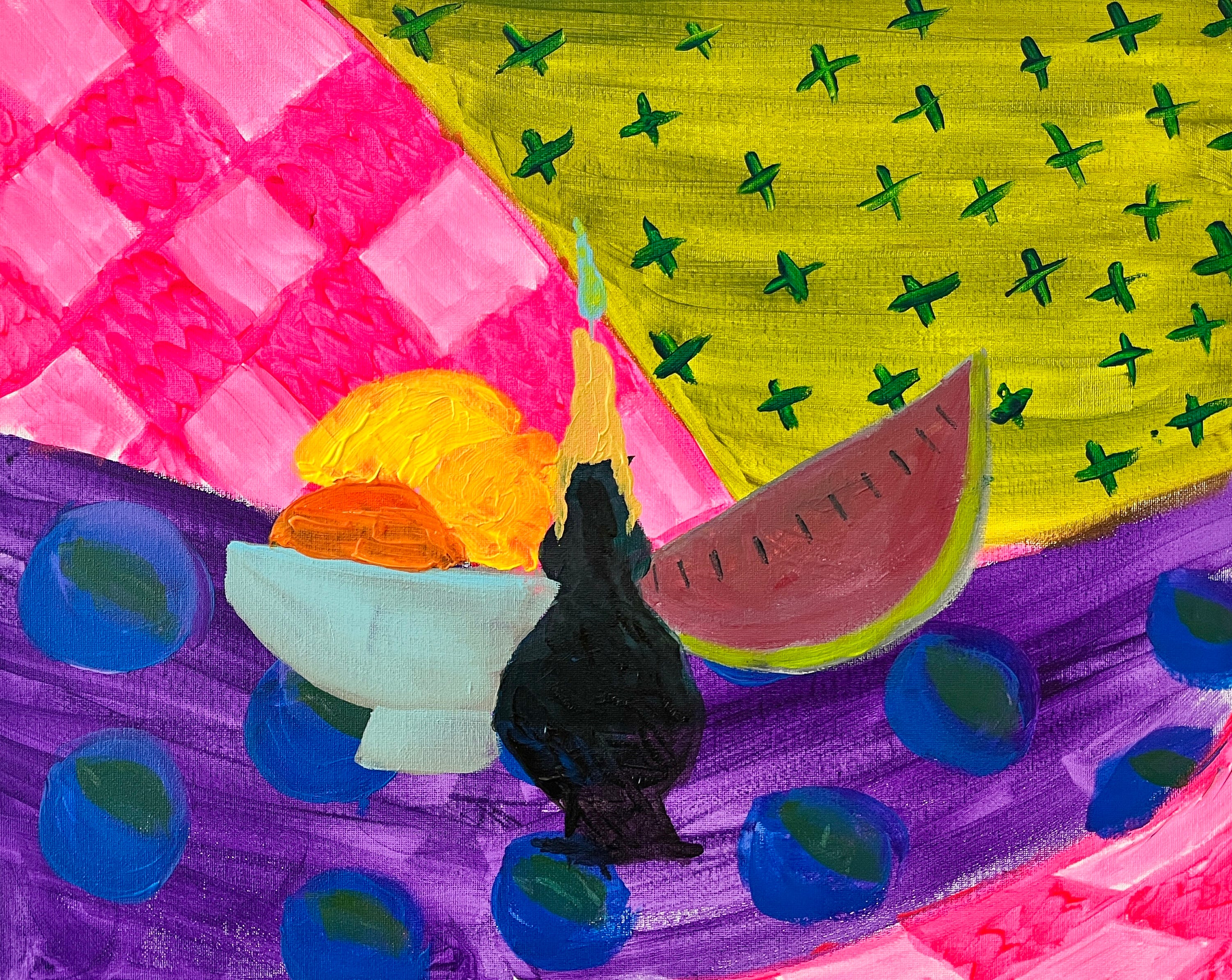
Elizabeth Palombo
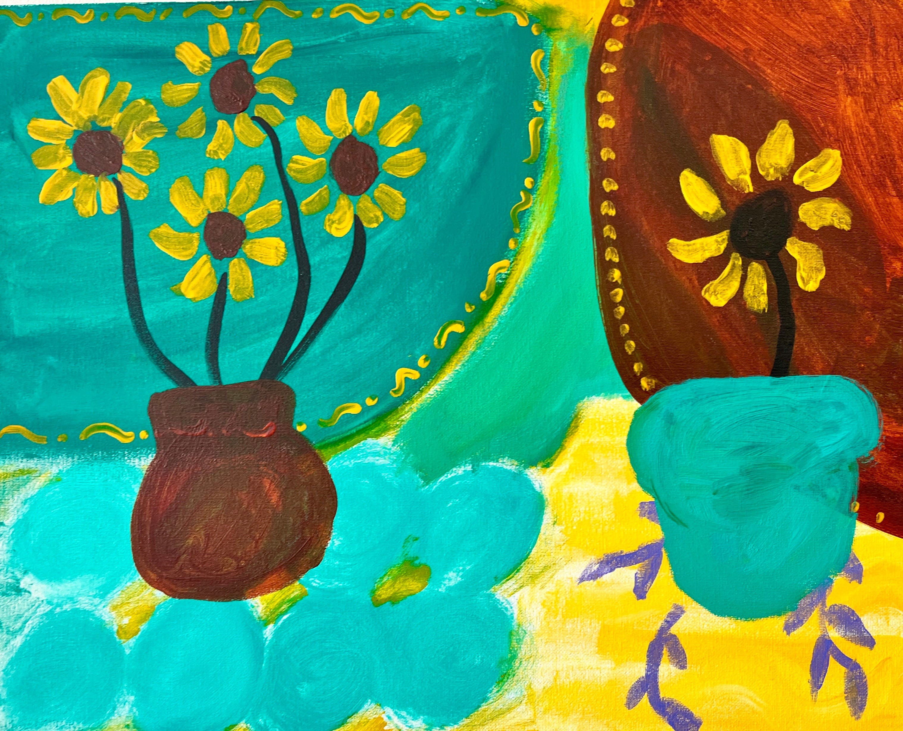
Megan Gurry
We also talked about the importance of inserting neutral colors, in Matisse’s case this was often black, in order to give the eyes to get a break from the madness in the multiple, often clashing, fabrics.
I've been forty years discovering that the queen of all colors is black.
Henri Matisse
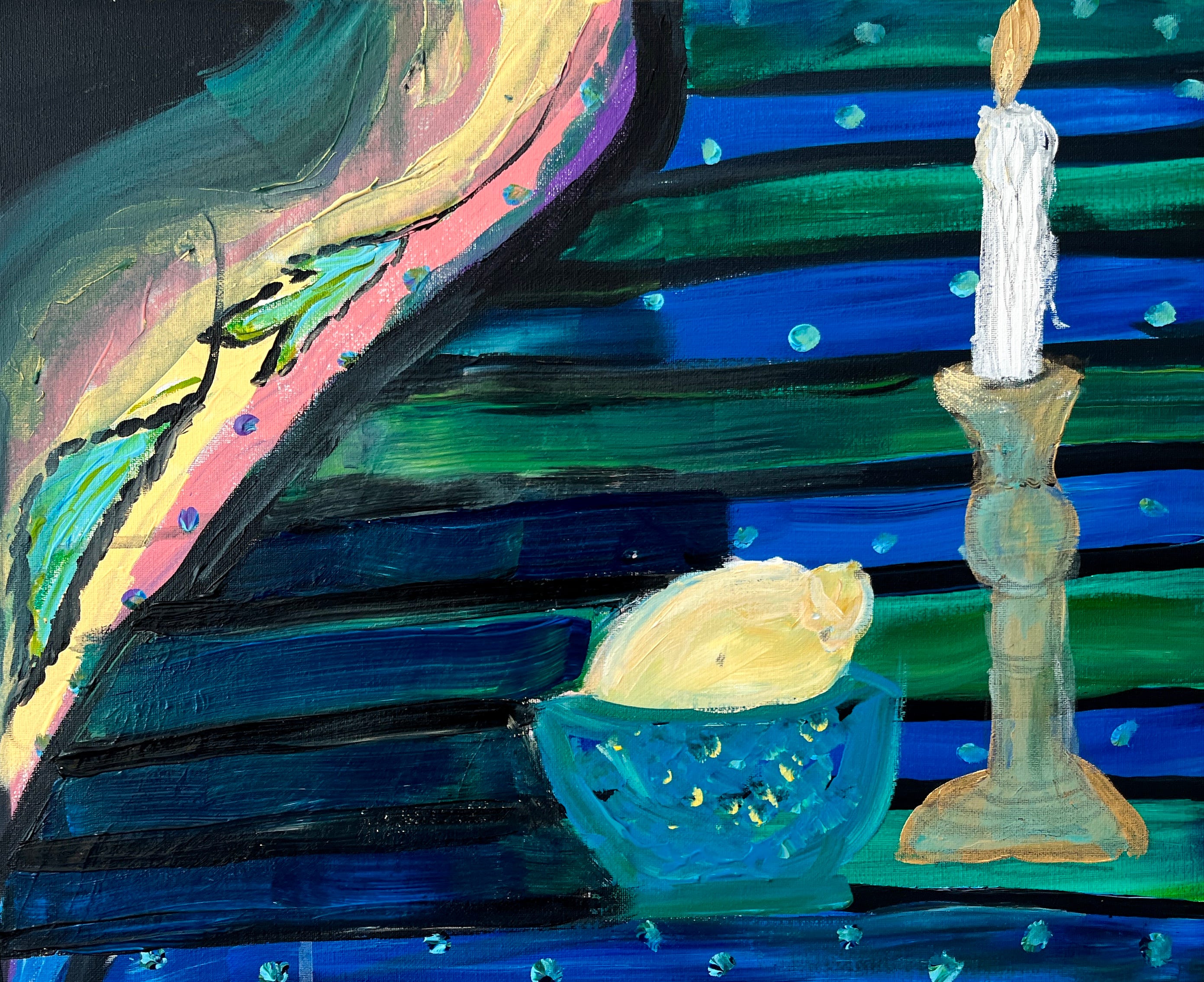
Alanna McLaughlin
And the artists all used the expressive, emotive and bold marks of Matisse.
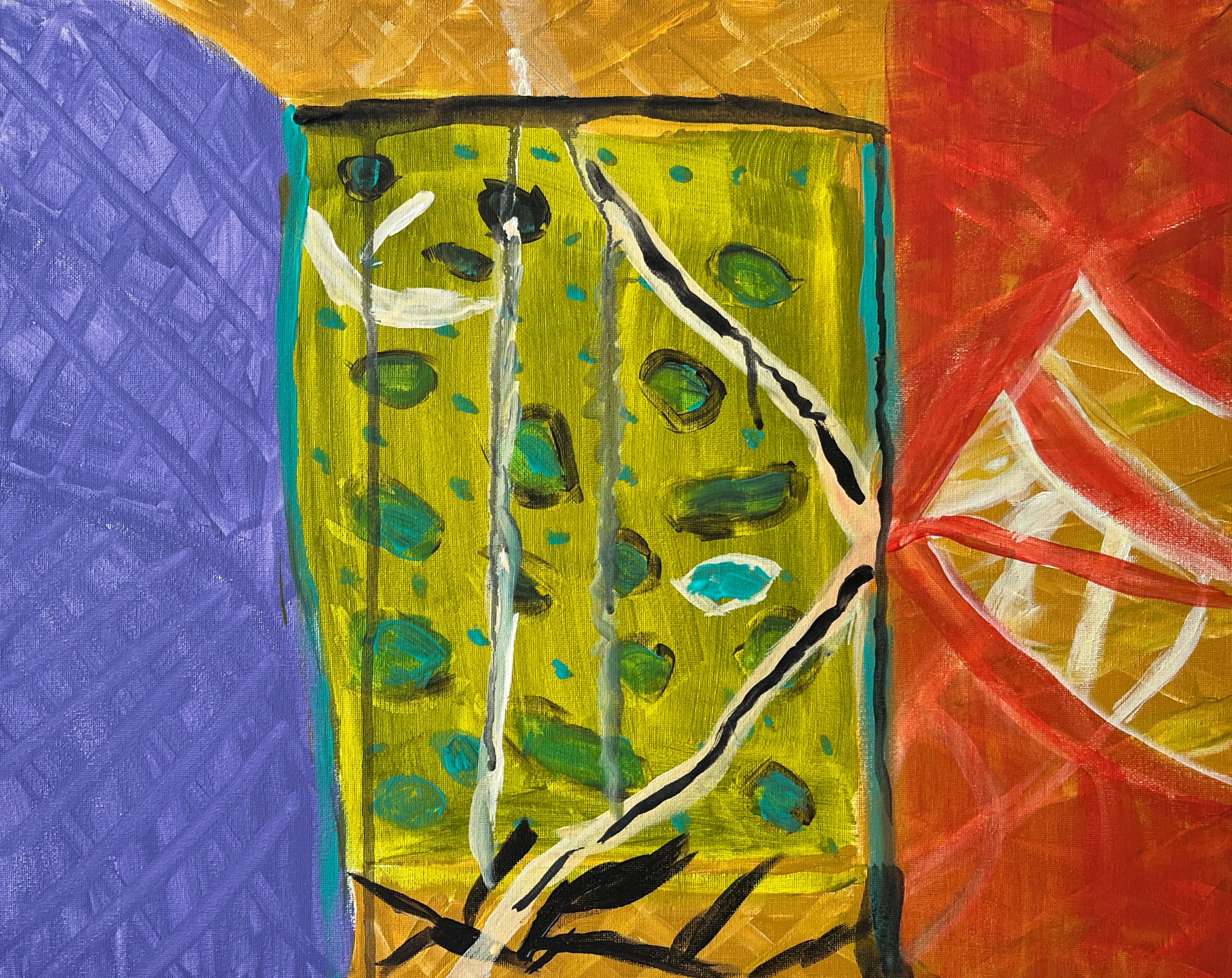
Lizi Moses
Bonnie Daly
As usual, there was a creative maverick in the class (in this case our maverick was author Maggie Hill, whose book Sunday Money is absolutely wonderful and gives you a look at the life of a family in Brooklyn in the 1970s that you won’t soon forget.) Maggie left the confines of the objects on the table and instead used her textile inspiration as the basis for an abstract allegory about leaving behind temptation to enter a world of liberation and bliss.
Maggie Hill
As you can see, the resulting artworks are thrilling in their use of color, their bold compositions, and their simple and effective painting styles. Everybody killed it. Matisse would be psyched.
So, how can you duplicate this exercise at home?
Select 3-4 different textiles or patterns and use them as inspiration in some way to fill your background. Don’t worry about there being too many patterns or too much clashing- at this stage your only job is to be bold.
As your background dries set up a Matisse-like still life with lemons, vases, flowers and any other bits and pieces you have around the house. I included an old clock, a seashell (they are so hard to paint, you’ve been warned), paper flowers from one of my favorite local stores, Mexico in my Pocket, and a silver figurine.
Look at your background and see if there is a sense of motion at play due to the fabric or the patterns. Make the most of that motion by placing your central object(s) in the place you would like the eyes to travel. Keep your objects graphic and simple in contrast to the wildness of the textiles.
Is too much going on at this point? Go back and insert some black or another neutral in various places on the canvas to serve as palette cleansers for the eyes.
If your painting is still not working for you - try adding more lemons! They are the best, most attractive shape.
If you try this fun end-of-summer exercise, please send me photos - paintingisgoodforyou@gmail.com.
And remember, our fall weekly classes for adults and kids start the second week of September!
Happy Painting!
Sara
Painting Can Save Your Life - my book