


Yes, you do need a color wheel.
The world's most affordable, simple and effective way to create harmonious palettes.

Before I start my plea for you to spend about $5 on a painting tool that could drastically elevate your painting practice, let me soft pitch The Painting School and let you know that our super fun weekly classes for adults are now open for Fall Registration. And if you are some sort of Young Sheldon of painting who is reading this painting newsletter, our after school classes for kids are open for sign up as well!
Okay. On we go…
If you have taken a class with me or read my book than you know that I love a color wheel. I am also a relative newcomer to the color wheel and I don’t remember having used or even seen a color wheel when I was in art school. Maybe they were there amongst the saw dust and pencil shavings and cigarette butts that were the debris of an early 1990s art department, but I don’t remember them.
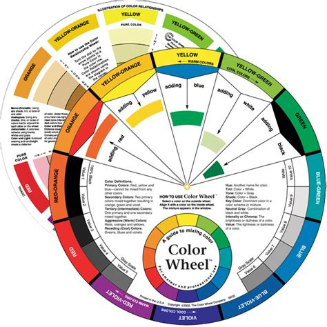
Here is what the color wheel that I currently use looks like. It is the most complicated, most simple optics tool that I have found thus far. (I like the one from the Color Wheel Company)
A color wheel is basically a guide to mixing color and creating color schemes, but it is also a guide to understanding the spectrum and how our eyes see it.
This is the visible spectrum of light that is the root cause of all the colors we see.

And in the most brief description possible, here is what happens when that spectrum (a word coined by Isaac Newton btw) hits an object:
When light hits an object the spectrum of color is also hitting that object.
Most of the spectrum is absorbed by the object, but some of the lightwaves from the light are not absorbed and those wavelengths bounce back at us. Those rejected wavelengths are the color we perceive that object to be.

Then a ton of stuff happens in our eyes and our brains and I’m not even going to pretend to understand any of it. But in terms of the color wheel and its purpose, it is important to know that these visible light waves come in a lot of different lengths, violet being the shortest and red being the longest.
This means that the red waves reach our eyes first, which makes red the color that emerges the most from a painting. And the shorter wavelength colors, violet and blue, seem to recede in the painting because they are slower to get to our eyes. The painting below demonstrates this well. The red seems to come at us, jumping off the canvas. In comparison, the blue seems to be receding or nestling into the painting.
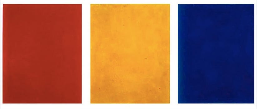
Aleksandr Rodchenko, Death of Painting (1921)
The color wheel takes the way that our eyes interact with colors and builds a system around it. Basically, a color wheel hacks the spectrum for the benefit of the painter.
So, what can a color wheel help you do when you are painting?
Learn how to mix colors
Learn what colors will look like when they are mixed with black, gray and white
Determine the lightness and darkness or a color
Understand what colors are warm and what colors are cool
And very importantly for the purpose of the rest of this newsletter, it helps us find color palettes that are naturally harmonious.
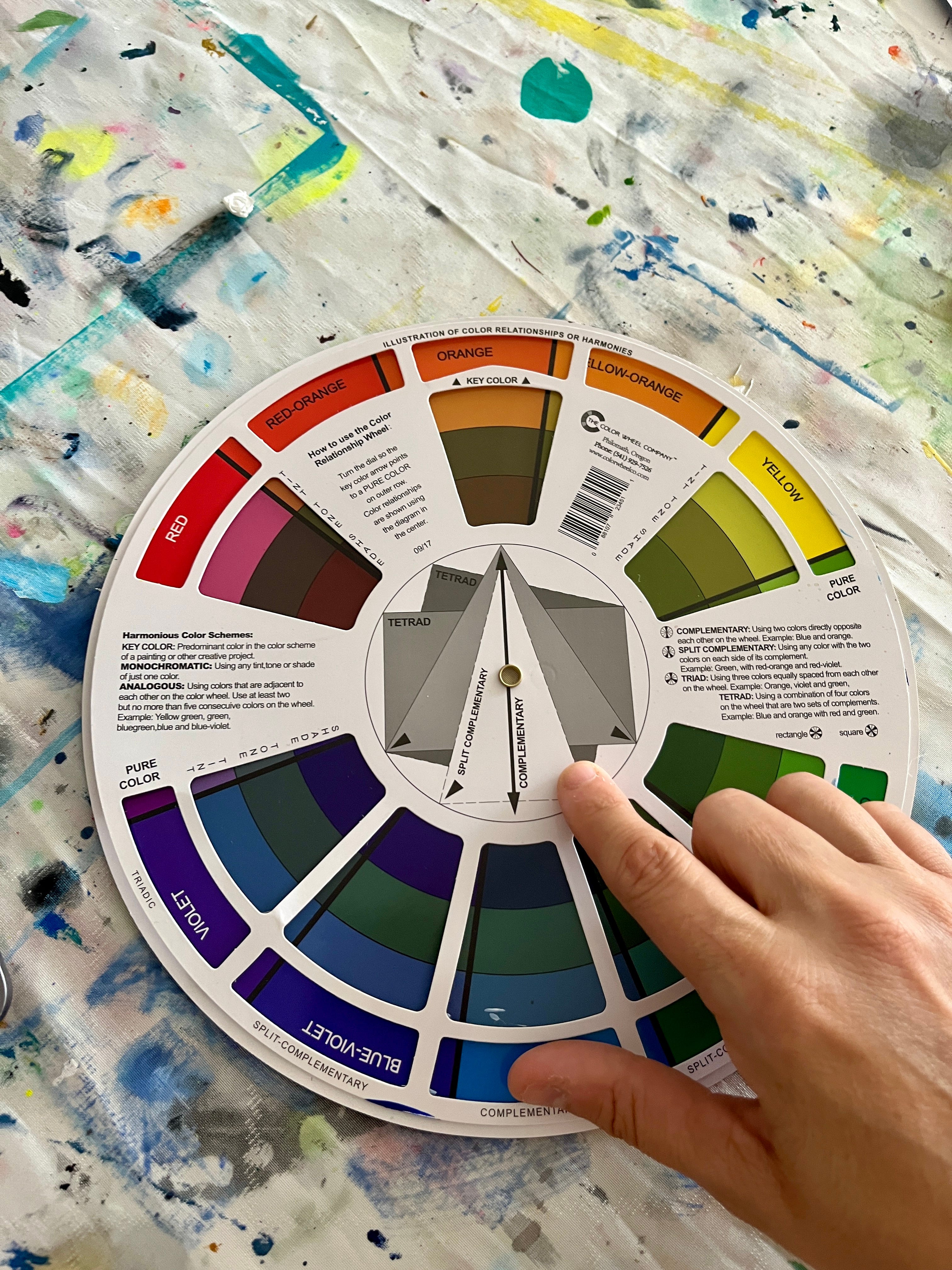
Those color harmonies live on this side of the color wheel. See those shapes in the center of the wheel where my finger is? Those triangles and rectangles are defining the color harmonies for us. Where the corners of those shapes hit a hue, we know that is a naturally harmonious combination. Let’s get to work using the color wheel.
A Color Wheel, Color Harmony Painting Exercise - Painting objects from your favorite childhood place using a variety of color harmonies
My family spent one week of every summer vacation with my cousins at this amazing, yet totally busted-up, old resort called Vacation Village in Lake Okoboji, Iowa.
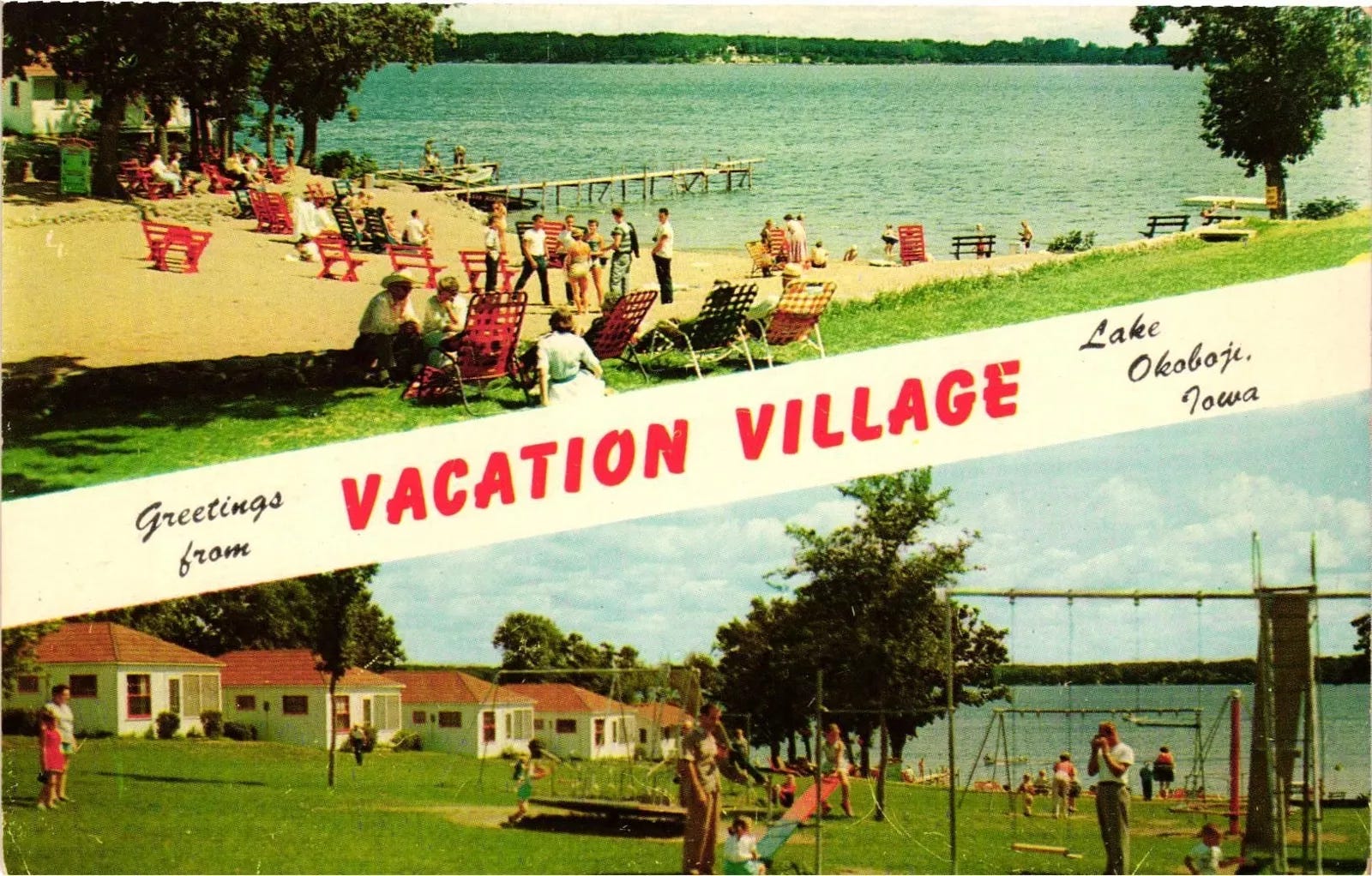
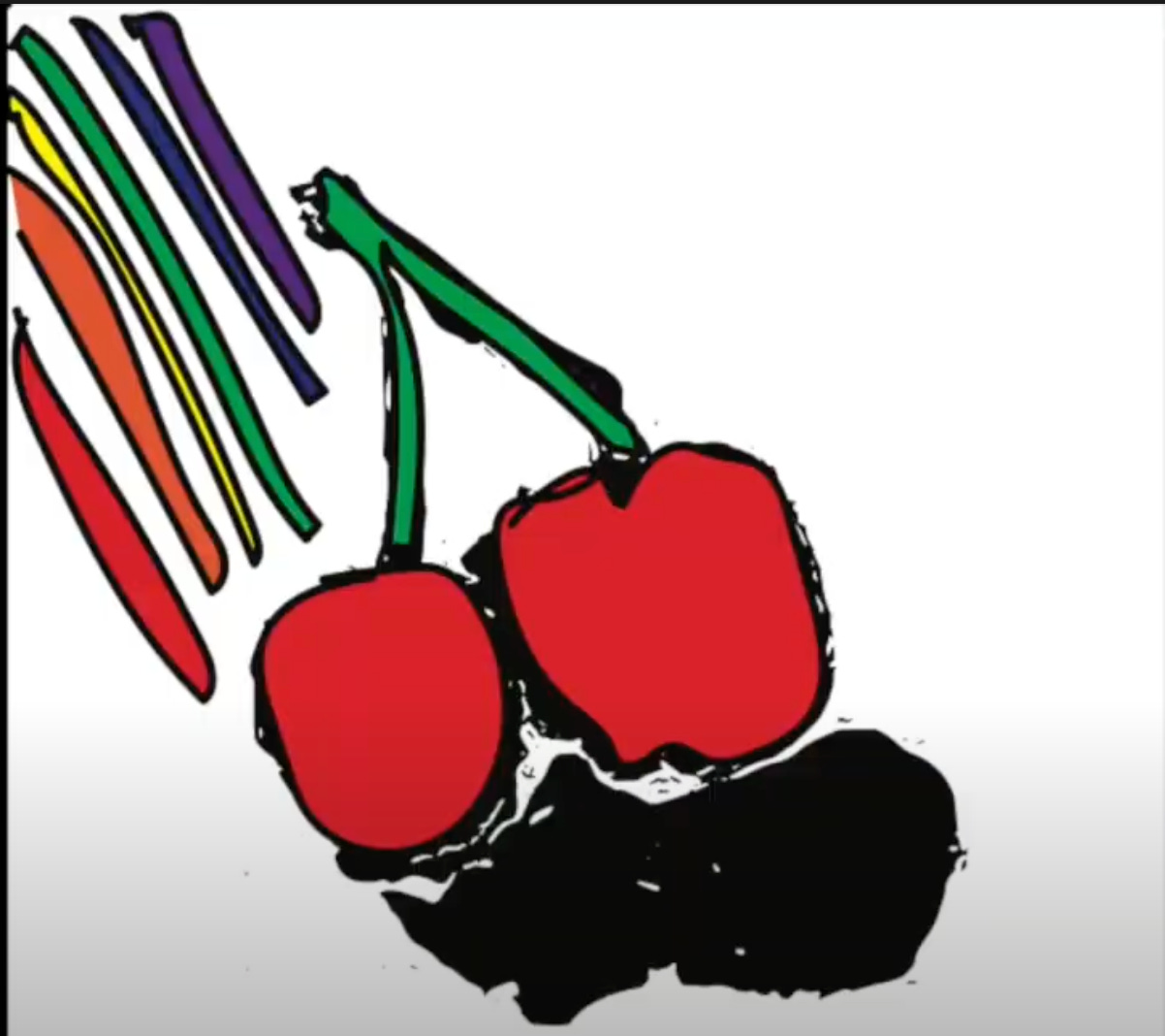
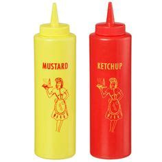
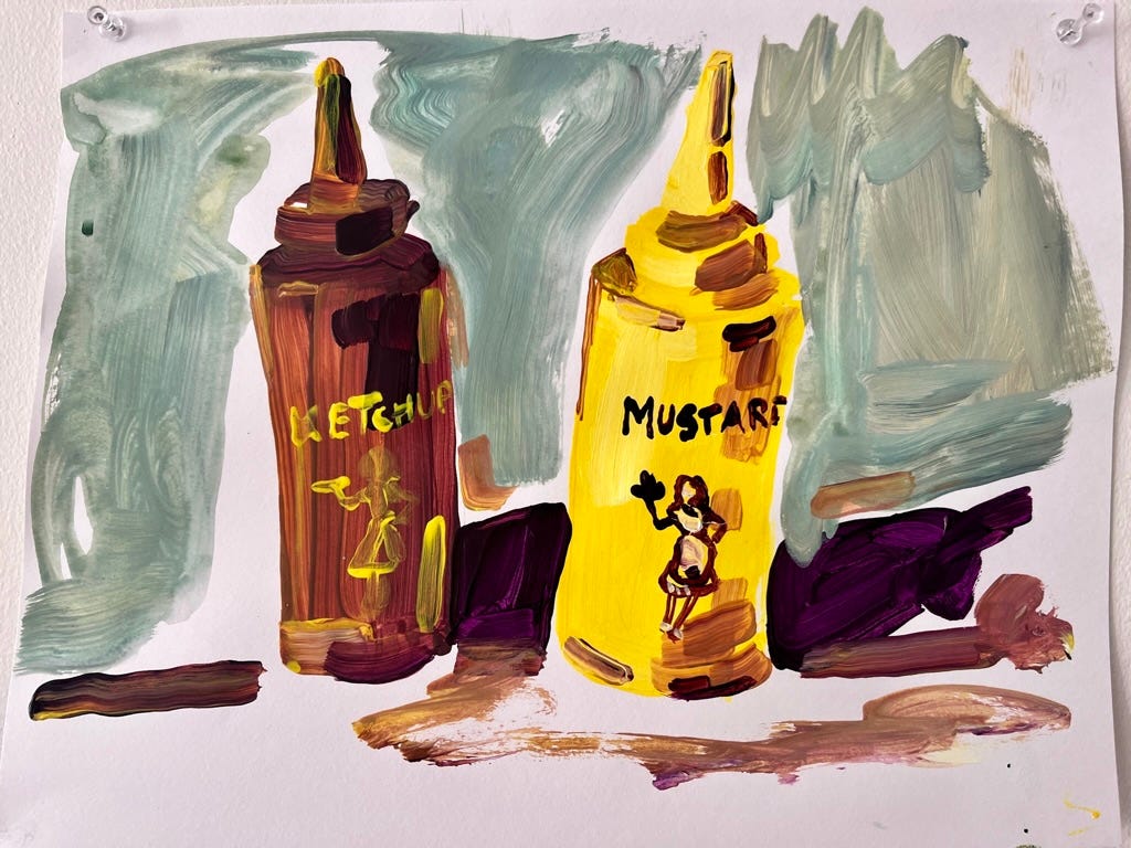
Vacation Village was my favorite place on the planet when I was growing up and this exercise celebrates it with harmonious paintings featuring two objects from that place - the iconic, summertime plastic red and yellow catsup and mustard bottles.
I painted the bottles using 4 different color schemes, all of them can be created using the color wheel: Monochromatic, Complementary, Split Complementary and Tetrad.
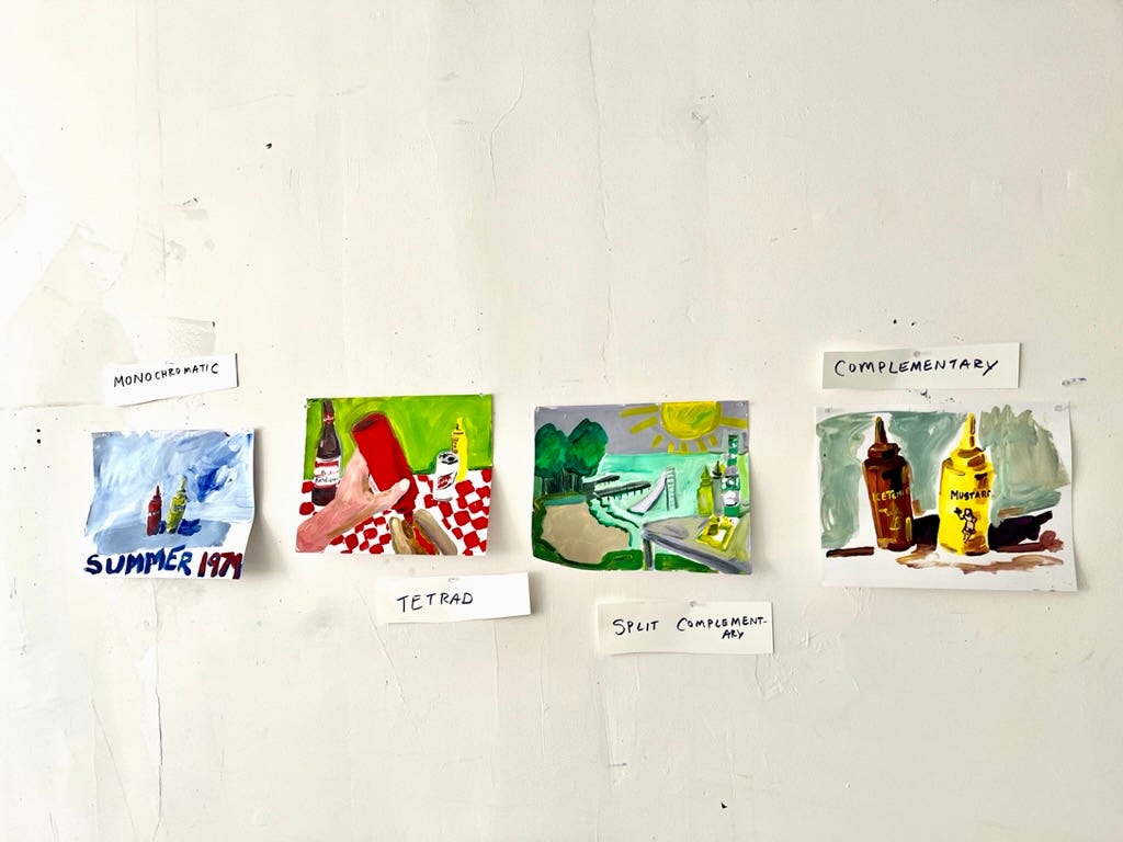
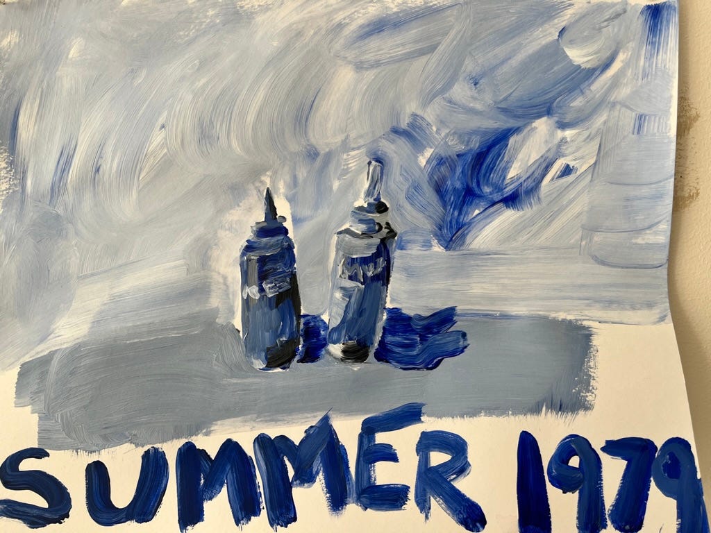
Monochromatic - Pick one hue (color) that you want to us. I used blue. Then mix the color you select with black, white and a variety of grays. This is a monochromatic palette. Your color wheel shows what colors you will get when mixing a blue with white (creating a tint) gray (a tone) and black (a shade). It is moody and awesome.
Complementary Color Harmony - Complementary colors are the colors on opposite ends of your color wheel. They are the naturally strongest color combinations and were often used by Van Gogh and others. For this I used violet and yellow, and that resulting combination gave my condiments a perfectly faded, Kodaky nostalgic vibe.
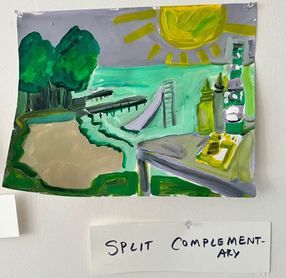
Split Complementary- The skinny triangle in the center of the color wheel is the split complementary. Those 3-color combinations are naturally powerful. The following painting uses the split-complementary of red-violet, yellow and green.
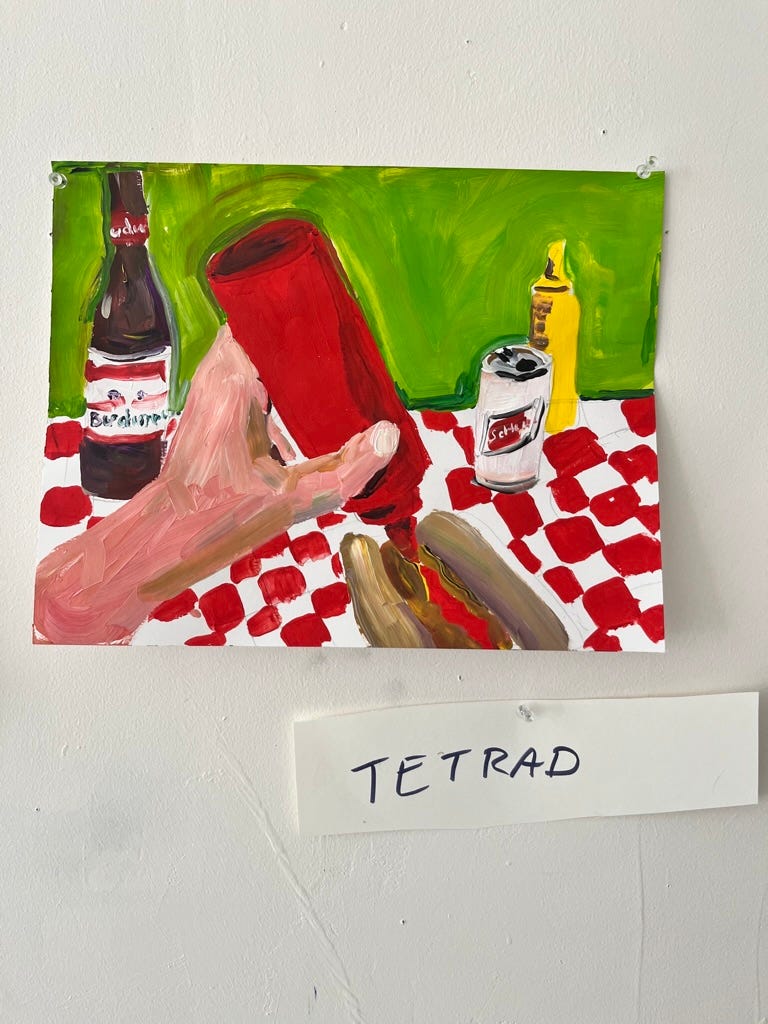
Tetrad - Tetrads are those 4-cornered rectangles in the middle of your color wheel, offering all kinds of complicated color harmonies. For this one I used red, violet, yellow and green.
There you have it. 4 different color harmony options. 4 painting ideas. All thanks to one brilliant & affordable painting tool. Isaac Newton would approve.
Thank you for reading and Happy Painting!
Sara
This is like a whole course! Ok, I’ll get a color wheel. ☺️